The use of modal popup is very common in web designing nowadays. Whether we are alerting the user or displaying an important message, we use a modal popup box. Generally, we need to use a jQuery plugin (or vanilla JavaScript) in order to create a modal dialog box. But, a simple modal (or alert box) can be created with only CSS. Yup! in this tutorial, we’ll build a pure CSS modal popup box that will reveal on button click.
If you are new to CSS, then you might be thinking how it is possible to open a modal dialog on click event. Actually, it’s fairly possible using the HTML hash link technique. We’ll set the id of modal dialog to the anchor part of the href attribute value. After that, functionalize it using CSS target pseudo-selector. So, when a user will click the link, the modal popup will be displayed.
The modal popup will not only displayed on click event but also disappeared when the user clicks on the close button. Besides this, we’ll also add a dim background overlay effect that will be displayed when a modal dialog opened. So, let’s start with HTML coding to create a modal box.
HTML for Modal Popup that opens on Button Click
First of all, create a hyperlink button with # href that will be used to trigger the modal popup. You can wrap this link in a div element for further customization.
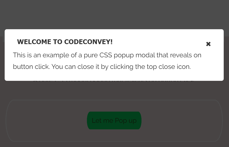
<div class="box">
	<a class="button" href="#popup1">Let me Pop up</a>
</div>
After that, create the HTML div element for overlay and place another div inside it for a modal popup. The following is a basic structure for modal dialog, you can also add any HTML element (i.e text, images, videos, etc) in it.
<div id="popup1" class="overlay"> <div class="popup"> <h2>Welcome to CodeConvey!</h2> <a class="close" href="#">×</a> <div class="content"> This is an example of a pure CSS popup modal that reveals on button click. You can close it by clicking the top close icon. </div> </div>
The CSS Styles
In CSS, we’ll convert the hyperlink into a virtual button. You can style it according to your needs, anyhow the basic style for a button is as follows:
.button {
  font-size: 1em;
  padding: 10px;
  color: #fff;
  border: 2px solid #06D85F;
  border-radius: 20px/50px;
  text-decoration: none;
  cursor: pointer;
  transition: all 0.3s ease-out;
}
.button:hover {
  background: #06D85F;
}
Now we’ll define styles for dim overlay background effect using CSS rgba() function. If you want to customize its color, you can update the rgba(0, 0, 0, 0.7) values.
.overlay {
  position: fixed;
  top: 0;
  bottom: 0;
  left: 0;
  right: 0;
  background: rgba(0, 0, 0, 0.7);
  transition: opacity 0.5s;
  visibility: hidden;
  opacity: 0;
}
.overlay:target {
  visibility: visible;
  opacity: 1;
}
The following are some basic styles for the popup modal. In order to make it responsive, I set its width value to 30% and leave the height attribute. The height will be automatically adjusted according to the modal’s contents. You can also set a fixed width & height according to your needs.
.popup {
  margin: 70px auto;
  padding: 20px;
  background: #fff;
  border-radius: 5px;
  width: 30%;
  position: relative;
  transition: all 0.5s ease-in-out;
}
Set some styles for modal heading. If you want to customize it, you can change its color (that is #333), margin, and font-size, etc.
.popup h2 {
  margin: 10px;
  margin-top: 0;
  color: #333;
  font-family: Tahoma, Arial, sans-serif;
  font-size: 16px;
}
Keep the absolute position for the close button and set a targeted position (top/left/right/bottom) where you want to display the close button.
.popup .close {
  position: absolute;
  top: 20px;
  right: 30px;
  transition: all 200ms;
  font-size: 30px;
  font-weight: bold;
  text-decoration: none;
  color: #333;
}
.popup .close:hover {
  color: #06D85F;
}
Finally, define the following styles for the modal content area and make it responsive using CSS3 media queries.
.popup .content {
  max-height: 30%;
  overflow: auto;
}

@media screen and (max-width: 700px){
  .box{
    width: 70%;
  }
  .popup{
    width: 70%;
  }
}
That’s all! I hope you like this pure CSS modal popup that reveals on button click. If you have any questions or suggestions about this modal popup, let me know by comment below. Thanks!