An image slideshow is the best solution to represent multiple photos on a webpage. It can be used to highlights features, a showcase of work or to display general purpose photos. On a webpage, an auto-playing image slider has its own value. So, in this tutorial, we are going to create a simple responsive automatic image slider using pure CSS.
Generally, an image slider can be created using a jQuery plugin or Vanilla JavaScript. But, it’s hard to find a slideshow plugin that fits your needs. Some of the plugins or multifunctional and come with multiple configuration options. In the case of simple slideshow, we really don’t need any JavaScript. Yes! we can do it with CSS only.
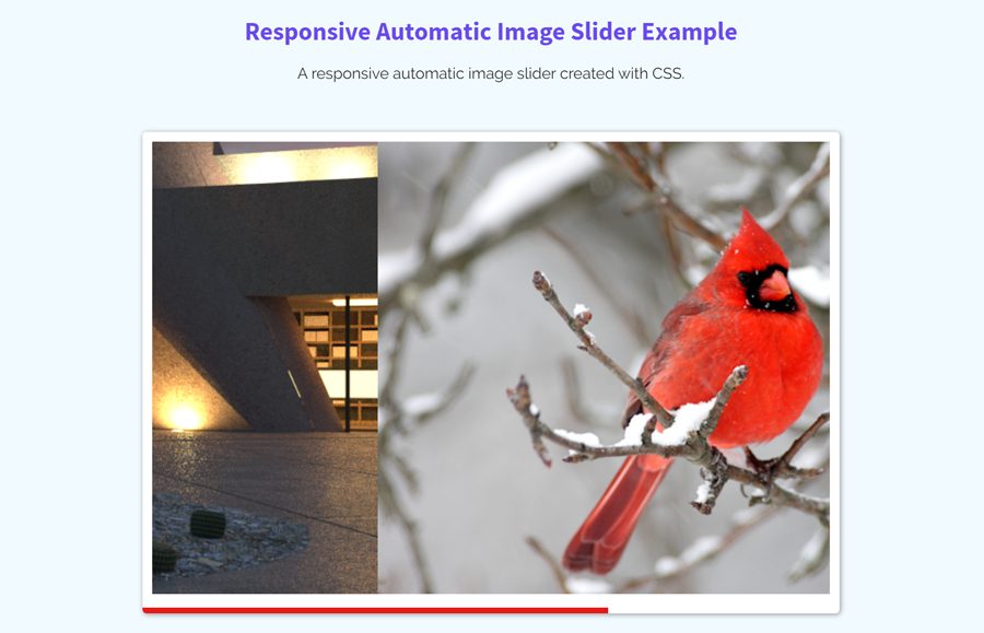
Before getting started with coding, let’s discuss what we are going to build. Did you browse the demo page? if yes then it’s cool. (Check demo page if you didn’t check yet) OK! the slider is really simple. As you’ve seen on the demo page, each image is sliding automatically with a sliding indicator. All we have done using CSS animations.
HTML for Responsive Automatic Image Slider
The HTML for the automatic image slider is very simple. First of all, create a section tag with the class name “auto-slider” and place other child elements in it. Group your slider images in figure tag and wrap it into a div element (with id “slider”). At the end of the figure tag, place a div element with the class name “indicator”.
<section class="auto-slider">
            <div id="slider">
                <figure>
                    <img src="img/image-1.jpg" alt="Image">
                    <img src="img/image-2.jpg" alt="Image">
                    <img src="img/image-3.png" alt="Image">
                    <img src="img/image-4.jpg" alt="Image">
                    <img src="img/image-5.jpg" alt="Image">
                </figure>
                <div class="indicator"></div>
    </div>
</section>
You can add any extra HTML element inside the slider section (i.e text for image captions or links to other pages) according to your needs.
The CSS Styles
Let’s start with the basic styles for the main container (auto-slider outer). The following CSS defines the styles (according to the demo image slider) if you want to customize its size (max-width), background, and shadow then pass the custom values in the following code block.
.auto-slider{
    position: relative;
    box-sizing: content-box;
    display: inline-block;
    padding: 10px 10px 20px;
    background: #fff;
    max-width: 720px;
    margin: 0 auto;
    overflow: hidden;
    border-radius: 4px;
    box-shadow: 1px 1px 6px rgba(0, 0, 0, 0.4);

}
Now, add the following CSS into your project to make slider images responsive. If you want to add more than 5 images in the slider, then simply update the width value (that is 500%). Similarly, update the animation duration that is 25 seconds for 5 images, each image taking 5 seconds. You can also set the custom animation duration to increase/decrease slider speed.
div#slider { overflow: hidden; }
div#slider figure img { width: 20%; float: left; }
div#slider figure {
  position: relative;
  width: 500%;
  margin: 0;
  left: 0;
  text-align: left;
  font-size: 0;
  animation: 25s sliding ease infinite;
}
The following are some styles for the sliding indicator. If you want to customize it, you can update the value of the background-color (for custom color) and height for the thickness of the bar.
/* Slider indicator */
.indicator{
    width: 100%;
    max-width: 720px;
    height: 6px;
    background: #e41b17;
    position: absolute;
    bottom: 0;

    animation: indicating 5s ease infinite;

}
Finally, add the CSS animations that automatically play the slider. Keep in mind, if you added more images in the slider, also update the values of sliding keyframes.
@keyframes sliding{
            0%{left: 0%; }
            20%{left: -100%;}
            40%{left: -200%;}
            60%{left: -300%;}
            80%{left: -400%;}
            100%{left: 0%;}
        }

@keyframes indicating{
            from{
                left: -100%;
            }
            to{
                left: 0;
            }
}
You have done! let me know by comment below if you have any questions or suggestions related to this CSS based responsive automatic image slider.
Hi, thank you so much for this it has really helped me, i am however confused. I want to add 18 pictures to the slide and position the enter slider to the center of my page. please advise
Hi Senzo!
You can add multiple images according to your needs. Just place your images inside the <figure> tag and update the slider width in CSS. In your case, the 18 images will take 1800% width and 90s animation duration.
div#slider figure { width: 1800%; animation: 90s sliding ease infinite; }Is it possible to add captions on each image?
Hi Dao!
Yes, you can add any HTML/text element inside the slider section. If you wanted to add caption for each image, you need to create a div element just after the <figure> tag. Wrap your text inside it and apply the same sliding animation to it.
Your HTML:
Then apply the sliding animation to
captionclass:.caption{ width: 500%; position: relative; animation: 25s sliding ease infinite; }Thank you
You’re welcome! keep visiting us for more free web design tutorials.
Thank You So much
You’re welcome! Kepp visiting us for more free code & scripts.
Hey! First thank you for doing a tutorial on this cool slider 🙂
I want to have the slider centered in the middle of my page, but putting margin to 0 auto in the .auto-slider doesnt do the trick. Im still relatively new to this, can you maybe help me out?
Thank you so much!
Hi Jasmin!
Wrap your slider in a container and define the following CSS in order to center align.
.container{ display: block; margin: 0 auto; max-width: 720px; /* optional */ text-align: center; }First of all, thank you for providing this creative solution.
Just one question, how would you approach the issue I’m having with the pictures being slightly different height, so when it slides between the pictures, you can clearly see that the bottom of each picture is slightly different in height.
They are aligning perfectly at the top, only at the bottom where they are different. I would love to solve it through CSS rather than manually editing the picture resolutions.
Hi Robert!
You can set the fixed height for your slider images as follows:
div#slider figure img{
  height: 220px; /* change it according to your needs */
  object-fit: cover; /* should be resized to fit its container */
}
You can also use the
"contain"or"fill"value for the object-fit property. The functions of these values are:contain: image keeps its aspect ratio, but is resized to fit within the given height.
fill: image will fill to the given width & height.
Hi ! Thank you so much, I want to put text on images but when I create caption they put themselves below… I have no idea how to do
Hello,
How I can make big image frame, and some small images placed underneath
the big frame with auto?
Vasily, We have already posted a “thumbnail slider” please check it here https://codeconvey.com/pure-css-image-slider-with-thumbnails/ Also search on site and you will find more. Thanks.
HI! your tutorial is great and really helpful! But, how can I add in your tutorial for user can click the image? like user can click to see the previous image or next image
We already have another slider with the next/prev option. You can take a look here https://codeconvey.com/pure-css-image-slider/
How do I combine auto slider and next/prev option?
how change for 6 image for @keyframe work
Hi
You can add multiple images in the slider according to your needs. First of all, count the number of images and multiply by 100 to get the total width of the slider. In your case, you want to add six images. So, 6×100 = 600. Use this value with the percentage sign as the total width of the slider.
div#slider figure {
   width: 600%;
}
After that, divide 100 with the number of images to get the viewable area for 1 image. Like, 6/100 = 16.66 that’s the single image width. Set this value for the img element of the slider.
div#slider figure img {
 width: 16.66%;
 float: left;
}
Finally, set the keyframes for each image. To determine the sliding value multiply 16.66 (that’s the single image width) with 2 then 3 and so on.
16.66 x 1 = 16.66
16.66 x 2 = 33.33
16.66 x 3 = 49.98
16.66 x 4 = 66.64
16.66 x 5 = 83.3
16.66 x 6 = 99.96 (or write 100% for last image)
@keyframes sliding{
            0%{left: 0%; }
            16.66%{left: -100%;}
            33.33%{left: -200%;}
            49.98%{left: -300%;}
            66.64%{left: -400%;}
            83.3%{left: -500%;}
            100%{left: 0%;}
}
You can also control the sliding speed for images.
div#slider figure {
  width: 600%;
.
.
.
.
  animation: 30s sliding ease infinite;
}
30/6 = 5 seconds for each image.
how to change the position of slider
Hi Lisa!
By default, the slider aligns the center of the page using the margin property (with 0 auto value). You can set the custom value for margin to change the position.
.auto-slider{ margin: 10px; /* Margin from all sides */ }Hello! Can I add article with text for description of each image?
Borislava, Yes you can add the text by customizing the slider.