Looking for Cool CSS Buttons? Check out this article here we are going to create a custom awesome collection of buttons with the help of CSS and HTML.
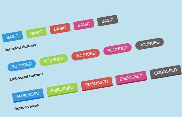
I will share your original set of CSS3 Buttons with different style combinations. In this pack, I have included simple, rounded, and Embossed style buttons that you can use for your website to make it outstanding.
We are going to use simple markup to create them and they look awesome in all WebKit-based browsers.
Our today buttons pack included three different sizes and five different color schemes. You need to pick a class name for a button size or background color and add it to the anchor tag.
Each button included ccbtn a class that used to add basic style such as padding, margin, font-size, font-family, and text-transform, etc.
Although other classes used to change the color, size, or style of the buttons.
The HTML for Cool CSS Buttons
In the below snippet, A class btn-blue is used to define a unique background color to the buttons. However, the class btn-simple is used for styling the buttons in a simple design.
Let’s have a look HTML mockup:
<a class="ccbtn btn-blue btn-simple" href="#1">Basic</a>
Similar, If you want to get a rounded style button then the markup will look like this:
<a class="ccbtn btn-blue btn-rounded" href="#1">Rounded</a>
You can easily apply different sizes to a particular button. Just like we did add a class btn-small in the below snippet to the button smaller.
<a class="ccbtn btn-blue btn-simple btn-small" href="#1">Small</a>
Button Colors
Currently, our set of buttons supports six different colors. Check out the list of all possible color classes:
- btn-blue
- btn-green
- btn-orange
- btn-red
- btn-pink
- btn-gray
Button Styles
You can apply any of the following styles on any kind of button size.
- btn-simple
- btn-rounded
- btn-embossed
Button Sizes
This set of buttons supports three different sizes and you can apply anyone on any style.
- btn-small
- btn-medium
- btn-big
The CSS Styles for Buttons
Let’s talk about how we can implement CSS into these CSS3 buttons. First of all, We need to add some CSS which is general for all buttons and it has some basic stuff like font size and padding, etc.
.ccbtn {
  font-size:20px;
  font-family: Arial;
  color: #ffffff;
  padding: 10px 20px 10px 20px;
  text-decoration: none;
  margin-right:15px;
  margin-bottom:15px;
  text-transform:uppercase;
}
Now we need to implement background color into a button. And for this, We need to add background property to the color class btn-blue
.btn-blue{
   background: #3498db;
}
Next, We need to implement a unique style on the button. This will be simple or rounded. I have used the border-radius property to make it a little rounded for the simple button and for full rounded it will be 25px.
.btn-simple{
  -webkit-border-radius: 5;
  -moz-border-radius: 5;
   border-radius: 5px;
}
.btn-rounded{
   -webkit-border-radius: 25px;
   -moz-border-radius: 25px;
   border-radius: 25px;
}
But for the embossed style button, Its CSS will be a little different. We need to use the border-bottom property with border color state and size.
.btn-blue.btn-embossed{
  -webkit-border-radius: 5;
  -moz-border-radius: 5;
   border-radius: 5px;
   border-bottom: 0.4rem solid #0F64E9;
}
At last, We will let you know how to make buttons in a different size. We have added three different sizes of a button which is small, medium, and big.
We simply take the help of font size and padding to make different sizes of buttons. Let’s take a look at CSS code:
.btn-small {
   font-size: 14px;
   padding: 10px 20px;
}
.btn-medium {
  font-size: 24px;
  padding: 15px 30px;
}
.btn-big {
  font-size: 30px;
  padding: 20px 45px;
}
Apply Hover Effect
We have added a simple hover effect to all buttons. We did use the CSS3 opacity element and make it 0.9.
.ccbtn:hover {
  opacity:0.9;
  text-decoration: none;
}
Enjoy! If you like, don’t forget to comment below.