Are you looking for responsive vertical tabs that built up with pure CSS? if your answer is “yes!” then you are at the right place. Here I’ll explain how to create vertical tabs using HTML and CSS. But before this, I would like to introduce you the basic use of tabs on a Web page.
On a website, tab is a navigational element that is used to access different parts of a same webpage. The tabs are like a content divider, users can easily navigate to related contents by clicking on a specific tab’s heading.
In Web design, there are multiple types of tabs contents nowadays. Some are horizontal tabs, vertical tabs, multi-layout tabs, nested tabbed content etc. But, here we’ll discuss about creating vertical tabs only.
Create HTML Structure for Responsive Vertical Tabs
In HTML structure, first we create section for tabs name filled under label tag. These label will used to reveal the related tab.
<section class="tabs-container">

   <label for="tab1"> First Tab </label>
   <label for="tab2"> Second Tab </label>
   <label for="tab3"> Third Tab </label>
   .
   .
   .
   <label for="tab-n"> N Tab </label>

</section>
You can define multiple tabs name and their contents. You just need to define a unique ID and for attribute with each input and its label.
After creating tabs name, build sections for tab contents as follows:
<input name="tab" id="tab1" type="radio" checked />
<section class="tab-content">
   <h2> Tab Heading </h2>
   <p>Your peragraph goes here.</p>
   <!-- Any other content -->
</section>

<input name="tab" id="tab2" type="radio" checked />
<section class="tab-content">
   <p> Contents for tab 2 </p>
</section>

<input name="tab" id="tab3" type="radio" checked />
<section class="tab-content">
   <p> Contents for tab 3 </p>
</section>
   .
   .
   .
<input name="tab" id="tab-n" type="radio" checked />
<section class="tab-content">
   <p> Contents for N tab</p>
</section>
As you can see above, each content area for tab starts with radio input. This input will be used to switch between tabs. In section tag (that has class name "tab-content") you can put any HTML element like images, videos or any embedded object.
CSS Styles for Tabs
Now, we’ll style our vertical tabs, make them responsive and functionalities using pure CSS. As HTML structure, first we define basic CSS properties for tabs name. You can set custom value for any attribute in order to get desired result.
/* Tabs Name Container */
.tabs-container{
   position: relative;
   background: #2652CC;
   width: 120px;
   height: 100vh;
   float: left;
   z-index: 20;

}
/* Tabs Names Label */
.tabs-container label{
   position: relative;
   padding: 10px;
   border-bottom: 1px solid rgba(0, 0, 0, 0.1);
   display: block;
   font-size: 13px;
   color: #fff;
   cursor: pointer;
   user-select: none;
}

/* Hover effect on tabs names */
.tabs-container label:hover{
  background: rgba(0, 0, 0, 0.2);

}
In the last CSS code block, transparent dark layer hover effect used. It’ll lightly dark the existing background color that used for tabs name. You can set different HTML color value instead of this.
After that, we’ll design layout for tabs contents area. We’ll float these sections just like tabs name. Similarly, add some other designing attributes as follows:
/* Content area for tabs */
.tab-content{
   position: relative;
   background: #eee;
   width: calc(100% - 120px);
   min-height: 100vh;
   padding: 15px;
   float: left;
   box-sizing: border-box;
   z-index: 19;
   display: none;
}

.tab-content:after{
   content: "";
   clear: both;

}
As we floated the tab contents, so we used CSS clear property to adjust the upcoming DOM elements.
After all of the above, now we’ll add the functionality for tabs. When a user clicks on a tab name, the related tab will be show. The logic is very simple, we will display tab content that comes just after the checked radio input.
Finally, we’ll hide HTML radio input and also add a basic sliding animation for tab. So, the CSS code with :checked pseudo selector is as follows:
/* Hide input radio from users */
input[name="tab"]{
   display: none;
}
/* Show tab when input checked */
input[name="tab"]:checked + .tab-content{
   display: block;
   animation: slide 0.5s forwards;
}

/* Slide animation for tab contents */
@keyframes slide{
   from{
     left: -100%;
     opacity: 0;
   }
   to{
     left: 0;
     opacity: 1;
   }
}
That’s all! We have done it. If you have any question or suggestion related to these vertical tabs, let me know by comment below. I’ll reply as soon as possible.
Thank you for this! I’ve been looking for a way to accomplish exactly these tabs (same animation and all) into an Electron app without having to rely on bootstrap clutter.
Hello!
Thanks a mill for this, super helpful.
How do I style the active tab?
I have tried a bunch of things, including:
.tabs-container label:focus
.tabs-container label:active
.tabs-container :focus
.tabs-container :active
But no luck…
Can you help?
Hi Theodore!
If you want to style the active tab name, first of all, move all radio inputs above the tabs container. Like:
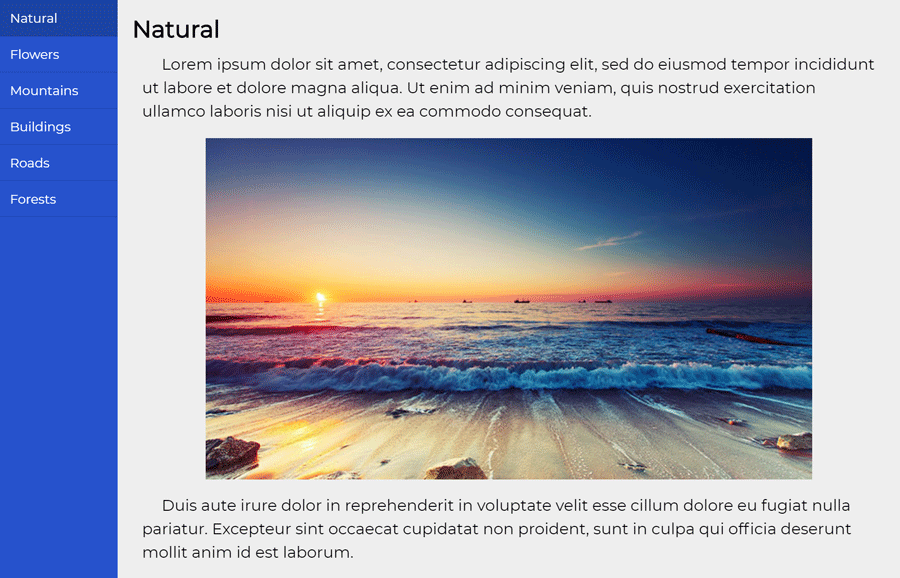
                <input name="tab" id="tab1" type="radio" checked />
                <input name="tab" id="tab2" type="radio" />
                <input name="tab" id="tab3" type="radio" />
                <input name="tab" id="tab4" type="radio" />

<section class="tabs-container">
<label for="tab1" id="label1"> Natural </label>
<label for="tab2" id="label2"> Flowers</label>
<label for="tab3" id="label3"> Mountains </label>
<label for="tab4" id="label4"> Buildings </label>

</section>
Then Switch between tabs lik this:
 /* Show tab when input checked */
#tab1:checked ~ .tabs-container ~ #content1,
#tab2:checked ~ .tabs-container ~ #content2,
#tab3:checked ~ .tabs-container ~ #content3,
#tab4:checked ~ .tabs-container ~ #content4{
  display: block;
  animation: slide 0.5s forwards;
}
Style your active tabs names as follows:
/* Active Tab Name */
#tab1:checked ~ .tabs-container #label1,
#tab2:checked ~ .tabs-container #label2,
#tab3:checked ~ .tabs-container #label3,
#tab4:checked ~ .tabs-container #label4{
    background: red;
}
Don’t forget to add Ids in tab’s content section.
OMG, rockstar, it worked!
Glad to know. Keep visiting us for more code and scripts with instant help!
Hello Muhammad,
Me again! 🙂
I was just wondering whether there was an easy way of making the active tab rotate automatically — say after 5 seconds.
So the idea would be that the tabs and content appear, tab 1 is active, and then, after 5seconds, tab 2 becomes active << rotation continues indefinitely.
Is this Javascript or can CSS do the trick?
All the best,
Theo
Hello Theodore!
Its quite possible with only CSS, but we need to change the whole concept of code. On the other hand, it can be done by adding a little JavaScript function to automatically switch to the next tab.
Here is your solution. 🙂
  $(document).ready(function (){
  //get the all radio inputs
  var tabRadio = $('input[name="tab"]');

  // index of tab
  var tabIndex = 0;

  setInterval(function(){
    // start from first tab after reaching at last
    if (tabIndex == tabRadio.length){
      tabIndex = -1;
    }
    //increase one for the next tab index
    tabIndex += 1;
    //active the next tab
    tabRadio.eq(tabIndex).prop('checked', 'true');

  }, 5000);

  });
Don’t forget to load jQuery JavaScript library.
Thanks again! 🙂
Hey,
Sorry, follow up query on the bit above, if you don’t mind.
I have added this to the header of the page:
$(document).ready(function (){
//get the all radio inputs
var tabRadio = $(‘input[name=”tab”]’);
// index of tab
var tabIndex = 0;
setInterval(function(){
// start from first tab after reaching at last
if (tabIndex == tabRadio.length){
tabIndex = -1;
}
//increase one for the next tab index
tabIndex += 1;
//active the next tab
tabRadio.eq(tabIndex).prop(‘checked’, ‘true’);
}, 5000);
});
What triggers the script?
Dear Muhammad,
Thank you very much for this tutorial on https://codeconvey.com/pure-css-responsive-vertical-tabs/!! It is very useful to me!
With me, it’s just that by default (when loading the page) the content of the LAST tab is shown.
I’ve included your HTML code in a PHP snippet, and the tabs are displayed via a hook on a Woocommerce product page.
Do you have any idea how this can be done? Is there a way to specify within the CSS which tab should be opened first?
Many thanks in advance for your response!
Ita
Hi Ita!
You’re welcome. Yes, it’s entirely possible to open an item with the checked attribute. You can define the checked attribute for the input element that is associated with the first tab:
hi Muhammad – in the content section rather than background-color I would like use a different image as background on every content. is it possible?
Thanks
Hi,
If i add more than 10 labels it is not even displaying the content at all.
I have added to tabs, so far In the main screen, I can see only 12 tabs, please guide, what corrections to be done?
Thank you for useful tutorial,
How I can make vertical tabs and content scrolling in mobile page version like this page
Medshow.net/categories