Today, we are going to make modal window popup using HTML and pure CSS. The modal window popup or dialog box is an excellent way to show a quick message or information. It used for the stuff like login/sign up form, notifications, or just for advertisements.
It works with a simple HTML link or a button to open a modal popup that also formatted with HTML and CSS. The modal window is created with pure CSS only and you don’t need JavaScript or jQuery plugins.
The background opacity of the modal dialog is to 0 (invisible) but the :target pseudo-class allow us to makes it visible with a lightbox style effect.
Nowadays, the modal window is more popular in web designing. Inside of adding the content to the page, It’s great to wrap up such content into the model box.
However, in spite of the truth that modal window regularly comprises challenge-crucial information, they may be mechanically created with JavaScript, which does now not take a seat nicely with the first-class-practices of revolutionary enhancement or sleek ornament.
This doesn’t want to be a problem because HTML5 & CSS3 permit us to create modal windows or CSS Overly without problems. What we’re going to do is use CSS3’s transition, opacity, pointer-event, and background color to create a totally lovely and practical modal box.
This modal box is purely CSS base, and you don’t need to add any JavaScript. I believe the JavaScript is just like the sugar in nowadays web designing because we can do most of the thing using CSS3.
Its designed for responsive web design and work pretty good on mobile and tablets. They work on all sizes from small to large, high-resolution screens.
HTML Structure for Popup Modal Window
The first step to creating a modal box, we need to build simple HTML and here is HTML markup:
<div class="wrap">
  <a href="#modal-one" class="btn btn-big">Open Modal!</a>
</div>
As you may see, we simply have an easy link that announces “Open Modal!” and hashtag modal-one. We’re doing all of our styling right here with classes, so we use the id just as a hook for establishing our Modal field.
Remember that it’s the only CSS and we are going to used pseudo selector “:before target” and no JavaScript for modal movement.
Next, to preserve all of our content within the modal window. Inside of this div, we are going to have a hyperlink to close the container which we will fashion with our CSS.
We can then placed an easy heading with a few paragraphs of textual content underneath it. Your HTML markup needs to now seem like this:
<!-- Modal -->
<div class="modal" id="modal-one" aria-hidden="true">
<div class="modal-dialog">
<div class="modal-header">
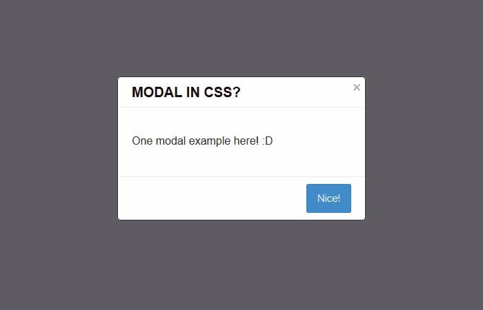
<h2>Modal in CSS?</h2>
<a href="#close" class="btn-close" aria-hidden="true">×</a> <!--CHANGED TO "#close"-->
</div>
<div class="modal-body">
<p>One modal example here! :D</p>
</div>
<div class="modal-footer">
<a href="#close" class="btn">Nice!</a> <!--CHANGED TO "#close"-->
</div>
</div>
</div>
</div>
<!-- /Modal -->
The CSS Styles
Now, its time for pure CSS to style modal window popup. We simply have a hyperlink with a div wrap covering it. we can start styling our container and making it clearly practical.
let’s first create our modal class and start moving forward. We used :before CSS property to start making it.
.modal:before {
  content: "";
  display: none;
  background: rgba(0, 0, 0, 0.6);
  position: fixed;
  top: 0;
  left: 0;
  right: 0;
  bottom: 0;
  z-index: 10;
}
.modal:target:before {
  display: block;
}
The code here is pretty easy. We design our dialog field via giving it a fixed role; that means it will flow down the page when to open if you scroll.
We additionally set our top, right, bottom, and left edges to zero so that our dark background will span throughout the entire display.
Now we have to set some background, border, and radius, etc. to style .modal-dialog and also make sure it should also have the fixed position. Let’s have a look at the modal popup CSS styles here.
.modal-dialog {
  background: #fefefe;
  border: #333 solid 1px;
  border-radius: 5px;
  margin-left: -200px;
  position: fixed;
  left: 50%;
  top: -100%;
  z-index: 11;
  width: 360px;
  -webkit-transform: translate(0, -500%);
  -ms-transform: translate(0, -500%);
  transform: translate(0, -500%);
  -webkit-transition: -webkit-transform 0.3s ease-out;
  -moz-transition: -moz-transform 0.3s ease-out;
  -o-transition: -o-transform 0.3s ease-out;
  transition: transform 0.3s ease-out;
}
Next, we need to target the modal-dialog and set it’s translate to 0. Here we also set top: 20%
.modal:target .modal-dialog {
-webkit-transform: translate(0, 0);
-ms-transform: translate(0, 0);
transform: translate(0, 0);
top: 20%;
}
Finally, here some more styling that should be used to make it look perfect. Here is some general style.
body {
  color: #333;
  font-family: 'Helvetica', arial;
  height: 80em;
}
.wrap {
  padding: 40px;
  text-align: center;
}
hr {
  clear: both;
  margin-top: 40px;
  margin-bottom: 40px;
  border: 0;
  border-top: 1px solid #aaa;
}
h1 {
  font-size: 30px;
  margin-bottom: 40px;
}
p {
  margin-bottom: 20px;
}
.modal-body {
  padding: 20px;
}
.modal-header,
.modal-footer {
  padding: 10px 20px;
}
.modal-header {
  border-bottom: #eee solid 1px;
}
.modal-header h2 {
  font-size: 20px;
}
.modal-footer {
  border-top: #eee solid 1px;
  text-align: right;
}
Now that we’ve styled the modal window and made it functional, the ultimate element we want to do is get our near button searching correctly.
The use of CSS3 and HTML5 can create buttons that appear like they are photos, but in reality, aren’t. Right here’s the CSS we use for this:
.btn {
  background: #428bca;
  border: #357ebd solid 1px;
  border-radius: 3px;
  color: #fff;
  display: inline-block;
  font-size: 14px;
  padding: 8px 15px;
  text-decoration: none;
  text-align: center;
  min-width: 60px;
  position: relative;
  transition: color .1s ease;
  /* top: 40em;*/
}
.btn:hover {
  background: #357ebd;
}
.btn.btn-big {
  font-size: 18px;
  padding: 15px 20px;
  min-width: 100px;
}
.btn-close {
  color: #aaa;
  font-size: 30px;
  text-decoration: none;
  position: absolute;
  right: 5px;
  top: 0;
}
.btn-close:hover {
  color: #919191;
}
/*ADDED TO STOP SCROLLING TO TOP*/
#close {
  display: none;
}
There you have it, you can now create a simple HTML and CSS modal window box, and you could use it for things like user login/registration bureaucracy, classified ads, and much more.
You’ve additionally learned why we have to use HTML/CSS instead of JavaScript, and seen a few examples of the way websites use Modal Window and how you can put into effect them into your very own designs.