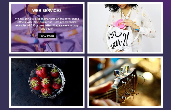
In this tutorial, We are going to build image overlay hover effects with CSS3 transitions. When a user mouse over the image, a nice and clean transition effect will show with a dim colorful background, some HTML content and a read more button.
A button gives a user hints to click to see more info. If you are a developer then you can apply additional functionality to open a popup with a bigger image or show more content.
You can also redirect the user to another page for more info. That’s a nice way to interact with the user and show them important information with one go button.
There is no doubt that the CSS3 comes with powerful features. It allows us to develop such useful overlay hover effect for images in a creative way.
One of its Transitions features is the best example which added in the latest version of CSS3 to create stunning hover effects for photos, links, and buttons, etc.
The transitions hover effects offer us the ability to animate changes to a CSS property value. Such effects can make your website online feel a lot greater dynamic and alive.
Let’s start with building special styles to use with photographs. We will create few thumbnails and when user hover over the photos, We will reveal some descriptions of the thumbnail in a unique fashion for each example.
How to Create Image Overlay Hover Effects with CSS3 Transitions
We have already prepared a demo and download source for you to get all the source code. Here We will simply explain to you how you can easily apply the any of effect on your site.
We will start with the markup. We have created a div with a class uxhover. This is our main container will hold the rest of the HTML content.
The additional class hoverEffect-first is used to apply the first effect from the demo. We did create four different effects and each one comes with unique.
You can easily apply anyone by adding the additional class from the CSS file.
Next, We will place an image inside our container. Finally, we will add the div with class mask to add the info which will be shown when hovering.
<div class="uxhover hoverEffect-first">
<img src="images/effect1.jpg" />
<div class="mask">
  <h2>Web Services</h2>
  <p>Description goes here...</p>
  <a href="#" class="info">Read More</a>
</div>
</div>
The CSS3 Styling
After developing our markup We’re going to set our styles for overlay Image effects. We will start with general styling by adding some width, margin, border, etc.
To overlay the description div mask, We will use the position absolute element.
/* General style */
.uxhover {
  width:46%;
  margin: 10px;
  float: left;
  border: 12px solid #fff;
  overflow: hidden;
  position: relative;
  text-align: center;
  cursor: default;
}
.uxhover .mask,
.uxhover .content {
  width: 100%;
  position: absolute;
  overflow: hidden;
  top: 0;
  left: 0
}
Image Overlay Description
We should apply the position relative to image so the absolute work well with the mask div. Furthermore, We will do add some general styles to paragraph, heading and a button.
.uxhover img {
  display: block;
  position: relative
}
.uxhover h2 {
  text-transform: uppercase;
  color: #fff;
  text-align: center;
  position: relative;
  font-size: 26px;
  padding: 10px;
   border-bottom: 1px solid rgba(0, 0, 0, 0.3);
  margin: 20px 0 0 0
}
.uxhover p {
  font-size: 18px;
  position: relative;
  color: #fff;
  padding: 0px 20px 0px;
  text-align: center
}
.uxhover a.info {
  display: inline-block;
  text-decoration: none;
  padding: 7px 14px;
  background: #000;
  color: #fff;
  text-transform: uppercase;
  font-size:18px;
  border-radius:5px;
}
Apply First Image Effect
As I am explaining the first effect here so here is the full CSS for that. We have a transition and transform property which helps us to create an amazing effect.
/* Effect 1*/
.hoverEffect-first img {
  transition: all 0.2s linear;
  width:100%;
  height:auto;
}
.hoverEffect-first .mask {
  opacity: 0;
  background-color: rgba(58, 1, 132, 0.44);
  transition: all 0.4s ease-in-out;
  width: 100%;
  height: 100%;
}
.hoverEffect-first h2 {
	margin: 20px 40px 0px 40px;
  transform: translateY(-100px);
  opacity: 0;
  transition: all 0.2s ease-in-out;
}
.hoverEffect-first p {
  transform: translateY(100px);
  opacity: 0;
  transition: all 0.2s linear;
}
.hoverEffect-first a.info {
  opacity: 0;
  transition: all 0.2s ease-in-out;
}

/* Effect 1:hover*/
.hoverEffect-first:hover img {
  transform: scale(1.1);
}
.hoverEffect-first:hover .mask {
  opacity: 1;
}
.hoverEffect-first:hover h2,
.hoverEffect-first:hover p,
.hoverEffect-first:hover a.info {
  opacity: 1;
  transform: translateY(0px);
}
.hoverEffect-first:hover p {
  transition-delay: 0.1s;
}
.hoverEffect-first:hover a.info {
  transition-delay: 0.2s;
}
For further effects, you can refer to the demo and download the source code. I am sure you love this and if you so then leave a comment and let me know.
