A few days back, I needed an accordion to toggle plain text using only CSS. I searched on the web, but didn’t find what I needed. So, I decided to code a simple and straightforward HTML & CSS based accordion to expand and collapse text without using JavaScript.
Generally, an accordion is used to make expandable HTML contents on a Web page. For heavy contents websites we need a multi-functional accordion plugin that comes with multiple configuration options. No doubt, a number of accordions (for JavaScript libraries like jQuery, React Vue.js etc.) are already available in the market. But for lite version web projects, we really need something that can be done without using JavaScript.
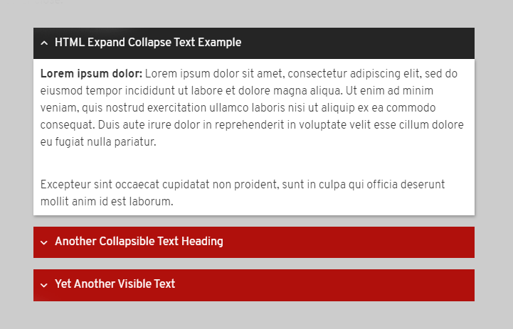
If you are looking for a lightweight pure CSS accordion, then this tutorial might be helpful for you. Here, we’ll create an expandable and collapsible accordion using HTML & CSS. So, let’s start with the basics.
HTML Structure to Expand Collapse Text
Initially, we’ll build an HTML structure for our accordion to expand collapse text but without using JavaScript. One thing I want to mention here that finished output of accordion will works like other JS based accordions. So, the users can’t judge whats behind it. Because this accordion also will have same user experience like other JavaScript accordions.
In HTML structure, we’ll define a section tag with class name “accordion” and all other elements wrap into it. The basic expand and collapse structure is as follows:
<section class="accordion">
  <input type="radio" name="collapse" id="handle1" checked="checked">
  <h2 class="handle">
    <label for="handle1">
    The Visible Short Heading
    </label>
  </h2>

  <div class="content">
    <p>Your detailed contents...</p>
  </div>
</section>
As you can see above code, you need to place an input tag (with type checkbox or radio) just before the label tag. The label tag will be used for visible short heading of the accordion while the div tag (that placed after the label tag with class name “content”) will be used for detailed information.
Similarly, you can add multiple collapsible elements just like the above structure. You just need to update input and label IDs. Such as, for second accordion:
  <input type="radio" name="collapse" id="handle2">
  <h2 class="handle">
    <label for="handle2">
     Another Heading
    </label>
  </h2>
Increase ID number for both input and label. You are not limited to use input type radio only. You can also use input type checkbox. However, the output is quite different (can be see on demo page). Its depends on you what you want to produce. Here the main output (in regards to accordion) difference between radio and checkbox type.
- Radio input: Close other opened accordion when select a new one but not toggle same accordion.
- Checkbox input: Toggle (show / hide) accordion contents but not close others.
Now, its your choice which type of output you want to get.
CSS Styles for Accordion
Now, it’s time to style and functionalities the accordion using CSS. In CSS coding, first of all we’ll hide the input element. If you are thinking why I said that, then here is my answer:
The input with type “radio” or “checkbox” will be used to get checked and unchecked value through the label tag. The label tag we placed under h2 (that has class handle) for visible area of collapsible text. So, the actual HTML input radio element must be invisible from the users.
To hide input tag, we have several methods in CSS. But, here I’ll recommend only two methods. It’s your choice which you’ll find batter for you. The first one is:
.accordion > input[name="collapse"] {
  display: none;
}
Similarly, you can do this:
.accordion > input[name="collapse"] {
  position: absolute;
  left: -100vw; /* Behind the scene */
}
After this, we’ll design the accordion’s content area. On page load, this area will not be visible to the users. It will expand on click event (that we’ll get from CSS :checked pseudo selector). So, the CSS code block is as follows:
.accordion .content {
  background: #fff;
  overflow: hidden;
  height: 0;
  transition: 0.5s;
  box-shadow: 1px 2px 4px rgba(0, 0, 0, 0.3);
}
We used 0 value for height and overflow kept to hide. We did so to bring smoothness while toggle (hide & show) text contents. Keep in mind that display none property will also work here, but CSS transition attribute (for smoothness) is not compatible with it.
Now, we’ll design the visible area (heading of text contents). You can use custom colors and other CSS styles for this according to your needs.
.accordion label {
  color: #fff;
  cursor: pointer;
  font-weight: normal;
  padding: 10px;
  background: #b0100c;

}

.accordion label:hover,
.accordion label:focus {
  background: #252525;
}

.accordion .handle label:before {
  font-family: FontAwesome;
  content: "\f107";
  display: inline-block;
  margin-right: 10px;
  font-size: 1em;
  line-height: 1.556em;
  vertical-align: middle;
  transition: 0.4s;

}

.accordion > input[name="collapse"]:checked ~ .handle label:before {
    transform: rotate(180deg);
    transform-origin: center;
    transition: 0.4s;
}
In the above CSS code block, I included Font Awesome angle up icon that will rotate to 180° when text contents expended. If you don’t want to use arrow down icon with accordion heading then simply remove the lebel:before code block.
Finally, define height value (according to the text length in content div) with :checked selector to smoothly expand collapse text in accordion.
.accordion > input[name="collapse"]:checked ~ .content {
  height: 380px;
  transition: height 0.5s;
}
You can also set height value to auto but it will not expand contents smoothly. However, other functionalities will remain same.
That’s all! we have done, if you have any question let me know by comment below.
This is great! I got it to work on my sidebar. However, I don’t want to pay Font Awesome for the angle up icon (I don’t quality for free plan). Is there a Google font? I can easily make an image in Photoshop, but if that would work, what would the CSS look like? Thanks!
Jack, The Font Awesome is a free library and you can use it. Although if you want to use an image then simply define background property in the
.accordion .handle label::before{
background:url(arrow.png);
}
Thanks.
What about nesting one according inside another, is that possible with this approach
Hi Sean!
Just place another section inside the content of parent accordion just like below:
<section class="accordion">
  <input type="checkbox" name="collapse" id="handle1" checked="checked">
  <h2 class="handle">
    <label for="handle1">Parent</label>
    </h2>
  <div class="content">
      <section class="accordion">
      <input type="checkbox" name="collapse" id="handle1-1" checked="checked">
      <h2 class="handle">
        <label for="handle1-1">Child</label>
        </h2>
      <div class="content">
  </section>
  </div>
  </section>
After that, add the following CSS into your accordion style file.
/* Multilevel Accordion */
.content > .accordion{
    margin-left: 15px;
}
.content .accordion .content{
    box-shadow: none;
    border: 1px solid #ddd;
}
.content .accordion > input[name="collapse"]:checked ~ .content{
    height: 220px;
}
Make sure to set the “auto” height of parent accordion.
.accordion > input[name="collapse"]:checked ~ .content { height: auto; }Hi,
I wish to change the color and the background of the label, so I added:
.accordion > input[name=”collapse”]:checked ~ .accordion label {
color:#000;
background: #ffffff;
}
but it does not work (nothing happens when I click on the button). What am I doing wrong?
Hi Sergio!
You can set the custom background and color for the label as follows:
.accordion label { color: #fff; background: #b0100c; }Hi Asif,
The Blocks, which appears on expanding, are of constant size. Is there any way I can set variable sized blocks that automatically adjusts itself to correctly fit to the data being displayed. Two situations: (1) there should not be blank space at the bottom if it is only one or two lines being displayed in the expanded box (Box should shrink) (2) the box should expand sufficiently to accommodate the whole text, if the text matter / paragraphs run into many a lines, say for example, some 50 lines or 10 paragraphs.
How this can be achieved? Thanks a lot in advance,
With regards, Husni Jifri.
Hi Husni!
Use the max-height property instead of the height property for the content class.
First set the 0 value for the max-height:
.accordion .content {
   max-height: 0;
}
Then set a value on max-height (to something bigger than the content container will ever get) for the checked pseudo-selector.
.accordion > input[name="collapse"]:checked ~ .content {
  max-height: 1000px;
  height: auto;
  transition: max-height 0.35s ease-out;
}
It will automatically adjust itself to correctly fit the data being displayed with a smooth transition.
Asif, I love your expanding text accordion. I was able to use borders to make an animated up or down transition and it works great. (instead of Font awesome) My problem when the page loads, the accordion appears open. Not sure how to make it load closed. Can you help me?
Hi Dawn Jenkins!
The accordion open/close with radio/checkbox input checked/unchecked condition. So, if you want the accordion to remain closed on page load, you can remove the “checked” attribute from the input.
Hi Asif:
Thanks for this article. I searched for a long time before finding a non-Javascript accordian solution that would work in most major browsers, including IE 11. I’ve got it working exactly as I want it except for the uppercase text in the section label area. I’ve tried may ways to make this use mixed uppercase and lowercase, with no luck. Please let me know how to accomplish this.
Thanks,
Bruce
Never mind, I found it in demo.css (was looking in style.css). Just comment out the line text-transform:uppercase; in the h2 style declaration. Thanks.
Hi Bruce!
You have added “demo.css” file into your project that’s causing uppercase formatting for labels. You can remove demo.css file or overwrite the rules as follows:
.accordion label{
   text-transform: none;
}
You can also use following values for tex-transform property:
capitalize: capitalizes the first letter of each word.
none: leaves the text’s case as entered.
lowercase: convert to lowercase letters.
inherit: follow the rules of parent elements.
Hopefully it will solve your problem.
Regards!
Hi Muhammed–thank you for sharing this!
I have added page anchors to this setup to help users navigate to specific sections. I am wondering: Is it possible to expand a specific section depending on which anchor is clicked?
For example, I have an anchor URL for section 4. When a user clicks on that URL, they are taken to the section, but the section is not expanded. How could I set this up so that the section expands when a user clicks on the anchor link?
Thanks again for your help with this!
Luke
Hi Luke Zimmer!
You can handle this situation with a little JavaScript function. Basically, you can expand any accordion-item by checking the checkbox element associated with that. So, you can use the following JavaScript function to expand/(check the checkbox element) through its id.
function expand(id) {
    document.getElementById(id).checked = true;
}
Then, you can call the “expand” function on the anchor’s click event. For example, you want to expand section 4, you can call the above function with anchor 4, like:
<a href="#section4" onclick="expand('handle4')"> Section 4 </a>Similarly, you can do the same thing for other links. Just pass the id of the relevant checkbox in the “expand” function parameter.
Hopefully, it will works for you!
Hi, I’ve been finding an accordion without a java script for my project, this is exactly what I wanted, I just wanna ask, how can I use images as an accordion, for example i want to use a plus icon image?
Hi John, You can put an image inside the label before the heading text.
Hi John,
You can simply replace content value. For plus icon f055 and for minus icon f056
.accordion .handle label:before {
content: “\f055”;
}
Hi Muhammad Asif
This is exactly what I looking for. Thank a lot!
Actually I am facing some issue while using this code.
1) When I expand the first Parent so it expands the second parent also. How to overcome this problem?
2) Also I can’t collapse the Second parent until I don’t close the Parent first.
Below is code that I modified as per my requirement:
Parent-1
Child-1
Child-1-1
Child-2
Parent 2
Child
Hi Muhammad Asif, you have provided a wonderful example and I am very grateful to be able to use it. I am struggling with hyperlinks within sections. I want a new browser tab to open with the page that was linked to so I am using target=”_blank” with the <a href tag but unfortunately, when clicked the linked page opens within the same tab and not a new tab.
Any suggestions?
Hi Grayson!
Thanks for your valuable suggestions. It’s really helpful for readers.