An accordion is the best solution to toggle (hide and reveal) content on a webpage. There are a lot of methods and plugin for accordion in JavaScript. But, what about a responsive accordion created with pure CSS? Yup, its quite possible to make a rich accordion even with arrow icons.
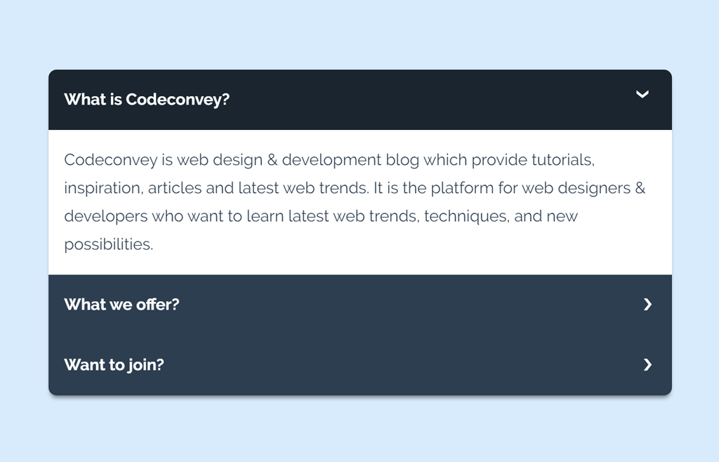
The output of this accordion you have seen on the above image (or on the demo page). If you didn’t visit the demo page yet, go and check its live version.
As you have explored the demo of this accordion, you may have noticed that it works smoothly just like any other JS accordion. But, it’s all done by using HTML radio input and CSS transition. Now, we’ll discuss how you can create or implement this CSS accordion in your HTML project.
Create a Responsive Accordion using Pure CSS
First of all, create a div element with class name “tabs” and place another div element (with class name “tab”) in it. Also, add a radio input just before the label tag. Describe your accordion title in the label tag. Similarly, place your detailed contents in "tab-content" div element.
<div class="tabs">
   <div class="tab">
      <input type="checkbox" id="chck1">
      <label class="tab-label" for="chck1">Heading Text</label>
      <div class="tab-content">
         Place your detailed contents here.
      </div>
   </div>
   <div class="tab">
      <input type="checkbox" id="chck2">
      <label class="tab-label" for="chck2">Heading Text</label>
      <div class="tab-content">
         Your accordion contents
      </div>
   </div>
</div>
Here, the use of HTML input is very important. It will help us to make accordion functionality in CSS. Besides this, its type (“checkbox” or “radio”) also important. If you want to open multiple accordion items at once then use “checkbox”. Likewise, use the “radio” type if you want to open one at a time.
CSS Style for Accordion
Now, its time to style accordion with CSS. The very first thing is to set overflow hidden for “tabs” (the main wrapper of accordion items) selector. Similarly, define other necessary styles for accordion tabs.
.tabs {
  border-radius: 8px;
  overflow: hidden;
  box-shadow: 0 4px 4px -2px rgba(0, 0, 0, 0.5);
}

.tab {
  width: 100%;
  color: white;
  overflow: hidden;
}
.tab-label {
  display: -webkit-box;
  display: flex;
  -webkit-box-pack: justify;
          justify-content: space-between;
  padding: 1em;
  background: #2c3e50;
  font-weight: bold;
  cursor: pointer;
  /* Icon */
}
.tab-label:hover {
  background: #1a252f;
}
.tab-label::after {
  content: "\276F";
  width: 1em;
  height: 1em;
  text-align: center;
  -webkit-transition: all .35s;
  transition: all .35s;
}
You are not limited to use all styles as it is. You can also add your own styles to customize it according to your needs. Now add some styles for tab content (the detailed contents in accordion). Here, the transition property is important for smoothness.
.tab-content {
  max-height: 0;
  padding: 0 1em;
  color: #2c3e50;
  background: white;
  -webkit-transition: all .35s;
  transition: all .35s;
}
In the above CSS, transition: all .35s it defines the speed for toggle contents. You can increase (for fast open/close) or decrease for the slow open and close.
Now, we’ll use CSS pseudo selector for input checked to functionalities the accordion.
input:checked + .tab-label {
  background: #1a252f;
}
input:checked + .tab-label::after {
  -webkit-transform: rotate(90deg);
          transform: rotate(90deg);
}
input:checked ~ .tab-content {
  max-height: 100vh;
  padding: 1em;
}
Finally, hide the HTML input element from the users. You can use the CSS display none property for it. Likewise, set its opacity value to zero. It’s your choice to place it behind the scene.
input {
  position: absolute;
  opacity: 0;
  z-index: -1;
}
I hope you like this CSS powered accordion. If you have any questions or suggestions related to the accordion, let me know by comment below.
i applied this accordion in a formidable form view in my wordpress localhost, the problem is that it shows accordion content which is not meant show itself before its clicked on and when i click on it, it disappears and the content shows up like its supposed to be
Hi Huzaifa!
Make sure you followed the guidelines described in the tutorial. Maybe you have misconfiguared something while integration of this accordion.
You really should use classes on your checkboxes as to not complicate things for beginners.
Hi Joe!
Let me know if you have any confusion regards to the integration of code for this accordion.
So…if I understand this correctly, if the content of a single tab exceeds 100vh, then that content is going to vanish. If you change the 100vh, the some weird number, the animation will not be as nice as with 100vh…What would you recommend?
Hello Andrew!
You can set a fixed max-width property along with the overflow auto. In the case of longer content in a single tab, your tab will become scrollable. You just need the following:
.tab-content { max-height: 300px; overflow: auto; }Somehow I cannot reply to your comment (button missing). Thanks for your suggestion, unfortunately scrolling is not an option for me, so I had to revert to js.
It’s OK!
Keep visiting us for free Web Design code & scripts.
unfortunately this isn’t working properly on Safari. On Safari (both mobile and desktop) there was an error where the content was revealed even before I clicked on the tab itself.
Hi Janie!
You need to define the max-width in px for the Safari browser.
input:checked ~ .tab-content {
  max-height: 100vh;
  max-height: 600px; /* For Safari */
  padding: 1em;
}
It will work.
Hello,
How do I set the first tab to be open by default?
Thank you!
Hi Catherine!
You can open the first tab by defining checked attribute for its input element.
Hello,
Wow, thank you!!! So easy and it worked perfectly!!!
This is so excellent, thank you!!!
-C
Hello,
Thanks again for your previous help!
Another question:
While having the first item set to be expanded by default, is it also possible to set it to be able to collapse as well? Currently, when I set it to be open by default, it’s not clickable anymore.
Thank you!
Catherine
Hello,
Please disregard my previous request; we had an issue that was unique to our project, unrelated to your Accordion – which we have now solved.
Thanks again so much!
-C
Hi, This opens beautifully, and I was able to match the styles to my website with no trouble. However, I can’t seem to get the accordion to close when I click it a second time. Did I miss something in the tutorial?
Thank you,
Amy
Hi Amy!
Please make sure you are using “checkbox” type attribute instead of “radio” for the input elements in your accordion HTML.