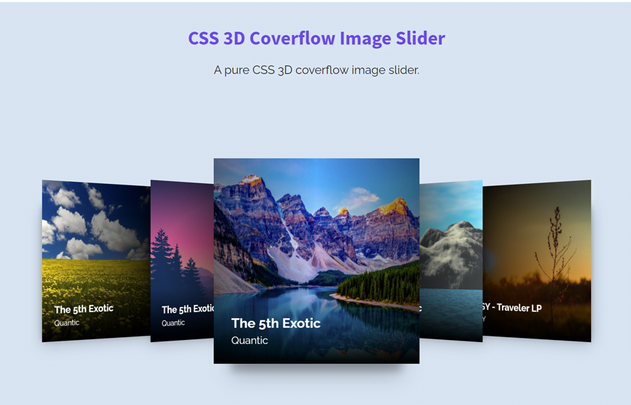
A 3D carousel is one of the most important components of a creative visual interface. It not only enhances the user experience but also attracts the user to stay longer on the page. There are many jQuery/JavaScript plugins to create a cover flow effect slider. But a general-purpose 3D coverflow image slider can be created with pure CSS. So, the benefit is that you don’t need to deal with JavaScript coding.
If you are new to CSS, maybe think how is it possible without JavaScript to functionalize the slider? well! for this purpose we’ll use the HTML radio input to get the checked/unchecked event in the CSS. Then we’ll functionalize the slider with a couple of special selectors.
Similarly, we’ll use the CSS3 transformations for images to make a coverflow effect for the slider’s images. On the other hand, we will place captions over the images and a shining hover effect. Before getting started with coding, have a look at the demo page to see all the above-mentioned features in action.
The HTML Structure
In HTML, the very first thing to consider is that how many slides you wanted to place in the slider. Then, create the HTML radio input according to the number of images with a unique ID attribute. Likewise, create the slides HTML structure as described below:
<div class="container">
  <div class="wgh-slider">
    <input class="wgh-slider-target" type="radio" id="slide-1" name="slider"/>
    <input class="wgh-slider-target" type="radio" id="slide-2" name="slider"/>
    <input class="wgh-slider-target" type="radio" id="slide-3" name="slider" checked="checked"/>
    <input class="wgh-slider-target" type="radio" id="slide-4" name="slider"/>
    <input class="wgh-slider-target" type="radio" id="slide-5" name="slider"/>
    <div class="wgh-slider__viewport">
      <div class="wgh-slider__viewbox">
        <div class="wgh-slider__container">
          <div class="wgh-slider-item">
            <div class="wgh-slider-item__inner">
              <figure class="wgh-slider-item-figure"><img class="wgh-slider-item-figure__image" src="img/image-1.jpg" alt="The 5th Exotic"/>
                <figcaption class="wgh-slider-item-figure__caption"><a href="https://f4.bcbits.com/img/a3905613628_16.jpg">The 5th Exotic</a><span>Quantic</span></figcaption>
              </figure>
              <label class="wgh-slider-item__trigger" for="slide-1" title="Show product 1"></label>
            </div>
          </div>
          <div class="wgh-slider-item">
            <div class="wgh-slider-item__inner">
              <figure class="wgh-slider-item-figure"><img class="wgh-slider-item-figure__image" src="img/image-2.jpg" alt="The 5th Exotic"/>
                <figcaption class="wgh-slider-item-figure__caption"><a href="https://f4.bcbits.com/img/a3905613628_16.jpg">The 5th Exotic</a><span>Quantic</span></figcaption>
              </figure>
              <label class="wgh-slider-item__trigger" for="slide-2" title="Show product 2"></label>
            </div>
          </div>
          <div class="wgh-slider-item">
            <div class="wgh-slider-item__inner">
              <figure class="wgh-slider-item-figure"><img class="wgh-slider-item-figure__image" src="img/image-3.png" alt="The 5th Exotic"/>
                <figcaption class="wgh-slider-item-figure__caption"><a href="https://f4.bcbits.com/img/a3905613628_16.jpg">The 5th Exotic</a><span>Quantic</span></figcaption>
              </figure>
              <label class="wgh-slider-item__trigger" for="slide-3" title="Show product 3"></label>
            </div>
          </div>
          <div class="wgh-slider-item">
            <div class="wgh-slider-item__inner">
              <figure class="wgh-slider-item-figure"><img class="wgh-slider-item-figure__image" src="img/image-4.jpg" alt="The 5th Exotic"/>
                <figcaption class="wgh-slider-item-figure__caption"><a href="https://f4.bcbits.com/img/a3905613628_16.jpg">The 5th Exotic</a><span>Quantic</span></figcaption>
              </figure>
              <label class="wgh-slider-item__trigger" for="slide-4" title="Show product 4"></label>
            </div>
          </div>
          <div class="wgh-slider-item">
            <div class="wgh-slider-item__inner">
              <figure class="wgh-slider-item-figure"><img class="wgh-slider-item-figure__image" src="img/image-5.jpg" alt="RYSY - Traveler LP"/>
                <figcaption class="wgh-slider-item-figure__caption"><a href="https://picsum.photos/id/237/480/480">RYSY - Traveler LP</a><span>RYSY</span></figcaption>
              </figure>
              <label class="wgh-slider-item__trigger" for="slide-5" title="Show product 5"></label>
            </div>
          </div>
        </div>
      </div>
    </div>
  </div>
</div>
In the above HTML code, you just need to update the URL of images. You can add more slides by copy/pasting <div class="wgh-slider-item">...</div> slide elements and update the label "for" attribute according to the new radio input for your next slide.
CSS Styles to Make Coverflow Slider
After creating the HTML code, now it’s time to style the slider using CSS. So, target the "container" class and define its width, height, and keep its position relative. In order to avoid the images overlap, use the hidden overflow property.
.container {
  position: relative;
  width: 100%;
  height: 400px;
  overflow: hidden;
}
The "wgh-slider" class is the wrapper of the coverflow slider. Define its styles to align it in the middle of the container.
.wgh-slider {
  position: relative;
  top: 50%;
  width: 100%;
  transform: translateY(-50%);
}
After that, specify the styles for the (inner wrapper) viewport. Keep its 100% width and height along with the relative position.
.wgh-slider__viewport {
  position: relative;
  height: 100%;
  width: 100%;
}
The "wgh-slider__viewbox" class is the wrapper element of each image. This element is the base of coverflow effect that we’ll make using the CSS transform property. So, define its basic CSS styles (as described) and use the CSS preserve-3d transform style.
.wgh-slider__viewbox {
  display: block;
  position: relative;
  perspective: 100vw;
  margin: 0 auto;
  width: 33.3333333333%;
  max-width: 280px;
  transform-style: preserve-3d;
  z-index: 0;
}
.wgh-slider__viewbox::before {
  position: relative;
  top: 0;
  left: 0;
  display: block;
  content: "";
  height: 0;
  padding-bottom: 100%;
  width: 100%;
}
We don’t want to show the radio inputs to the users, use the CSS display none property to hide them.
input.wgh-slider-target {
  display: none;
}
Target the "wgh-slider-item" class to style the slides. Keep its absolute position, 100% dimension, and transform it as described below:
.wgh-slider-item {
  display: block;
  position: absolute;
  top: 0;
  left: 0;
  width: 100%;
  height: 100%;
  opacity: 1;
  transform: translate3d(0, 0, 0) rotateY(45deg);
  transition: transform 0.6s cubic-bezier(0.62, 0.28, 0.23, 0.99) 0.15s;
}
Similarly, define the 100% dimension for the figure element and keep its overflow hidden. Also, set the same dimension for the figure image with an absolute position.
.wgh-slider-item-figure {
  position: relative;
  width: 100%;
  height: 100%;
  margin: 0;
  padding: 0;
  overflow: hidden;
}
.wgh-slider-item-figure__image {
  position: absolute;
  display: block;
  max-width: 100%;
  max-height: 100%;
  left: 0;
  right: 0;
  top: 0;
  bottom: 0;
  z-index: 1;
  opacity: 1;
}
Define the CSS styles for the image caption as described in the following snippet. You can set the custom values for the font-size, color, and line-height etc.
.wgh-slider-item-figure__caption {
  position: absolute;
  display: block;
  overflow: hidden;
  left: 0;
  right: 0;
  bottom: 0;
  color: #fff;
  padding: 24px;
  background-image: linear-gradient(0deg, #000 0%, transparent 100%);
  z-index: 2;
}
.wgh-slider-item-figure__caption a {
  display: inline-block;
  text-decoration: none;
  font-size: 18px;
  line-height: 20px;
  font-weight: bold;
  color: #fff;
}
.wgh-slider-item-figure__caption span {
  display: block;
  font-size: 14px;
  line-height: 16px;
}
Now, target each slide item using CSS nth-child selector and set the position to sort the slides in a coverflow order.
.wgh-slider-item:nth-child(1) {
  left: 0%;
}
.wgh-slider-item:nth-child(2) {
  left: 50%;
}
.wgh-slider-item:nth-child(3) {
  left: 100%;
}
.wgh-slider-item:nth-child(4) {
  left: 150%;
}
.wgh-slider-item:nth-child(5) {
  left: 200%;
}
.wgh-slider-item:nth-child(6) {
  left: 250%;
}
.wgh-slider-item:nth-child(7) {
  left: 300%;
}
.wgh-slider-item:nth-child(8) {
  left: 350%;
}
Finally, add the following CSS snippet into your project to functionalize the slider and done.
.wgh-slider-target:nth-of-type(8):checked ~ .wgh-slider__viewport .wgh-slider-item:nth-child(8) .wgh-slider-item__inner, .wgh-slider-target:nth-of-type(7):checked ~ .wgh-slider__viewport .wgh-slider-item:nth-child(7) .wgh-slider-item__inner, .wgh-slider-target:nth-of-type(6):checked ~ .wgh-slider__viewport .wgh-slider-item:nth-child(6) .wgh-slider-item__inner, .wgh-slider-target:nth-of-type(5):checked ~ .wgh-slider__viewport .wgh-slider-item:nth-child(5) .wgh-slider-item__inner, .wgh-slider-target:nth-of-type(4):checked ~ .wgh-slider__viewport .wgh-slider-item:nth-child(4) .wgh-slider-item__inner, .wgh-slider-target:nth-of-type(3):checked ~ .wgh-slider__viewport .wgh-slider-item:nth-child(3) .wgh-slider-item__inner, .wgh-slider-target:nth-of-type(2):checked ~ .wgh-slider__viewport .wgh-slider-item:nth-child(2) .wgh-slider-item__inner, .wgh-slider-target:nth-of-type(1):checked ~ .wgh-slider__viewport .wgh-slider-item:nth-child(1) .wgh-slider-item__inner {
  transform: scale(1);
  transition-delay: 0.6s;
}
.wgh-slider-target:nth-of-type(8):checked ~ .wgh-slider__viewport .wgh-slider-item:nth-child(8) .wgh-slider-item__inner::before, .wgh-slider-target:nth-of-type(7):checked ~ .wgh-slider__viewport .wgh-slider-item:nth-child(7) .wgh-slider-item__inner::before, .wgh-slider-target:nth-of-type(6):checked ~ .wgh-slider__viewport .wgh-slider-item:nth-child(6) .wgh-slider-item__inner::before, .wgh-slider-target:nth-of-type(5):checked ~ .wgh-slider__viewport .wgh-slider-item:nth-child(5) .wgh-slider-item__inner::before, .wgh-slider-target:nth-of-type(4):checked ~ .wgh-slider__viewport .wgh-slider-item:nth-child(4) .wgh-slider-item__inner::before, .wgh-slider-target:nth-of-type(3):checked ~ .wgh-slider__viewport .wgh-slider-item:nth-child(3) .wgh-slider-item__inner::before, .wgh-slider-target:nth-of-type(2):checked ~ .wgh-slider__viewport .wgh-slider-item:nth-child(2) .wgh-slider-item__inner::before, .wgh-slider-target:nth-of-type(1):checked ~ .wgh-slider__viewport .wgh-slider-item:nth-child(1) .wgh-slider-item__inner::before {
  transform: translate(0, 24px);
}
.wgh-slider-target:nth-of-type(8):checked ~ .wgh-slider__viewport .wgh-slider-item:nth-child(8) .wgh-slider-item__inner::after, .wgh-slider-target:nth-of-type(7):checked ~ .wgh-slider__viewport .wgh-slider-item:nth-child(7) .wgh-slider-item__inner::after, .wgh-slider-target:nth-of-type(6):checked ~ .wgh-slider__viewport .wgh-slider-item:nth-child(6) .wgh-slider-item__inner::after, .wgh-slider-target:nth-of-type(5):checked ~ .wgh-slider__viewport .wgh-slider-item:nth-child(5) .wgh-slider-item__inner::after, .wgh-slider-target:nth-of-type(4):checked ~ .wgh-slider__viewport .wgh-slider-item:nth-child(4) .wgh-slider-item__inner::after, .wgh-slider-target:nth-of-type(3):checked ~ .wgh-slider__viewport .wgh-slider-item:nth-child(3) .wgh-slider-item__inner::after, .wgh-slider-target:nth-of-type(2):checked ~ .wgh-slider__viewport .wgh-slider-item:nth-child(2) .wgh-slider-item__inner::after, .wgh-slider-target:nth-of-type(1):checked ~ .wgh-slider__viewport .wgh-slider-item:nth-child(1) .wgh-slider-item__inner::after {
  background-position: -50% 0%;
}
.wgh-slider-target:nth-of-type(8):checked ~ .wgh-slider__viewport .wgh-slider-item:nth-child(8) ~ .wgh-slider-item .wgh-slider-item__inner::before, .wgh-slider-target:nth-of-type(7):checked ~ .wgh-slider__viewport .wgh-slider-item:nth-child(7) ~ .wgh-slider-item .wgh-slider-item__inner::before, .wgh-slider-target:nth-of-type(6):checked ~ .wgh-slider__viewport .wgh-slider-item:nth-child(6) ~ .wgh-slider-item .wgh-slider-item__inner::before, .wgh-slider-target:nth-of-type(5):checked ~ .wgh-slider__viewport .wgh-slider-item:nth-child(5) ~ .wgh-slider-item .wgh-slider-item__inner::before, .wgh-slider-target:nth-of-type(4):checked ~ .wgh-slider__viewport .wgh-slider-item:nth-child(4) ~ .wgh-slider-item .wgh-slider-item__inner::before, .wgh-slider-target:nth-of-type(3):checked ~ .wgh-slider__viewport .wgh-slider-item:nth-child(3) ~ .wgh-slider-item .wgh-slider-item__inner::before, .wgh-slider-target:nth-of-type(2):checked ~ .wgh-slider__viewport .wgh-slider-item:nth-child(2) ~ .wgh-slider-item .wgh-slider-item__inner::before, .wgh-slider-target:nth-of-type(1):checked ~ .wgh-slider__viewport .wgh-slider-item:nth-child(1) ~ .wgh-slider-item .wgh-slider-item__inner::before {
  transform: translate(24px, 12px);
}
.wgh-slider-target:nth-of-type(8):checked ~ .wgh-slider__viewport .wgh-slider-item:nth-child(8) ~ .wgh-slider-item .wgh-slider-item__inner::after, .wgh-slider-target:nth-of-type(7):checked ~ .wgh-slider__viewport .wgh-slider-item:nth-child(7) ~ .wgh-slider-item .wgh-slider-item__inner::after, .wgh-slider-target:nth-of-type(6):checked ~ .wgh-slider__viewport .wgh-slider-item:nth-child(6) ~ .wgh-slider-item .wgh-slider-item__inner::after, .wgh-slider-target:nth-of-type(5):checked ~ .wgh-slider__viewport .wgh-slider-item:nth-child(5) ~ .wgh-slider-item .wgh-slider-item__inner::after, .wgh-slider-target:nth-of-type(4):checked ~ .wgh-slider__viewport .wgh-slider-item:nth-child(4) ~ .wgh-slider-item .wgh-slider-item__inner::after, .wgh-slider-target:nth-of-type(3):checked ~ .wgh-slider__viewport .wgh-slider-item:nth-child(3) ~ .wgh-slider-item .wgh-slider-item__inner::after, .wgh-slider-target:nth-of-type(2):checked ~ .wgh-slider__viewport .wgh-slider-item:nth-child(2) ~ .wgh-slider-item .wgh-slider-item__inner::after, .wgh-slider-target:nth-of-type(1):checked ~ .wgh-slider__viewport .wgh-slider-item:nth-child(1) ~ .wgh-slider-item .wgh-slider-item__inner::after {
  background-position: -100% 0%;
}
That’s all! I hope you have successfully created a coverflow image slider based on pure CSS. If you have any questions or suggestions, let me know by comment below.
how can we use it as a react js component?
Joan, We don’t have experience in react. you can see the official resource about using the react component.
where do you need to insert the codes for adding more figures besides these five ?
pls answer. thank you,
Hi!
You can add up to 8 images in the slider. First, define the radio inputs for your 6, 7, and 8th images.
After that, copy/paste the slide HTML and just change the label “for” attribute according to the radio input.
          <div class="wgh-slider-item">
            <div class="wgh-slider-item__inner">
              <figure class="wgh-slider-item-figure"><img class="wgh-slider-item-figure__image" src="img/image-6.jpg" alt=""/>
                <figcaption class="wgh-slider-item-figure__caption"><a href="https://f4.bcbits.com/img/a3905613628_16.jpg">6th Image</a><span>Quantic</span></figcaption>
              </figure>
              <label class="wgh-slider-item__trigger" for="slide-6" title="Image 6"></label>
            </div>
          </div>
For upcoming images, update
for="slide-7"and so on.This is great, thanks! One question: is there a way to hyperlink the images once they are selected?
great work it will be much better if we have infinite loop option if some one select any image that should in center with equal left right images any idea?
Very nice, thanks! Just wondering if there’s a trick to using different sized images?
Trying to make the whole thing larger… full width of the page with bigger images… approx 450 x 300 … but nothing seems to work?
Thanks!
Hi Matt!
You can control the size of images by adjusting the width of the container and viewbox.
.container{
  height: 640px;
}
.wgh-slider{
   width: 100%;
}
.wgh-slider__viewbox{
    width: 33.3333333333%;
    max-width: 280px;
}
The images inside the viewbox uses 100% of width. So, when you increase the width of viewbox, image size will be increased accordingly. Similarly, you can increase the width and height of the contaniner which will give extra space for viewbox.
Hi, i add 11 image but i need to center the 6th
Nice work! Just one question, is this slider accessible?
Thanks!
Michelle
How to add prev and next controls to this carousel?