Last morning, I was working on a project in which I had to place the brand logo in the middle of the navbar. I tried different methods to get the site logo middle of the links but nothing was working for me. Finally, I got it working after a couple of efforts using CSS flexbox property. So, today I’m going to share this method to create a responsive navigation menu with a centered logo.
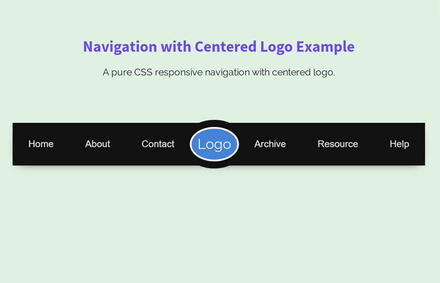
Generally, it’s a simple horizontal navbar with a logo placeholder that can be further styled with some additional CSS. Anyhow, with this guide you’ll be able to place your logo in the exact middle of the navigation menu. Before starting with coding, I’ll suggest you check the final output on the demo page.
On the demo page, there is a CSS styled dummy logo that is actually a logo wrapper. You can easily place your SVG, image, or iconic logo inside the logo wrapper and further customize it according to your needs. OK! let’s get started with HTML to create this navigation menu step-by-step.
HTML for Responsive Navigation with Centered Logo
The HTML for the navigation menu is simple and in the coding, the logo container at the beginning of the menu as usual. To getting started with this navigation, create a div element with the class name "container", place a div wrapper for logo, and specify navigational links.
<div class="container">
   <div class="logo">Logo</div>
   <a href="#1" class="item">Home</a>
   <a href="#2" class="item">About</a>
   <a href="#3" class="item">Contact</a>
   <a href="#4" class="item">Archive</a>
   <a href="#5" class="item">Resource</a>
   <a href=#6"" class="item">Help</a>
</div>
You can place your image logo inside the “logo” div element. Moreover, you can also increase/decrease the number of links according to your needs.
The CSS Styles
As I mentioned above, this navigation menu is based on the CSS flex property. You need to display the main container as flexbox and justify the content with space around value. Likewise, the flex items should be centered. The other properties like box-shadow, margin, and background color can be specified according to your needs.
.container {
  display: -webkit-box;
  display: flex;
  justify-content: space-around;
  -webkit-box-align: center;
          align-items: center;
  background: #111;
  margin: 25px 0;
  box-shadow: 0 5px 15px -10px #111;
}
After that, create the CSS styles for the logo wrapper. This selector is the child element of the flex container. So, it can be arranged in the flexbox ordinal group. Use the 2 value for -webkit-box-ordinal-group and define the order value as 1 in order to display the logo in the middle of the navbar.
.logo {
  -webkit-box-ordinal-group: 2;
          order: 1;
  border-radius: 100%;
  background: #4382d6;
  box-shadow: 0 0 0 3px #fff, 0 0 0 15px #111;
  font-size: 24px;
  color: #fff;
  line-height: 32px;
  padding: 10px;
}
Now, define color, font-family, and padding property for links items. Likewise, change the background color of items on hover. You can check this article to create animated links hover effect.
.item {
  color: rgba(255, 255, 255, 0.88);
  text-decoration: none;
  font-family: sans-serif;
  padding: 24px;
}
.item:hover{
    color: #fff;
    background: rgba(255, 255, 255, 0.15);
}
Shift links after the logo using CSS nth-of-type selector.
.item:nth-of-type(n+4) {
  -webkit-box-ordinal-group: 3;
          order: 2;
}
At last, make the navigation responsive using CSS media queries. You can differently customize the look of navigation on mobile devices.
@media all and (max-width: 800px) {
  .container {
    -webkit-box-orient: vertical;
    -webkit-box-direction: normal;
            flex-direction: column;
    -webkit-box-align: stretch;
            align-items: stretch;
  }

  .logo {
    -webkit-box-ordinal-group: 1;
            order: 0;
    text-align: center;
    width: 100px;
    margin: auto auto 20px;
  }

  .item {
    text-align: center;
    border-bottom: 1px solid #111;
  }
}
You have done all! I hope you have got everything to create a navbar with the middle logo. If you have any questions or suggestions, let me know by comment below.
your images arenot loading on the demo side
Hi Priya!
Everything is fine, images are properly loading on demo side. It might be due to slow internet connection.
Thank you so much.
Hi Wilson!
You’re welcome. Keep visiting us for more HTML and CSS coding tutorials.
This is awesome man. But is there any chance to add a dropdown menu an for the navbar to stay functional as it is?
Hi Cydon!
Follow this tutorial to create a dropdown menu.
https://codeconvey.com/pure-css-onclick-dropdown-menu/
Is there a chance to add a dropdown on this nav elements?
But for the nabvar to stas responsive as it is?