Learn how to create animated CSS link hover underline effects. You can also use this transition for text and buttons. It is cool and fully customizable.
I recently working on a website which needs to add a visual effect on its navigation menu items. The idea was to create an underline border effect which reveals on hover by animation and also out from the center.
Before I go to explain you further, Just want to mention here that I did create some of CSS Cool Link Hover Effect which you may be interesting to check out.
Anyway, to create such an effect is surprisingly easy. You don’t require to add additional DOM element and can add a falls back for the older version of browsers that don’t’ support CSS3 animations.
We can easily add an underline effect by using the text-decoration and it will work great but don’t you think it looks boring?
Why not improve it by using little CSS3 animation? It will not just look great but also enhance the user experience and add extra beauty to your website design.
How to Create Animated CSS Link Hover Effects Underline
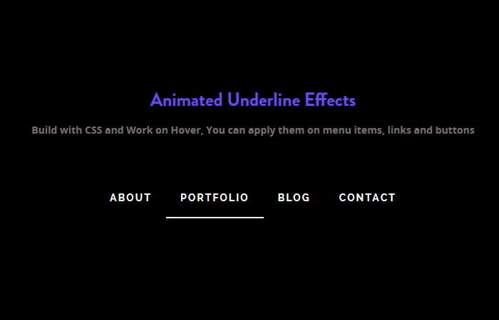
To create the underline effects for the link, Let’s start with the markup. I’ll simply use the standard HTML format to make ready the list of items.
We have a container then unorder list of elements and each li element hold the link.
<div class="underlineEffects">
   <ul>
      <li><a href="#">About</a></li>
      <li><a href="#">Portfolio</a></li>
      <li><a href="#">Blog</a></li>
      <li><a href="#">Contact</a></li>
    </ul>
</div>
The Style
Let’s start with styling the unordered list UL and LI. We will apply the basic style to make them a standard navigation list items.
For simplicity’s sake, we use the display property, margin and text-align to make them center in the container. We also use the position relative to the li so that we can set it on normal position.
.underlineEffects ul {
  margin: 0 auto;
  padding: 0;
  list-style: none;
  display: table;
  text-align: center;
}
.underlineEffects li {
  display: table-cell;
  position: relative;
  padding: 15px 0;
}
Our next step to turn off text-decoration on the link and add some extra style such as color, text-transform, etc.
.underlineEffects a {
  color: #fff;
  text-transform: uppercase;
  text-decoration: none;
  letter-spacing: 0.15em;
  display: inline-block;
  padding: 15px 20px;
  position: relative;
}
Now we want to add a bottom border which will reveal on hover. We will do this by using the background color and setting the height with :after element. To make it look nice and animated, we will use the transition property with width, a position left and timer value.
.underlineEffects a:after {
  background: none repeat scroll 0 0 transparent;
  bottom: 0;
  content: "";
  display: block;
  height: 2px;
  left: 50%;
  position: absolute;
  background: #fff;
  transition: width 0.3s ease 0s, left 0.3s ease 0s;
  width: 0;
}
Our final step to make it work on hover and you know we can easily do with :hover element. We will simply set it’s width 100% and left value will be zero.
.underlineEffects a:hover:after {
  width: 100%;
  left: 0;
}
That’s It. This solution work with almost all of the web browser and you can implement on production websites. As for animation, it’s now supported by Firefox without using moz prefix since version 16.0.