Generally, we can make a dropdown menu using pure CSS with the help of a hover pseudo-selector. So, users can easily reveal the dropdown menu by hovering over the title of the dropdown. But how can you make an onclick dropdown menu using pure CSS? Well, in this tutorial you will come to know how to create a pure CSS dropdown menu that will open on click.
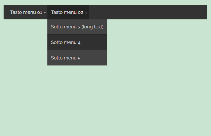
As you have seen in the above preview, a horizontal menubar containing a dropdown title, arrow down icon, and submenu/dropdown. It’s all done using CSS only even the chevron-down icon next to the dropdown title is also made using border property. In order to open the dropdown on click, we used the HTML checkbox to toggle the dropdown height with the checked class selector.
You can check the final output on the demo page to see how the dropdown opens/closes smoothly while clicking the dropdown title. It quite works the same as other drop-down menus do. So, let’s get started with HTML to create this dropdown menu.
The HTML Structure
The HTML structure for the menubar consists of an unordered list. We’ll design the parent list as a horizontal menubar and the child list as a dropdown menu. So, create ul element with an id "menu" and place a checkbox input tag with a unique id inside the first list item. Likewise, create a label element just after the input tag and place the dropdown title inside it. Create another ul element just after the label element and define its class "submenu", this ul is the dropdown menu.
Place your dropdown links inside the ul that has a class name "submenu". Similarly, you can create multiple dropdowns in the menubar using the same method. You just need to assign a unique id to the input for the next dropdows. So, the complete HTML structure for the menu bar and dropdowns looks like below:
<ul id="menu">
  <li>
    <input id="check01" type="checkbox" name="menu"/>
    <label for="check01">Tasto menu 01</label>
    <ul class="submenu">
      <li><a href="#">Sotto menu 1</a></li>
      <li><a href="#">Sotto menu 2</a></li>
    </ul>
  </li>
  <li>
    <input id="check02" type="checkbox" name="menu"/>
    <label for="check02">Tasto menu 02</label>
    <ul class="submenu">
      <li><a href="#">Sotto menu 3 (long text)</a></li>
      <li><a href="#">Sotto menu 4</a></li>
      <li><a href="#">Sotto menu 5</a></li>
    </ul>
  </li>
</ul>
Basically, we are designing a simple one-level dropdown menu. If you want to make a multilevel dropdown menu, then you can check this tutorial to make a multilevel dropdown menu using pure CSS.
Styling onClick Dropdown Menu using CSS
In order to style the menubar, select the ul element that has id "menu". Define its relative position with 100% width and 3em height value. Similarly, define the 0 value for the margin to remove the after and before spacing. Specify some value for left and right padding to leave some space inside the menubar. You can set a background color according to your needs, I used a dark gray color with the off-white text color.
Use CSS box-shadow property to make a light shadow to the bottom of it. Moreover, you can also set the menubar fixed on the top of the page by setting the position value "fixed" along with the top value 0.
ul#menu{
  position: relative;
  width:100%;
  height:3em;
  margin:0;
  padding:0 10px;
  background:#333;
  color:#eee;
  box-shadow:0 -1px rgba(0,0,0,.5) inset;
}
After that, select the li (list item) of the menubar and use CSS float value to place the links/label (dropdown title) side by side. Define the "none" value for the list-style-type property in order to remove the default bullets of the list item.
ul#menu > li{
  float:left;
  list-style-type:none;
  position:relative;
}
Now target the label element to style the dropdown title. Keep its relative position and display it as a block element. Define its padding, line height, transition, and cursor property as described below:
label{
  position:relative;
  display:block;
  padding:0 18px 0 12px;
  line-height:3em;
  transition:background 0.3s;
  cursor:pointer;
}
Select the label with ":after pseudo-class" to design a chevron-down icon next to the dropdown title. Define its absolute position and display it as a block element. Define the 0 value for both width & height as we are going to make an arrow down icon using the border property. So, define border-top, border-bottom, border-left, and border-right values as follows:
label:after{
  content:"";
  position:absolute;
  display:block;
  top:50%;
  right:5px;
  width:0;
  height:0;
  border-top:4px solid rgba(255,255,255,.5);
  border-bottom:0 solid rgba(255,255,255,.5);
  border-left:4px solid transparent;
  border-right:4px solid transparent;
  transition:border-bottom .1s, border-top .1s .1s;
  }
We just need to update border-top and border-bottom values in order to convert the arrow-down to arrow-up when the dropdown opened. So, select the label:after with input checked selector and define the border values as described below:
label:hover,
input:checked ~ label{background:rgba(0,0,0,.3);}

input:checked ~ label:after{
  border-top:0 solid rgba(255,255,255,.5);
  border-bottom:4px solid rgba(255,255,255,.5);
  transition:border-top .1s, border-bottom .1s .1s;
}
After styling the menubar and dropdown title, now it’s time to design the dropdown menu. To do so, select the "submenu" class and define the 0 value for the max-height property to initially hide the dropdowns. Similarly, keep the overflow value hidden and define the background, box-shadow, transition, and position value as mentioned in the following snippet:
ul.submenu{
  max-height:0;
  padding:0;
  overflow:hidden;
  list-style-type:none;
  background:#444;
  box-shadow:0 0 1px rgba(0,0,0,.3);
  transition:max-height 0.5s ease-out;
  position:absolute;
  min-width:100%;
}

ul.submenu li a{
  display:block;
  padding:12px;
  color:#ddd;
  text-decoration:none;
  box-shadow:0 -1px rgba(0,0,0,.5) inset;
  transition:background .3s;
  white-space:nowrap;
}
Select the “a” element of the submenu with hover pseudo-class to define hover styles. You can also check different hover effects if you want to apply a custom hover style for menu links.
ul.submenu li a:hover{
  background:rgba(0,0,0,.3);
}
Finally, hide the checkbox input and define max-height for the submenu with input-checked selector.
/*hide the inputs*/
input{display:none}

input:checked ~ ul.submenu{
  max-height:300px;
  transition:max-height 0.5s ease-in;
}
That’s all! I hope now you are able to create onclick dropdown menu using pure CSS. If you have any questions or suggestions, let me know by comment below.