A few months back, we created a pure CSS modal popup that reveals on button click. Today, we are going to create a visually same popup window with a close button using pure CSS with different and easy coding techniques. Unlike the previous popup window, it doesn’t rely on the hash link technique to reveal the popup box.
The coding concept for this popup window is that we’ll use HTML checkbox input in order to reveal it on checked value. Similarly, when a user clicks the close button, the checkbox will be unchecked and the popup window will be closed.
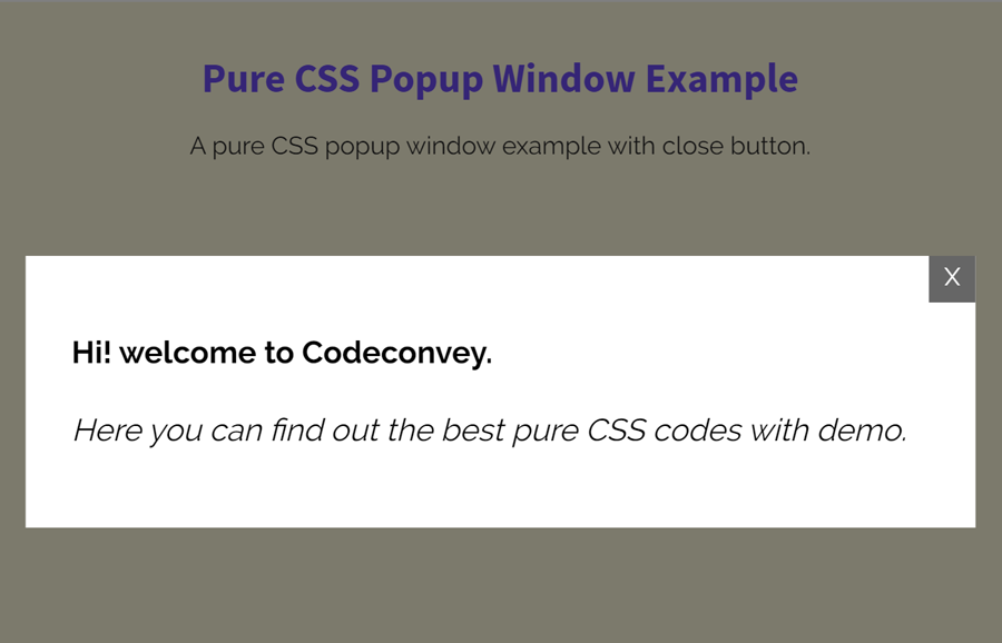
You can browse the demo page to check the final output of this popup window before getting started with the coding. OK! let’s get started with coding without wasting your valuable time.
The Markup for Pure CSS Popup Window
First of all, create a div element with a class name “pop” and place another div element with the class name “modal” inside it. Create a checkbox input just before the modal and build a label tag (associated with checkbox) that will be used to trigger the popup window. Wrap your modal contents inside the “modal__inner” div. The complete HTML structure for the popup modal looks like below:
<div class="pop">
    <p><center><label for="3" class="open">Open Poup!</label> to open the pure CSS popup window.</center></p>
    <input type="checkbox" id="3" />
    <div class="modal">
      <div class="modal__inner">
          <p>Place here your popup content.</p>
        <label class="btn-close" for="3">X</label>
      </div>
    </div>
</div>
You can place any HTML element inside the “modal__inner” container that will display in the popup window. Similarly, you can also add the font icon inside the close button (that is X) or use × HTML entity for the cross (×) symbol.
The CSS Styles
In CSS, define the styles for the outer of the popup window (.pop selector). Define its position as absolute and set it 0 to the top, left, right and bottom in order to align it to the center of the page. Likewise, keep its margin to auto and define its padding value according to your needs.
.pop {
  position: absolute;
  width: 50%;
  margin: auto;
  padding: 20px;
  height: 50%;
  top: 0;
  left: 0;
  right: 0;
  bottom: 0;
}
@media (max-width: 640px) {
  .pop {
    position: relative;
    width: 100%;
  }
}
After that, style the dim background layer and keep its visibility hidden in order to reveal it on the checkbox checked. To make a fade-in effect (when popup display), keep its opacity to 0 and define the transition property for opacity. Similarly, define the background color as rgba(0, 0, 0, 0.5).
.pop .modal {
  z-index: 2;
  opacity: 0;
  visibility: hidden;
  position: fixed;
  width: 100%;
  height: 100%;
  background: rgba(0, 0, 0, 0.5);
  top: 0;
  left: 0;
  right: 0;
  bottom: 0;
  -webkit-transition: opacity 500ms ease-in-out;
  transition: opacity 500ms ease-in-out;
}
The ".modal__inner" selector is the actual element that will be displayed as a modal popup. Keep its position to the absolute, set background color (according to your choice), define padding property and other necessary styles. To make it responsive, use the CSS media queries and define its width 100% for mobile devices. The (max-width: 640px) is ideal for maximum width of a mobile screen.
.pop .modal__inner {
  -webkit-transform: translate(-50%, -50%) scale(0.75);
          transform: translate(-50%, -50%) scale(0.75);
  top: 50%;
  left: 50%;
  width: 50%;
  background: white;
  padding: 30px;
  position: absolute;
  color: black;
}
@media (max-width: 640px) {
  .pop .modal__inner {
    width: 100%;
  }
}
Now, define the CSS styles for the close button. Set its color, text-align, and other necessary properties if you want to customize it.
.btn-close{
    color: #fff;
    text-align: center;
}

.pop label {
  display: inline-block;
  cursor: pointer;
}
.pop label.open {
  color: turquoise;
  -webkit-transition: color 200ms ease-in-out;
  transition: color 200ms ease-in-out;
  text-decoration: underline;
}
.pop label.open:hover {
  color: paleturquoise;
}
At last, hide the checkbox input and make it visible using CSS checked pseudo-selector. Similarly, add the popup effect using CSS transform property mentioned in the below code:
.pop input {
  display: none;
}
.pop input:checked + .modal {
  opacity: 1;
  visibility: visible;
}
.pop input:checked + .modal .modal__inner {
  -webkit-transform: translate(-50%, -50%) scale(1);
          transform: translate(-50%, -50%) scale(1);
  -webkit-transition: all 200ms ease-in-out;
  transition: all 200ms ease-in-out;
}
.pop input:checked + .modal .modal__inner p {
  font-size: 1.25rem;
  line-height: 125%;
}
.pop input:checked + .modal label {
  position: absolute;
  top: 0;
  right: 0;
  height: 30px;
  width: 30px;
  background: #666666;
  -webkit-transition: all 200ms ease-in-out;
  transition: all 200ms ease-in-out;
}
.pop input:checked + .modal label:hover {
  background: #333333;
}
That’s all! I hope now you are able to create a pure CSS popup window with a close button. If you have any questions or suggestion let me know by comment below.
I really appreciated this nice, simple explanation. I wish it might have had some details on what some of the particular CSS means (nice for novices like myself) but the only reason it didn’t work for me the first time is that I mistyped modal__inner in only one of its places.
Hi Jack!
Thanks for your appreciation. You can download the error-free code available in each tutorial. Anyhow, it’s a good practice if you write code by hand.
I generally do write my code by hand (Ada, C++, HTML, Kotlin, Java, JavaScript, you name it), but I’m not familiar with CSS, don’t have the time to study it properly, and that means I use it just often enough to forget the little I learn.
Oh great!
Learning CSS is not a big deal, keep visiting us, we constantly update our site with newly CSS code snippet. At Codeconvey, you can read CSS tutorials, practice, and learn new things.
Great concept, it works very well, how can I have multiple Popup Windows?
Thanks in anticipation.
Regards
Milton.
Milton, you can do that by copying the HTML source code and paste it then change its classes and ID, etc. Similar you need to do with CSS.