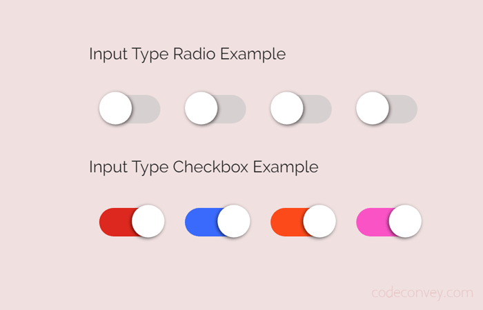
Basically, HTML input type checkbox & radio is used to switch between true or false in JavaScript statements. We can easily change a setting between two states by getting checkbox checked (or unchecked) value.
Although, we can use such inputs as a toggle but these inputs not look like a toggle switch button by default. So, in this tutorial, I’m going to convert the HTML checkbox to the toggle button using CSS.
How to Convert Checkbox to Toggle Button
First of all, create HTML input with type checkbox and class name "cm-toggle" to prepare a basic toggle switch.
You can also set id or other attributes according to your needs. But, we need only a class name here to style this input with CSS. If you want to set a label, you can read our previous tutorial to create a pure CSS toggle switch with ON/OFF.
<input type="checkbox" name="checkbox" class="cm-toggle">
You are not limited to create an input type checkbox. Similarly, you can also set input type radio. It will also look the same, but you can control its functionality in JavaScript.
<input type="radio" name="radio" class="cm-toggle">
Now, its time to style our checkbox. We’ll use :before, :after and :checked pseudo elements to style checkbox. You can set custom width, height, and colors as you need.
/* Toggle Button */
.cm-toggle {
	-webkit-appearance: none;
	-webkit-tap-highlight-color: transparent;
	position: relative;
	border: 0;
	outline: 0;
	cursor: pointer;
	margin: 10px;
}


/* To create surface of toggle button */
.cm-toggle:after {
	content: '';
	width: 60px;
	height: 28px;
	display: inline-block;
	background: rgba(196, 195, 195, 0.55);
	border-radius: 18px;
	clear: both;
}


/* Contents before checkbox to create toggle handle */
.cm-toggle:before {
	content: '';
	width: 32px;
	height: 32px;
	display: block;
	position: absolute;
	left: 0;
	top: -3px;
	border-radius: 50%;
	background: rgb(255, 255, 255);
	box-shadow: 1px 1px 3px rgba(0, 0, 0, 0.6);
}


/* Shift the handle to left on check event */
.cm-toggle:checked:before {
	left: 32px;
	box-shadow: -1px 1px 3px rgba(0, 0, 0, 0.6);
}
/* Background color when toggle button will be active */
.cm-toggle:checked:after {
	background: #16a085;
}
The above CSS will produce a toggle button when the user checks the checkbox its handle shifted to left.
To add smoothness, we’ll use the CSS transition property (3 milliseconds with transition type ease). You can also set custom speed & type for transitions.
/* Transition for smoothness */
.cm-toggle,
.cm-toggle:before,
.cm-toggle:after,
.cm-toggle:checked:before,
.cm-toggle:checked:after {
	transition: ease .3s;
	-webkit-transition: ease .3s;
	-moz-transition: ease .3s;
	-o-transition: ease .3s;
}
JUST BRILLIANT!!! The easiest way I found across Google, thank you!!!
You’re welcome! Here you can learn pure CSS techniques to design almost all kinds of website components. Keep visiting us for more coding tutorials.
Really thank you very much, it was really useful and easy to understand and implement