In this tutorial, we are going to create a simple popover that displays on hover using pure CSS. Basically, it’s a simple content container that may contain any HTML element that you want to show on hover. So, you can use it as a popover or general-purpose text tooltip.
Before getting started with coding, let’s have a look at the demo page to see the popover in action. The popover can contain a gif image with a title above that. You also place videos, iframes, or any inline content inside it.
Also, check out these pure CSS tooltips if you wanted to show some additional information about an element. These tooltips are also useful to create a basic popover for the images, titles, and any other webpage element.
HTML Structure for Popover
The HTML structure for the popover consists of three main parts. The very first element is the wrapper that wraps both popover content and an element that relate to the hover.
So, create an element that you want to have a popover on hover event with a class name "popover__title". Similarly, create a div element with a class name"popover__content" and place your content inside it.
Wrap all these elements into a div tag and define its class name "popover__wrapper". The complete HTML code for a basic popover is as follows:
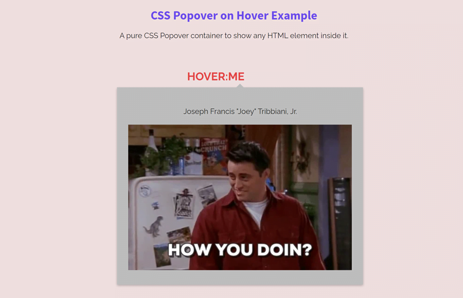
<div class="popover__wrapper">
  <a href="#">
    <h2 class="popover__title">Hover:me</h2>
  </a>
  <div class="popover__content">
    <p class="popover__message">Joseph Francis "Joey" Tribbiani, Jr.</p>
    <img alt="Joseph Francis Joey Tribbiani, Jr." src="img/giphy.webp">
  </div>
</div>
You can place any HTML element (like text, images, videos, etc) inside the popover content container. Likewise, the hovered element (that shows the popover) can be any valid HTML element.
Styling Popover on Hover with CSS
Now, let’s get started with CSS to style the popover. So, target the "popover__title" class and define CSS values as follows:
.popover__title {
  font-size: 24px;
  line-height: 36px;
  text-decoration: none;
  color: rgb(228, 68, 68);
  text-align: center;
  padding: 25px 0;
}
The “popover__wrapper” class is the main element that controls the popover on hover. Display it as an inline-block element and keep its relative position. Leave some space on the top using margin-top property to have some gap between the popover and hovered element.
.popover__wrapper {
  position: relative;
  margin-top: 2.5rem;
  display: inline-block;
}
After that, specify CSS styles for the "popover__content" that contains the popover content. Keep its absolute position, define the background color, box-shadow as described below. As we’ll display popover on hover event, we need to hide it. So, use the CSS visibility hidden property and 0 value for the opacity.
.popover__content {
  opacity: 0;
  visibility: hidden;
  position: absolute;
  left: -150px;
  transform: translate(0, 10px);
  background-color: #bfbfbf;
  padding: 1.5rem;
  box-shadow: 0 2px 5px 0 rgba(0, 0, 0, 0.26);
  width: auto;
}
Use the “before” pseudo-selector and define the following styles in order to create the speech bubble/arrow icon for the popover.
.popover__content:before {
  position: absolute;
  z-index: -1;
  content: "";
  right: calc(50% - 10px);
  top: -8px;
  border-style: solid;
  border-width: 0 10px 10px 10px;
  border-color: transparent transparent #bfbfbf transparent;
  transition-duration: 0.3s;
  transition-property: transform;
}
Make the popover content visible with the hover pseudo-selector. Moreover, use the CSS transform property to create a slide up animation that will trigger each time when popover display.
.popover__wrapper:hover .popover__content {
  z-index: 10;
  opacity: 1;
  visibility: visible;
  transform: translate(0, -20px);
  transition: all 0.5s cubic-bezier(0.75, -0.02, 0.2, 0.97);
}
Finally, align the message text to the center and done. You can also define some extra styles in order to customize the popover.
.popover__message {
  text-align: center;
}
That’s all! I hope you have successfully created a popover that shows on hover with the help of this pure CSS code snippet. If you have any questions or need further help, let me know by comment below.