A speech bubble is a visual element that shows the quote or special text that points to something. In web design, it is used in the testimonial to indicate the reviews, tooltips, and text chat interface. Besides this, speech bubbles are also used in the tour wizard to introduce the users to the new interface. In this tutorial, you will come to know how to create a speech bubble using CSS border property with different sizes and colors.
Before going further, I would suggest you check the demo page to see the various examples of the speech bubbles. Generally, it is a div element styled as a speech bubble. You can place any HTML element (like image, hyperlink, or button) inside it that you want to show in the speech bubble.
Whether you want to make a CSS message box, a tooltip container, or something like that, you can easily integrate this speech bubble example. Similarly, you can also apply any additional CSS to the speech bubble in order to fit your needs.
The HTML Structure
In order to create a speech bubble, we just need to wrap text into a div element. So, create a div element with a class name "speech-bubble" and place your text inside it.
<div class="speech-bubble">
    Short text!
</div>
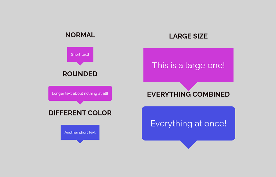
As you have seen in the above image, there are various speech bubbles of different colors and sizes. The CSS code is common for each speech bubble. Anyhow, you can add some additional classes to make it different. Like, you can add a class name "rounded" to make its corner rounded.
<div class="speech-bubble rounded">
       Longer text about nothing at all!
</div>
Similarly, if you want to place multiple speech bubbles with different colors. Then you can add another class name for the custom color of the background.
<div class="speech-bubble blue">
    Another short text
 </div>
You can also change the size of a speech bubble by adding a class name for the size. Later, this class can be styled for the large text extra padding for the speech bubble. So, define a class name "large" for the speech bubble as follows:
<div class="speech-bubble large">
  This is a large one!
</div>
The following HTML example for the speech bubble contains everything combined.
<div class="speech-bubble rounded large blue">
  Everything at once!
</div>
You are not limited to place only text inside the speech bubble, you can also add any other HTML elements like image, links, etc or whatever you want to add.
CSS Styles for the Speech Bubble
After creating HTML, now it’s time to style the speech bubble with CSS. So, target the "speech-bubble" class and define its background, color, font-size, mini-width, and margin property as described below. Here, the important thing is the CSS position property that should be relative. So, specify the position and set the "top" value for the vertical-align property.
.speech-bubble {
   background: #cc39d8;
   color: #fff;
   display: inline-block;
   font-size: 14px;
   line-height: 4em;
   margin-bottom: 1em;
   padding: 0 1em;
   position: relative;
   text-align: center;
   vertical-align: top;
   min-width: 7em;
   margin: 30px 10px;
}
After that, use the CSS :after pseudo selector in order to make the arrow icon with CSS border property. The trick is that we’ll transparent the border of the other three sides and set the color for only one side border. As a result, the border looks like an arrow icon.
Therefore, define the CSS border property with 1em width/thickness and transparent color. Then set a color value for the top side using the “border-top-color” property. Keep its absolute position, define the 100% top value in order to attach with a speech bubble container. Here, the content is a necessary property, so define it and keep the blank value. Similarly, define the 0 value for the width and height.
.speech-bubble:after {
	border: 1em solid transparent;
	border-top-color: #cc39d8;
	content: '';
	margin-left: -1em;
	position: absolute;
	top: 100%;
	left: 50%;
	width: 0;
	height: 0;
}
Basically, the style for a general-purpose speech bubble has been completed. Now, we’ll define some styles for the extra classes in order to make the speech bubble more attractive.
Style Variant for Speech Bubble
Now, define the styles for the “large” class name. You can set the custom values for the font-size and padding property as you want. Similarly, the min-width property defines the minimum width of the speech bubble. So, you can also control the width in this class name.
.speech-bubble.large {
	font-size: 2em;
	padding: 0 1em;
	min-width: 4em;
}
In order to make the rounded border, we just need to define the CSS border-radius property for the "rounded" class name. You can set the custom values for the border-radius according to your needs. If you want to make a speech balloon or circular speech bubble, then set the "50%" value for the border-radius.
.speech-bubble.rounded {
	border-radius: .4em;
}
Finally, define the background color for the custom background color class. Here, the important thing to notice is that you’ll also need to change the border color to keep the same.
.speech-bubble.blue {
	background: #484ee2;
	color: #fff;
}
.speech-bubble.blue:after {
	border-top-color: #484ee2;
}
You have done it! hopefully, now you are able to create a CSS speech bubble with an arrow icon with border property. If you have any questions or suggestions, let me know by comment below.