The Tooltip is the way of showing more information about the user by hovering the text or image. It can be used to draw user attention on specify content.
Today, We are going to build a mobile-friendly pure CSS tooltip with an arrow in the center of the box when user hovers over the link.
This CSS Tooltip builds to provide captions for the pictures. It’s light-weight and easy to implement on any kind of website.
I have created a demo for you and all you have to copy the CSS file and define a specific class to implement it.
Ok, are you looking for Javascript for Tooltip? No need of that! Just use our CSS3 build Tooltip for easy implementation to avoid conflict and load site fast.
It also can be utilized for the link to show long descriptions or any other relevant information which improve the user experience.
This tooltip is develop using only CSS and HTML, There is no javascript or jquery used. It is straightforward and excellent CSS tooltip with HTML content and works on all major browsers.
You can easily customize it as you need and also can add an image to the tooltip. It also allows you to add text or link.
How to Create Pure CSS Tooltip with Arrow Indication
Another main feature of this Tooltip is, it allows mouse over to the Tooltip which normally didn’t have such functionality in other tooltips.
Typically you have seen HTML5 Tooltips used the title attribute of the link to show it.
But I have used div which allows the mouse over the tooltip.
It has added different color variations; you just pick which one fits into your website. It is cross-browser compatible and lightweight.
You can use it very efficiently. It works on-hover the link or image and will show on the top of the link or image. In the demo, I have added a link on hover tooltip, but you can also add an image inside the link.
It is cross-browser compatible and lightweight. You can use it very efficiently. It works on-hover the link or image and will show on the top of the link or image.
I have implemented the tooltip on links but this CSS image tooltip can also be implemented on pictures so you can replace the link/text into pictures if you want to do that.
I have added the links, but you can also add an image inside the link. If you are looking for the great library then the best one is Hint.css
The Markup
The HTML markup is easy to understand. We use the unordered list ul, li. We place an anchor link and other HTML inside li.
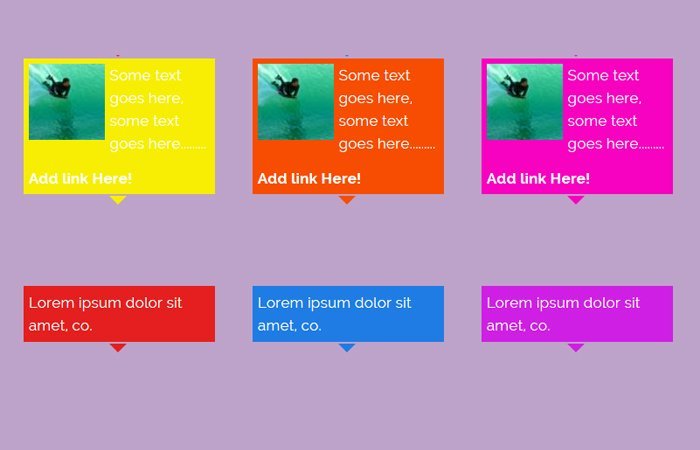
To change the color of the tooltip you need to add color class next to class, .tooltipT. I have included eight color schemes which are red, blue, purple, green, yellow, orange, pink and brown.
You just need to pick up the color class name which you like most and implement on your website.
See an example of HTML code below.
<li class="tip">
<a href="#">red</a>
<div class="tooltipT red">
    <img class="ref" src="images/sports.jpg" height="80" width="80" alt="" />
    <p>Some text goes here, some text goes here.........</p>
    <a href="#"> Add link Here!</a>
</div>
</li>
The Style
First of all, we need to implement a CSS property display:none; which hide the tooltip. Next, the display:block, is used to show it on hover.
.tip > .tooltipT{
display:none;
}
.tip:hover > .tooltipT
{
display:block;
}
You need to position the tooltip by using position: absolute; add arrow below the tooltip box by using: before selector.
.tooltipT{
color: #FFFFFF;
padding: 5px;
position: absolute;
z-index: 10;
bottom:26px;
left: 0px;
width:200px;
}
.tooltipT:before{
border-style: solid;
border-width: 10px;
height:0px;
width:0px;
position:absolute;
display:block;
content:"\00a0";
right:92px;
bottom:-20px;
}
And finally we need to add a background color, and for this, you need to use CSS background color into class, tooltipT Then if you want to add than one tooltip and want each has the different color, then you need to add a class name like red next to tooltipT in the div.
See example code.
.tooltipT.red {
background: none repeat scroll 0 0 #E41F1F;
}
The last thing you should also need to add color for the arrow by using :before selector with .tooltipT.red the class which will look like that
.tooltipT.red:before {
border-color: #E41F1F rgba(0, 0, 0, 0) rgba(0, 0, 0, 0);
}
Let’s share your thought about this simple CSS tooltip technique in the below the comments section.