You have implemented CSS Tooltips once in your life while creating a website. You are surely done this by using the combination of Link, span or DIV element. But how about creating pure HTML5 / CSS tooltips using the title data attribute? Yup! in this tutorial we’ll create such tooltips.
With the help of HTML5 Tooltip Attribute along with CSS :before & :after selectors we can easily create and show off the image Alt text or link title on hover.
I love this technique because it’s easy to build different design tooltips with arrows on different links or HTML elements.
If you want to add more than two Tooltips on the same website and want them to design differently than this can easily do with HTML5 tooltips by simply customizing specific class.
There are numerous tutorials online discussing the idea of CSS-based tooltips. But many examples require HTML factors (Span or DIV) at the side of the anchor link.
My approach is to replace this system and follow the standard HTML5 Data Attribute to create one for you!
How to Create Pure HTML5 / CSS Tooltip Using Title Attribute
We did create six different variations with two different color schemes such as blue and black. You simply need to add or remove the specified class to get the desired result.
Our markup is very simple without having too much HTML code. Just a simple anchor link is given primarily based on the class tooltip. The text which will be shown when hovering a link is placed inside the tool-tips.
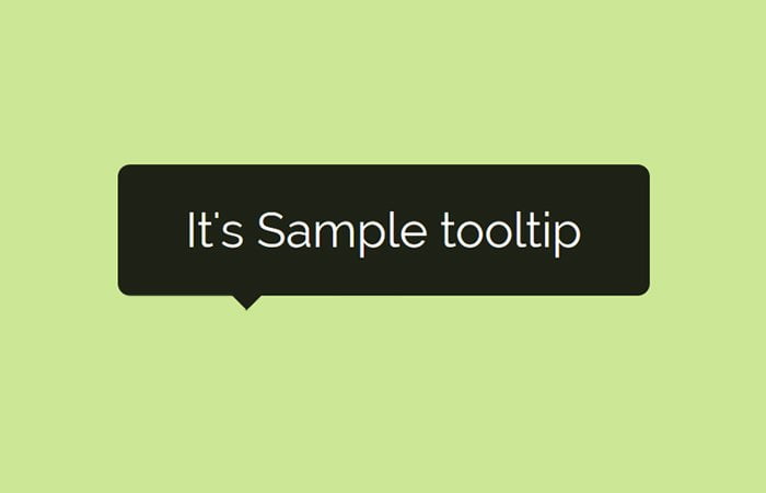
<a href="#" class="tooltip" tool-tips="It's Sample tooltip">Black Top Tooltip</a>
That’s almost done but let’s says you want to add a nice animation so it cleanly shows Off when hovering. Simply add class animationTips along with tooltip class.
<a href="#" class="tooltip animationTips" tool-tips="It's Sample tooltip">Black Top Tooltip</a>
You can do more customization like let’s change the color into the blue.
<a href="#" class="tooltip animationTips blue" tool-tips="oh this one is blue">Top Blue</a>
Similar you can easily change the position of tooltip by simply add the additional class. let’s say you want to show it on the right side.
<a href="#" class="tooltip right animationTips blue" tool-tips="Right Blue one">find out right one</a>
CSS Styles for Tooltips
Now move forward to style the tooltip with CSS. Of course, this is the most important part because without CSS the HTML is nothing.
Let’s start with setting up the anchor link position to relatively so we can use the absolute positioning for pseudo-elements.
We will apply the CSS to :after element to design the tooltip box where the :before the element will show the small (down/left/right ) arrow.
a.tooltip{
  position: relative;
  display: inline;
}
a.tooltip:after{
  display: block;
  visibility: hidden;
  position: absolute;
  bottom: 0;
  left: 20%;
  opacity: 0;
  content: attr(tool-tips); /* might also use attr(title) */
  height: auto;
  min-width: 100px;
  padding: 5px 8px;
  z-index: 999;
  color: #fff;
  text-decoration: none;
  text-align: center;
  background: rgba(0,0,0,0.85);
  -webkit-border-radius: 5px;
  -moz-border-radius: 5px;
  border-radius: 5px;
}
a.tooltip:before {
  position: absolute;
  visibility: hidden;
  width: 0;
  height: 0;
  left: 50%;
  bottom: 0px;
  opacity: 0;
  content: "";
  border-style: solid;
  border-width: 6px 6px 0 6px;
  border-color: rgba(0,0,0,0.85) transparent transparent transparent;
}
a.tooltip:hover:after{ visibility: visible; opacity: 1; bottom: 20px; }
a.tooltip:hover:before{ visibility: visible; opacity: 1; bottom: 14px; }
By default the tooltip bubble show on the top of the anchor link but by applying following specific class, You can easily change its position. (.right, .left, and .bottom.)
/* tips on bottom */
a.tooltip.bottom:after { bottom: auto; top: 0; }
a.tooltip.bottom:hover:after { top: 28px; }
a.tooltip.bottom:before {
  border-width: 0 5px 8.7px 5px;
  border-color: transparent transparent rgba(0,0,0,0.85) transparent;
  top: 0px
}
a.tooltip.bottom:hover:before { top: 20px; }

/* tips on the right */
a.tooltip.right:after { left: 100%; bottom: -45%; }
a.tooltip.right:hover:after { left: 110%; bottom: -45%; }
a.tooltip.right:before {
  border-width: 5px 10px 5px 0;
  border-color: transparent rgba(0,0,0,0.85) transparent transparent;
  left: 90%;
  bottom: 2%;
}
a.tooltip.right:hover:before { left: 100%; bottom: 2%; }

/* tips on the left */
a.tooltip.left:after { left: auto; right: 100%; bottom: -45%; }
a.tooltip.left:hover:after { right: 110%; bottom: -45%; }
a.tooltip.left:before {
  border-width: 5px 0 5px 10px;
  border-color: transparent transparent transparent rgba(0,0,0,0.85);
  left: auto;
  right: 90%;
  bottom: 2%;
}
a.tooltip.left:hover:before { right: 100%; bottom: 2%; }
You can easily apply your color scheme by just editing the below snippet.
/* tooltip colors (add your own!) */
a.tooltip.blue:after { background:#5f87c2; }
a.tooltip.blue:before { border-color: #5f87c2 transparent transparent transparent; }
a.tooltip.bottom.blue:before{ border-color: transparent transparent #5f87c2 transparent; }
a.tooltip.right.blue:before { border-color: transparent #5f87c2 transparent transparent; }
a.tooltip.left.blue:before { border-color: transparent transparent transparent #5f87c2; }
You can apply or add your animation by editing the following code.
a.tooltip.animationTips:after, a.tooltip.animationTips:before {
  -webkit-transition: all 0.2s ease-in-out;
  -moz-transition: all 0.2s ease-in-out;
  -ms-transition: all 0.2s ease-in-out;
  -o-transition: all 0.2s ease-in-out;
  transition: all 0.2s ease-in-out;
}
That’s It. Feel free to download code snippets for pure HTML5 / CSS tooltips using the title data attribute.