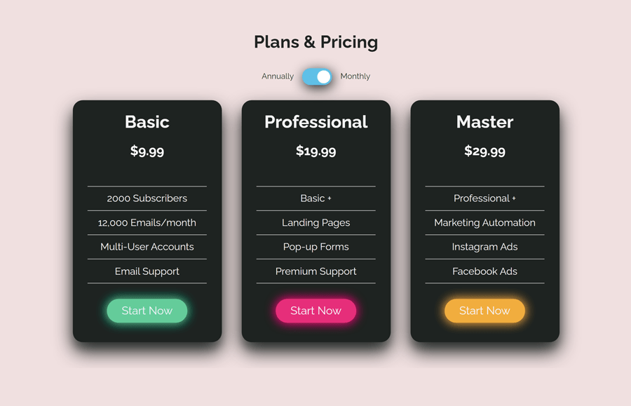
A pricing table is a useful element to describe the features and price of a product/service. No doubt, a pricing table plays an important role in successful sales on an eCommerce website. So, it must be user-friendly, attractive, clear, and responsive for a good conversion rate. Basically, pricing tables contain annual or monthly plans for a service but we can show both time periods and allow users to switch between them. Therefore, in this tutorial, we are going to create a responsive pricing table with a switch toggle button using CSS.
As you have seen in the above preview, there are three tables with different pricing plans. Each table has call to action button “Start Now” for quickly engage with the package. You can check these tables on the demo page to see their responsive design and glowing button hover effect.
With the help of this tutorial, you’ll be able to create a basic structure for pricing tables and pricing toggle functionality. After that, you can further customize these tables according to your needs. You can set a custom background, color, custom buttons, and package features of your products. So, let’s get started with HTML to build a pricing table.
The HTML Structure
The HTML structure consists of two main parts, a toggle switch button, and pricing tables. Generally, you can place the toggle button anywhere on your webpage to switch between pricing/features. But I would suggest you put this toggle button at the top of your pricing table. So, define the HTML code for the heading and toggle switch button as follows:
    <div class="top">
      <h1>Plans & Pricing</h1>
      <div class="toggle-btn">
        <span style="margin: 0.8em;">Annually</span>
        <label class="switch">
          <input type="checkbox" id="checbox" onclick="check()" ; />
          <span class="slider round"></span>
        </label>
        <span style="margin: 0.8em;">Monthly</span></div>
    </div>
In the above code, I used the HTML checkbox input that we’ll style in CSS to make it a toggle button. You can read this tutorial to convert checkbox input into a toggle button.
After that, create a div element with a class name "packages", place your prices wrapped in h2 element and define class names “text1” and “text2” that will be used in JS function to switch. So, a basic HTML structure for pricing table is as follows:
    <div class="package-container">
      <div class="packages">
        <h1>Basic</h1>
        <h2 class="text1">$9.99</h2>
        <h2 class="text2">$119.99</h2>
        <ul class="list">
          <li class="first">2000 Subscribers</li>
          <li>12,000 Emails/month</li>
          <li>Multi-User Accounts</li>
          <li>Email Support</li>
        </ul>
        <a href="#" class="button button1">Start Now</a>
      </div>
      <div class="packages">
        <h1>Professional</h1>
        <h2 class="text1">$19.99</h2>
        <h2 class="text2">$239.99</h2>
        <ul class="list">
          <li class="first">Basic +</li>
          <li>Landing Pages</li>
          <li>Pop-up Forms</li>
          <li>Premium Support</li>
        </ul>
        <a href="#" class="button button2">Start Now</a>
      </div>
      <div class="packages">
        <h1>Master</h1>
        <h2 class="text1">$29.99</h2>
        <h2 class="text2">$359.99</h2>
        <ul class="list">
          <li class="first">Professional +</li>
          <li>Marketing Automation</li>
          <li>Instagram Ads</li>
          <li>Facebook Ads</li>
        </ul>
        <a href="#" class="button button3">Start Now</a>
      </div>
    </div>
You can also define text3, text4 classes for the alternative text for features and use the same rule in the JavaScript function to toggle text.
CSS Styles for Pricing Table
In CSS, select the "container" class and define its 100% width.
.container {
  width: 100%;
}
Similarly, target the "package-container" class and display it as a flex element. Align items to the center using align-items and justify-content property.
.package-container {
  display: flex;
  align-items: center;
  justify-content: center;
  flex-wrap: wrap;
}
The "packages" class contains the price and features. Define its fixed width as 300px and keep some space between tables using the margin property. Likewise, define the background color, box-shadow, and color, etc. Use the CSS flex property and set the flex-direction to the column in order to make the grid of these tables.
.packages {
  margin: 20px;
  width: 300px;
  padding-bottom: 1.5em;
  height: 100%;
  background-color: #1e2321;
  display: flex;
  flex-direction: column;
  align-items: center;
  text-align: center;
  border-radius: 20px;
  box-shadow: 0 19px 38px rgba(30, 35, 33, 1), 0 15px 12px rgba(30, 35, 33, 0.2);
  flex-wrap: wrap;
  color: #f4f4f4;
}
Now, target the li element of the list class and define its CSS styles as described below. You can set the custom values for the features list according to your needs.
.list li {
  font-size: 20px;
  list-style: none;
  border-bottom: 1px solid #f4f4f4;
  padding-inline-start: 0;
  border-width: 1px;
  padding: 10px;
}

.first {
  margin-top: 40px;
  border-top: 1px solid #f4f4f4;
}

.list {
  width: 80%;
}

ol,
ul {
  padding: 0;
}
The final part of the pricing table is a call to action button. It can be a “Buy Now”, or “Signup Now” or whatever you want. Target the “button” class and specify its styles as mentioned below. You can also use the custom button, check these cool CSS button examples to integrate into your pricing table.
.button {
  padding: 10px 30px;
  text-decoration: none;
  font-size: 1.4em;
  margin: 15px 15px;
  border-radius: 50px;
  color: #f4f4f4;
  transition: all 0.3s ease 0s;
}

.button:hover {
  transform: scale(1.2);
}

.button1 {
  background-color: #00cc99;
  box-shadow: 0 0 10px 0 #00cc99 inset, 0 0 20px 2px #00cc99;
}

.button2 {
  background-color: #ff007c;
  box-shadow: 0 0 10px 0 #ff007c inset, 0 0 20px 2px #ff007c;
}

.button3 {
  background-color: #ffae42;
  box-shadow: 0 0 10px 0 #ffae42 inset, 0 0 20px 2px #ffae42;
}
Styling Toggle Switch
In order to design the toggle switch button, target the "switch" class and define its relative position.
.switch {
  position: relative;
  display: inline-block;
  width: 60px;
  height: 34px;
}
We don’t need to show the default checkbox input to the users. So, hide it using CSS opacity 0 along with 0 dimension (height & width).
.switch input {
  opacity: 0;
  width: 0;
  height: 0;
}
The "slider" class is the element that indicates the on/off toggle. Keep its absolute position and set 0 value for all directions. Specify a background color CSS transition duration for smoothness.
.slider {
  position: absolute;
  cursor: pointer;
  top: 0;
  left: 0;
  right: 0;
  bottom: 0;
  background-color: #1e2321;
  -webkit-transition: 0.4s;

  box-shadow: 2px 6px 25px #1e2321;
  transform: translate(0px, 0px);
  transition: 0.6s ease transform, 0.6s box-shadow;
}
.slider:before {
  position: absolute;
  content: "";
  height: 26px;
  width: 26px;
  left: 4px;
  bottom: 4px;
  background-color: white;
  -webkit-transition: 0.4s;
  transition: 0.4s;
}
Target the "slider" class with input checked pseudo selector and define a background color. Similarly, target the before pseudo-class and use the CSS translateX transformation in order to slide/switch the toggle button.
input:checked + .slider {
  background-color: #50bfe6;
}

input:focus + .slider {
  box-shadow: 0 0 1px #50bfe6;
}

input:checked + .slider:before {
  -webkit-transform: translateX(26px);
  -ms-transform: translateX(26px);
  transform: translateX(26px);
}
In order to make the slider with a rounded corner, we made a class "round" with border radius property. You can increase/decrease the border radius value to customize the rounded thickness.
.slider.round {
  border-radius: 34px;
}

.slider.round:before {
  border-radius: 50%;
}
JS Function to Switch Pricing Table Text
In the final step, we need a little JavaScript function that will check the checkbox checked value and switch the text. So, add this function before the closing of the body tag and done.
<script>
function check() {
  var checkBox = document.getElementById("checbox");
  var text1 = document.getElementsByClassName("text1");
  var text2 = document.getElementsByClassName("text2");

  for (var i = 0; i < text1.length; i++) {
    if (checkBox.checked == true) {
      text1[i].style.display = "block";
      text2[i].style.display = "none";
    } else if (checkBox.checked == false) {
      text1[i].style.display = "none";
      text2[i].style.display = "block";
    }
  }
}
check();
</script>
That’s all! I hope you have successfully implemented this CSS pricing table with the pricing toggle switch button. If you have any questions or need further help, feel free to comment below.