Our today small quick tip is about creating button animation with a Shine/Glow effect on hover using pure CSS transition and transform CSS property.
I will create a simple CSS button and apply the glow effect with CSS3 when a user hovers over it. This effect can be applied to both an input type button or anchor.
You can check out our previous tutorial about creating Link Hover Effect with CSS which are perfect if you want to create a stunning navigation bar.
To build this nice and tiny effect, I will use transform property and will use two parameters. I will set the value of skewX 20 degrees and translate it on the X-axis by adding translateX value 0.
On hover, I will simply set translateX to 300px and add transition all linear.
Create Markup for Shine/Glow Effect
The markup is simple and all you need to create HTML for a button. We place an HTML element button with class name hello.
Next, we need to add a div with class name shine. This call allows us to create a shine effect on hover.
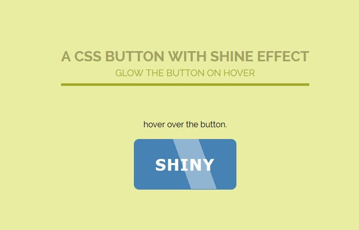
<div class="buttonWrapper">
  <button class="hello">SHINY</button>
  <div class="shine"></div>
</div>
The container class is just used to align the page. If you are using any CSS framework, then you don’t need to add a container.
You can just place the HTML button code and a shine div.
CSS Style for Button
Let’s first of all design the button itself and we need to add some color, font, and background color.
To remove the default border, we need to set the border to 0 and add some padding to make it look good in size.
We also added some border-radius, but if you need to keep the flat button design, then you don’t need to add that.
.hello {
  border: 0;
  padding: 30px 15px;
  width: 200px;
  background: steelblue;
  color: white;
  font-size: 2em;
  font-weight: bold;
  transition: background .3s linear;
  letter-spacing: 2px;
  border-radius: 10px;
}
Adding Button Glossy Hover Effect
To create the shine effect of the button, we need to set the position to absolute with top 0 but the left will be -70px.
The height and width are depending on how much size you want for the glow effect.
Next, we need some color to shine effect and we will use the RGBA color system so it gives the look of shine.
The transition allows us to control the speed of effect while hovering the button and by using transform, we able to set the position of the effect comes from.
.shine {
  position: absolute;
  top: 0;
  left: -70px;
  height: 98px;
  width: 50px;
  background: rgba(255, 255, 255, 0.4);
  transition: all .3s linear;
  transform: skewX(20deg) translateX(0);
}
Apply Glow Effect on Hover
On hover, we will keep transform skewX value to 20degree but we need to change the translateX to 300px. This is actually the speed of effect that how come it fast and go away.
.container:hover .shine {
  transform: skewX(20deg) translateX(300px);
}
I hope you like this pure CSS based button shine/glow effect that reveal on hover. You can play with its style to generator your own style button. You can change the color, background or transform value, etc.