A Photo Gallery is a great way to integrate a set of images into a web page. It not only provides an easy way to view multiple images at once but also enhances the user experience. You are probably working on a project in which you need to add a photo gallery and are stuck in coding. No need to worry anymore, in this tutorial you will learn how to create a gallery on the website and find the full HTML code for the photo gallery.
In web designing, a general-purpose photo gallery can be created using HTML and CSS to showcase the work with images. But, sometimes you need a feature-rich gallery to show some creativity along with your photos. For this purpose, this gallery project is ideal to fulfill your requirements.
Basically, this photo gallery is based on jQuery that comes with a responsive flexbox layout and touch supported lightbox. It has built-in icons and creative hover styles. You can easily integrate and customize each part of the gallery after reading this tutorial. So, let’s start with HTML coding to getting started with the photo gallery.
Create HTML Code for Photo Gallery
The HTML structure for this photo gallery is simple because the most part of the gallery created dynamically. So, you just need to build a basic layout of your photo gallery with a few classes schemes as described below:
<div class="gallery">
<div class="gallery-item item-3x4">
<img class="thumb placeholder" src="https://codeconvey.com/Tutorials/global-images/image-1.jpg" data-src="https://codeconvey.com/Tutorials/global-images/image-1.jpg" data-image="https://codeconvey.com/Tutorials/global-images/image-1.jpg" data-title="Photo by Daniel J. Schwarz (1)" alt="Photo by Daniel J. Schwarz">
<div class="caption"><span>Caption 1</span></div>
</div>
<div class="gallery-item item-4x3">
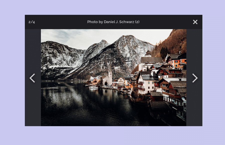
<img class="thumb placeholder" src="https://codeconvey.com/Tutorials/global-images/image-2.jpg" data-src="https://codeconvey.com/Tutorials/global-images/image-2.jpg" data-image="https://codeconvey.com/Tutorials/global-images/image-2.jpg" data-title="Photo by Daniel J. Schwarz (2)" alt="Photo by Daniel J. Schwarz">
<div class="caption"><span>Caption 2</span></div>
</div>
<div class="gallery-item item-3x4">
<img class="thumb placeholder" src="https://codeconvey.com/Tutorials/global-images/image-3.jpg" data-src="https://codeconvey.com/Tutorials/global-images/image-3.jpg" data-image="https://codeconvey.com/Tutorials/global-images/image-3.jpg" data-title="Photo by Daniel J. Schwarz (3)" alt="Photo by Daniel J. Schwarz">
<div class="caption"><span>Caption 3</span></div>
</div>
<div class="gallery-item item-4x3">
<img class="thumb placeholder" src="https://codeconvey.com/Tutorials/global-images/image-4.jpg" data-src="https://codeconvey.com/Tutorials/global-images/image-4.jpg" data-image="https://codeconvey.com/Tutorials/global-images/image-4.jpg" data-title="Photo by Daniel J. Schwarz (4)" alt="Photo by Daniel J. Schwarz">
<div class="caption"><span>Caption 4</span></div>
</div>
</div>
In the above HTML, you just need to place your images link and caption text. Besides this, you can also append some extra elements between the images according to your needs.
CSS Styles for Photo Gallery
The “gallery” class is the basic wrapper for the photos/thumbnails that you need to display as a flexbox. Likewise, set the “wrap” value for the flex-wrap property in order to arrange the images in a responsive grid layout.
.gallery {
  display: flex;
  flex-wrap: wrap;
}
Now, specify the CSS styles for the gallery items/images (for the gallery-item class). Keep its position relative, define maximum width and height as 530px and 300px respectively. In the same way, specify the initial flex item length as 175px by using the CSS flex-basis property. You can increase/decrease these values if you want to adjust the size of the thumbnails according to your needs.
Here, the important property is the overflow that you need to keep hidden. The other properties like margin and cursor can be defined as your requirements.
.gallery-item {
  flex: 1 1 auto;
  flex-basis: 175px;
  margin: .5em;
  max-width: 530px;
  max-height: 300px;
  position: relative;
  cursor: pointer;
  overflow: hidden;
}
After that, define the variations size values for the various item size classes using the CSS calc() function. Generally, these classes are optional but you can use these classes to make a different size for the thumbnail.
.gallery-item.item-2x3 {
  flex-basis: calc(175px * 0.666);
}
.gallery-item.item-3x4 {
  flex-basis: calc(175px * 0.75);
}
.gallery-item.item-1x1 {
  flex-basis: 175px;
}
.gallery-item.item-4x3 {
  flex-basis: calc(175px * 1.333);
}
.gallery-item.item-3x2 {
  flex-basis: calc(175px * 1.5);
}
.gallery-item.item-8x5 {
  flex-basis: calc(175px * 1.6);
}
.gallery-item.item-2x1 {
  flex-basis: calc(175px * 2);
}
Gallery Items Hover Styles
In order to make a creative hover style for the gallery thumbnails, we’ll place an overlay icon and a lite/transparent background color. To do so, place a background image and define some CSS styles for the gallery items overlay using the CSS after pseudo selector. Similarly, define the styles as described below for the photo caption container that will be displayed on the mouseover event.
.gallery-item::after {
  content: "";
  position: absolute;
  top: 0;
  bottom: 0;
  left: 0;
  right: 0;
  opacity: 0;
  background-color: rgba(0, 0, 0, 0.4);
  background-image: url("data:image/svg+xml,%3Csvg width='36' height='36' viewBox='0 0 36 36' fill='none' xmlns='http://www.w3.org/2000/svg'%3E%3Cpath fill-rule='evenodd' clip-rule='evenodd' d='M4.5 13.75C4.5 8.64137 8.64137 4.5 13.75 4.5C18.8586 4.5 23 8.64137 23 13.75C23 18.8586 18.8586 23 13.75 23C8.64137 23 4.5 18.8586 4.5 13.75ZM13.75 0C6.15609 0 0 6.15609 0 13.75C0 21.3439 6.15609 27.5 13.75 27.5C16.3774 27.5 18.8327 26.7631 20.9205 25.4846L30.4906 35.0547C31.7509 36.3151 33.7944 36.3151 35.0547 35.0547C36.3151 33.7944 36.3151 31.7509 35.0547 30.4906L25.4846 20.9205C26.7631 18.8327 27.5 16.3774 27.5 13.75C27.5 6.15609 21.3439 0 13.75 0Z' fill='white'/%3E%3C/svg%3E");
  background-position: center;
  background-size: 1.85rem;
  background-repeat: no-repeat;
  transition: opacity 250ms;
  z-index: 10;
}
.gallery-item .caption {
  position: absolute;
  text-align: center;
  left: 0;
  right: 0;
  bottom: 0;
  padding: 1em 0;
  line-height: 1em;
  color: #fff;
  background-color: rgba(0, 0, 0, 0.6);
  transform: translateY(4em);
  transition: transform 250ms;
  z-index: 20;
}
.gallery-item .caption span {
  display: inline-block;
  max-width: calc(100% - 2em);
  text-overflow: ellipsis;
  overflow: hidden;
  white-space: nowrap;
}
Reveal the photo overlay and photo caption bar while hovering the gallery item. Here, you need an additional class that will be added dynamically (through gallery JavaScript file) to fix the size of the thumbnails on hover. So, define the CSS styles to reveal the caption as described below:
.gallery-item:hover .thumb {
  transform: scale(1.05);
}
@media (hover: hover) {
  .gallery-item:hover::after {
    opacity: 1;
  }
  .gallery-item:hover .caption {
    transform: translateY(0);
  }
}
.gallery-item .thumb {
  display: inline-block;
  width: 100%;
  height: 100%;
  object-fit: cover;
  min-height: unset;
  text-align: center;
  background-color: #333;
  transition: filter 500ms, transform 500ms;
}
.ie-fix .gallery-item .thumb {
  width: auto;
}
Another creative feature of the gallery is the item’s placeholder. For this purpose, create a class “placeholder” and specify the CSS blur filter. It’s really simple in regards to coding but produces an amazing blur effect.
.gallery-item .placeholder {
  filter: blur(20px);
}
Customization of Photo Gallery Lightbox CSS Code
After creating the basic styles for the gallery layout, now its time to stylize the lightbox of the gallery. Actually, the HTML structure for the lightbox generated dynamically in the gallery JavaScript function, but you can style/customize it through CSS. So, let’s have a look at the following CSS snippets.
Define the styles for the “lightbox-wrapper” selector. Keep it hidden (using CSS display none property) until the user clicks an image. Display the slides of the lightbox as flexbox, keep the relative position, and hide the overflow along with the other described values as follows:
.lightbox-wrapper {
  display: none;
  background-color: #2e2e35;
  position: fixed;
  top: 0;
  bottom: 0;
  left: 0;
  right: 0;
  z-index: 9999;
}
.lightbox .lightbox-slides-wrapper {
  flex-grow: 1;
  display: flex;
  overflow: hidden;
  position: relative;
}
Similarly, display the lightbox container as flex and keep the column layout for the flex-direction.
.lightbox {
  display: flex;
  flex-direction: column;
  height: 100%;
  color: white;
}
After that, define the styles for the lightbox header (title area) as described below:
.lightbox .lightbox-header {
  flex-shrink: 0;
  display: flex;
  justify-content: space-between;
  align-items: center;
  background-color: rgba(0, 0, 0, 0.3);
  padding: 1em;
  font-weight: 600;
  text-align: center;
}
.lightbox .lightbox-header > * {
  opacity: .75;
}
Specify the CSS styles for the close button. Keep its position as relative and define width and height values. You can set the custom values for the height and width if you want to change the size of the close button.
.lightbox .lightbox-close {
  position: relative;
  height: 1.85rem;
  width: 1.85rem;
  display: flex;
  align-items: center;
  justify-content: center;
  background: none;
  padding: 0;
  border: none;
}
.lightbox .lightbox-close::before, .lightbox .lightbox-close::after {
  position: absolute;
  content: "";
  height: 4px;
  width: 80%;
  background-color: #fff;
}
.lightbox .lightbox-close::before {
  transform: rotate(-45deg);
}
.lightbox .lightbox-close::after {
  transform: rotate(45deg);
}
.lightbox .lightbox-close:hover {
  opacity: 1;
}
The important part of the lightbox UI is the next and previous arrows buttons. Define the CSS properties for these buttons as follows. You can customize the size of these buttons by changing the width and height values that are both 4rem.
.lightbox .lightbox-arrow {
  position: absolute;
  top: 50%;
  width: 4rem;
  height: 4rem;
  padding: .5rem;
  background-repeat: no-repeat;
  background-position: center;
  background-size: 1.5em;
  opacity: .75;
  cursor: pointer;
  filter: drop-shadow(0 0 7px #000);
}
.lightbox .lightbox-arrow:hover {
  opacity: 1;
}
.lightbox .lightbox-arrow.arrow-left {
  left: 0;
  background-image: url("data:image/svg+xml,%3Csvg width='32' height='53' viewBox='0 0 32 53' fill='none' xmlns='http://www.w3.org/2000/svg'%3E%3Cpath fill-rule='evenodd' clip-rule='evenodd' d='M0 26.5L27.3171 0L32 4.54286L9.36585 26.5L32 48.4571L27.3171 53L0 26.5Z' fill='white'/%3E%3C/svg%3E");
}
.lightbox .lightbox-arrow.arrow-right {
  right: 0;
  background-image: url("data:image/svg+xml,%3Csvg width='32' height='53' viewBox='0 0 32 53' fill='none' xmlns='http://www.w3.org/2000/svg'%3E%3Cpath fill-rule='evenodd' clip-rule='evenodd' d='M32 26.5L4.68293 53L0 48.4571L22.6341 26.5L3.83911e-06 4.54286L4.68293 0L32 26.5Z' fill='white'/%3E%3C/svg%3E");
}
The final part of the lightbox is the slide that you need to keep absolute. The gallery JS uses this selector to slide the images on the touch event.
.lightbox .lightbox-slide {
  display: flex;
  align-items: center;
  justify-content: center;
  flex-grow: 1;
  transition: all 0ms ease;
  position: absolute;
  top: 0;
  bottom: 0;
  left: 0;
  right: 0;
}
.lightbox .lightbox-slide[data-state="prev"] {
  transform: translateX(-100%);
  opacity: 0;
}
.lightbox .lightbox-slide[data-state="next"] {
  transform: translateX(100%);
  opacity: 0;
}
.lightbox .lightbox-image {
  display: none;
  max-width: 100%;
  max-height: 100%;
}
.lightbox .spinner {
  display: none;
}
Photo Gallery Initialization
Finally, Load the jQuery JavaScript library and gallery JS file just before the closing of the body tag in order to activate the photo gallery.
<!-- jQuery -->
<script src='https://cdnjs.cloudflare.com/ajax/libs/jquery/3.5.1/jquery.min.js'></script>
<!-- Gallery JS -->
<script src='js/gallery.js'></script>
You’ve done it all! Hopefully, you have successfully implemented the HTML, CSS, and JS code of this photo gallery into your website project. If you have any issues related to this gallery project, feel free to comment below.
Where is the gallery.js code?
Hi James!
Download the source code using the “Download” button available at starting the tutorial. Extract the zip file and browse the “js” folder, there you will find gallery.js code.
Hi.
I have to make a code similar to this one. The idea is to have a code that load photos from a folder and built a layout to explore photos.
Since we have diferente folders with several photos and quantities are not always the same, i wish that code could upload them automatically and dispose them in layout.
Thank you for all the help.
Hi,
How would one go about adding more images. I have added another image however the image is not appearing in the hover style window, its completely blank
Alia, It require bit customization. You should edit some css to make it work with more images.
Hey. Thank you for the code. I am using it for a website. I am not a coding people. I am wondering. If there is a way to make it when I click on the photo. It opens the image itself in a new tab? Or…. is there a way to add a magnifying glass function to it? My supervisor is complaining that the image is too small. Thanks. Really appreciate if you can help.
In the style sheet, I see:
.gallery-item .caption {
…
}
Where can I find more info on this.
Thanks for your time.
In style.css there is a class:
.gallery-item .caption {
…
]
Please, where can I find out more information on this.
Thank you for your time.
I am so sorry in advance for my stupidity, but how can I change the text on the top of the image to the bottom?
Thanks a TON for this and the help in advance!