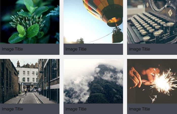
Today, we are going to create a simple CSS based gallery with image captions. Actually, it’s not a regular gallery but CSS image grid with title and description underneath the photos.
It is a block layout gallery which allows you to show multiple images as a grid. It also allows adding the title of each image and description. This showcase gallery is perfect if you are going to build a portfolio website.
But if you want to build a thumbnails gallery then you can check out our Simple HTML Photo Gallery which change the image when click on thumbnails.
It is a responsive media gallery without using media queries. We will take help max-width to make work the gallery on mobile and desktop devices.
The media gallery is perfect for portfolio website or photographic website. If you are planning to create one, then this might help you.
How to Create Image Gallery with Captions
Let’s start with HTML. The code is easy to understand. We have a wrapper and then a child div.grid
Next, we will place each media inside the grid-item. We will define the figure element and place image tag and caption or title.
<div class="wrapper">
<div class="grid">
    <div class="grid-item">
        <figure>
            <img src="https://unsplash.it/250/187?image=400" alt="">
            <figcaption>Image Title</figcaption>
        </figure>
    </div>
    <div class="grid-item">
        <figure>
            <img src="https://unsplash.it/250/187?image=401" alt="">
            <figcaption>Image Title</figcaption>
        </figure>
    </div>
</div>
</div>
CSS Style for Gallery
Now let see the CSS. The grid max-width is set to 1000px, and it used the display flex with justify-content so that all items align correctly.
.grid {
  max-width: 1000px;
  margin: 0 auto;
  display: -webkit-box;
  display: -ms-flexbox;
  display: flex;
  -ms-flex-wrap: wrap;
      flex-wrap: wrap;
  -webkit-box-pack: center;
      -ms-flex-pack: center;
          justify-content: center;
}
Each of grid item has min-width and max-width of 250px.
.grid-item {
  min-width: 250px;
  max-width: 250px;
  -webkit-box-flex: 1;
      -ms-flex: 1 1 250px;
          flex: 1 1 250px;
  padding-left: .5rem;
  padding-right: .5rem;
  margin-bottom: 1rem;
}
We set the wrapper to 100vh so that it will acquire the full height of the body.
.wrapper {
  min-height: 100vh;
  padding: 2rem 0;
  background: #40424a;
  color: #e4e4e8;
  font-family: 'Roboto', sans-serif;
  text-align: center;
}
.grid-item figure {
  padding: 0;
  margin: 0;
  box-shadow: 0px 0px 6px 0px rgba(0, 0, 0, 0.05);
}
The following simple CSS line makes your image gallery & captions responsive.
.grid-item figure img {
  display: block;
  max-width: 100%;
}
.grid-item figcaption {
  display: block;
  padding: .625rem .5rem;
  background: #474952;
}