A message box is a perfect solution to notify the users about the process that’s going to happen on a webpage. Basically, a Website may show various types of messages to the users. However, a message that display on a button click in HTML likely be an alert or notification about the process that they are going to perform.
This tutorial is focused on a message box that we are going to build using HTML, CSS, and a little bit of JavaScript function. The main requirement of this project is that when a user clicks on the button, a closable message popup box will display. Surprisingly, you can also create a pure CSS popup box on click but this idea is quite tricky while executing callback functions.
Anyhow, with the help of this tutorial, you will be able to execute your custom functions along with this message popup box. So, let’s get started with HTML coding to display a message box on a button click.
HTML Structure to Display Message Box
First of all, create a button element that will be used to reveal the message box. You can also create a div element virtual button to display a message box in HTML.
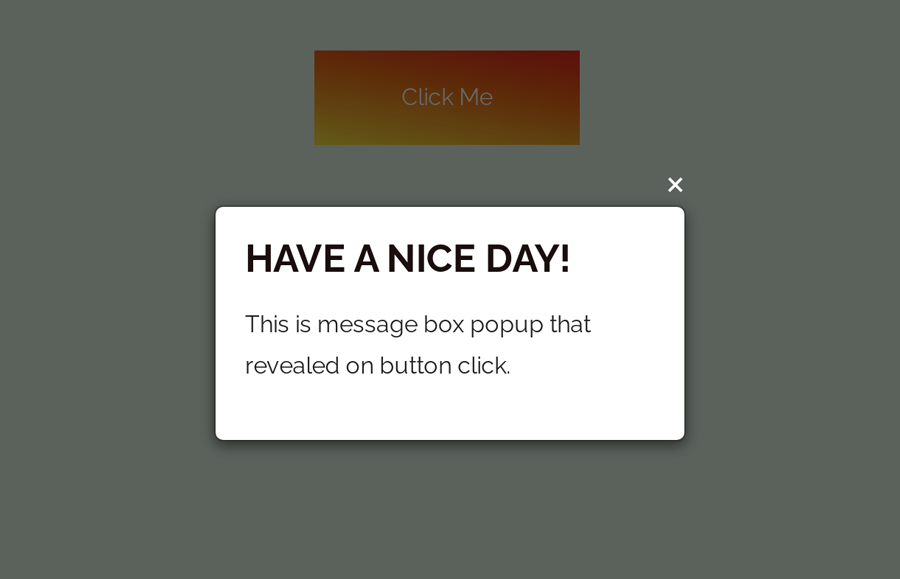
<button class="Click-here">Click Me</button>
After that, create HTML for message box and background dim overlay as follows:
<div class="custom-model-main">
   <div class="custom-model-inner">
      <div class="close-btn">×</div>
      <div class="custom-model-wrap">
         <div class="pop-up-content-wrap">
            <h2>Have a nice day!</h2>
            <p>This is message box popup that revealed on button click.</p>
         </div>
      </div>
   </div>
   <div class="bg-overlay"></div>
</div>
You can place any HTML element (e.g images, videos, text, and links ) inside the "pop-up-content-wrap" tag.
The CSS Styles
In CSS, define the CSS styles for your button element that’s will be used to trigger the message. Generally, the design of this button is optional. Anyway, you can also browse some cool CSS buttons to pick a different design.
.Click-here {
  cursor: pointer;
  background-image: linear-gradient(190deg, #f83600 0%, #fee140 100%);
  color: #fff;
  width: 180px;
  text-align: center;
  font-size:16px;
  padding: 18px 0;
  margin: 0 auto;
  transition:background-image 3s ease-in-out;
}
.Click-here:hover{
  transition:background-image 3s ease-in-out;
  background-image: linear-gradient(90deg, #fee140 0%, #f83600 100%);
}
Now, desfine styles for the main wrapper of the message box. Keep its o overflow hidden and set a fixed position. We need to hide it by default by defining opacity value as 0. Likewise, define CSS transition for smoothness of the opacity in order to make a fading effect.
.custom-model-main {
  text-align: center;
  overflow: hidden;
  position: fixed;
  top: 0;
  right: 0;
  bottom: 0;
  left: 0; /* z-index: 1050; */
  -webkit-overflow-scrolling: touch;
  outline: 0;
  opacity: 0;
  -webkit-transition: opacity 0.15s linear, z-index 0.15;
  -o-transition: opacity 0.15s linear, z-index 0.15;
  transition: opacity 0.15s linear, z-index 0.15;
  z-index: -1;
  overflow-x: hidden;
  overflow-y: auto;
}
We need a special class that we’ll add to modal using the jQuery click function to show the pop-up. In this class, keep the opacity value 1 and z-index greater than other elements.
.model-open {
  z-index: 99999;
  opacity: 1;
  overflow: hidden;
}
Define the CSS styles for the message box as described below:
.custom-model-inner {
  -webkit-transform: translate(0, -25%);
  -ms-transform: translate(0, -25%);
  transform: translate(0, -25%);
  -webkit-transition: -webkit-transform 0.3s ease-out;
  -o-transition: -o-transform 0.3s ease-out;
  transition: -webkit-transform 0.3s ease-out;
  -o-transition: transform 0.3s ease-out;
  transition: transform 0.3s ease-out;
  transition: transform 0.3s ease-out, -webkit-transform 0.3s ease-out;
  display: inline-block;
  vertical-align: middle;
  width: 320px;
  margin: 30px auto;
  max-width: 97%;
}
.custom-model-wrap {
  display: block;
  width: 100%;
  position: relative;
  background-color: #fff;
  border: 1px solid #999;
  border: 1px solid rgba(0, 0, 0, 0.2);
  border-radius: 6px;
  -webkit-box-shadow: 0 3px 9px rgba(0, 0, 0, 0.5);
  box-shadow: 0 3px 9px rgba(0, 0, 0, 0.5);
  background-clip: padding-box;
  outline: 0;
  text-align: left;
  padding: 20px;
  -webkit-box-sizing: border-box;
  -moz-box-sizing: border-box;
  box-sizing: border-box;
  max-height: calc(100vh - 70px);
	overflow-y: auto;
}
.model-open .custom-model-inner {
  -webkit-transform: translate(0, 0);
  -ms-transform: translate(0, 0);
  transform: translate(0, 0);
  position: relative;
  z-index: 999;
}
Create styles for background dim overlay that display over the main content when the message box will be displayed.
.model-open .bg-overlay {
  background: rgba(0, 0, 0, 0.6);
  z-index: 99;
}
.bg-overlay {
  background: rgba(0, 0, 0, 0);
  height: 100vh;
  width: 100%;
  position: fixed;
  left: 0;
  top: 0;
  right: 0;
  bottom: 0;
  z-index: 0;
  -webkit-transition: background 0.15s linear;
  -o-transition: background 0.15s linear;
  transition: background 0.15s linear;
}
Similarly, define CSS styles for close button as follows:
.close-btn {
  position: absolute;
  right: 0;
  top: -30px;
  cursor: pointer;
  z-index: 99;
  font-size: 30px;
  color: #fff;
}
At last, add the following CSS snippet into your project to make the message box responsive.
@media screen and (min-width:800px){
	.custom-model-main:before {
	  content: "";
	  display: inline-block;
	  height: auto;
	  vertical-align: middle;
	  margin-right: -0px;
	  height: 100%;
	}
}
@media screen and (max-width:799px){
  .custom-model-inner{margin-top: 45px;}
}
The JavaScript
Load the jQuery JavaScript library and create a click function to activate the message box.
    <!-- jQuery -->
    <script src='https://cdnjs.cloudflare.com/ajax/libs/jquery/3.3.1/jquery.min.js'></script>
    <script>
    $(".Click-here").on('click', function() {
      $(".custom-model-main").addClass('model-open');
    });
    $(".close-btn, .bg-overlay").click(function(){
      $(".custom-model-main").removeClass('model-open');
    });
    </script>
You have completed it! If you have any questions or suggestions related to this message box project, let me know by comment below.
Sir where should I code it so that it will appear as above ……I mean which coding app should I use
Hi Arnab!
You can use Sublime or Brackets code editor app for Desktop to edit, modify or customize this code. You can also use ACode editor in your Android phone to edit code.
I want to put 2 buttons that display different message in one page, I already tried to change the variables and class name. However, both buttons keeps displaying the message box on the very bottom only. Can you help me with my problem? Thank you.