The sliding underline animation is an attractive way to indicate the active tab. The animation is based on a simple idea to smoothly move the underline from one tab title to the active title. It looks smooth but designing it is a little bit hard. But, you don’t need to worry, here you will come to know the way to create CSS tabs with sliding underline animation using jQuery and CSS.
We’ll append a sliding underline to the Bootstrap native tab penal component. So, the effort for creating tabs navigation is not necessary. In addition, we’ll add icons to the tab title to make it more attractive. You can check the final output in the following video:
Video Preview
You can also browse the demo page to see the tabs with sliding underline animation in action. The color and thickness of the underline can be customized according to your requirements.
The HTML Structure
In the very first step, load the Bootstrap and Font Awesome CSS by adding the following CDN links into the head tag of your HTML document.
<!-- Bootstrap 4 CSS -->
<link rel='stylesheet' href='https://cdnjs.cloudflare.com/ajax/libs/twitter-bootstrap/4.1.1/css/bootstrap.css'>
<!-- Font Awesome CSS -->
<link rel='stylesheet' href='https://use.fontawesome.com/releases/v5.0.13/css/all.css'>
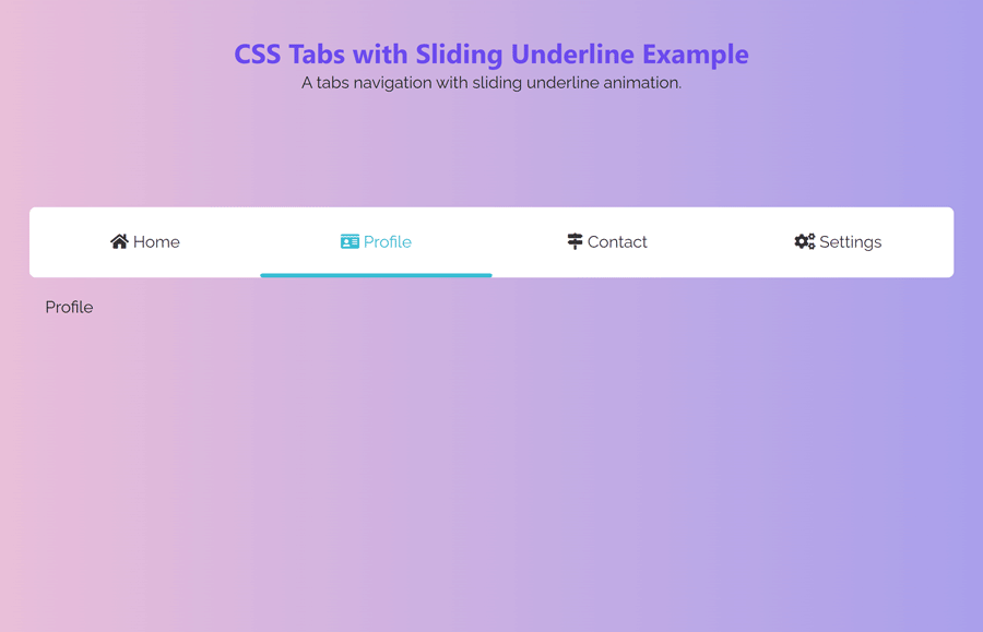
After that, create the Bootstrap native tabs structure and additionally prepend a div element with a class name "slider" inside the nav-tabs element.
<div class="tile" id="tile-1">

  <!-- Nav tabs -->
  <ul class="nav nav-tabs nav-justified" role="tablist">
    <div class="slider"></div>
     <li class="nav-item">
        <a class="nav-link active" id="home-tab" data-toggle="tab" href="#home" role="tab" aria-controls="home" aria-selected="true"><i class="fas fa-home"></i> Home</a>
      </li>
      <li class="nav-item">
        <a class="nav-link" id="profile-tab" data-toggle="tab" href="#profile" role="tab" aria-controls="profile" aria-selected="false"><i class="fas fa-id-card"></i> Profile</a>
      </li>
      <li class="nav-item">
        <a class="nav-link" id="contact-tab" data-toggle="tab" href="#contact" role="tab" aria-controls="contact" aria-selected="false"><i class="fas fa-map-signs"></i> Contact</a>
      </li>
    <li class="nav-item">
        <a class="nav-link" id="setting-tab" data-toggle="tab" href="#setting" role="tab" aria-controls="setting" aria-selected="false"><i class="fas fa-cogs"></i> Settings</a>
      </li>
  </ul>

  <!-- Tab panes -->
  <div class="tab-content">
  <div class="tab-pane fade show active" id="home" role="tabpanel" aria-labelledby="home-tab">Home</div>
  <div class="tab-pane fade" id="profile" role="tabpanel" aria-labelledby="profile-tab">Profile</div>
  <div class="tab-pane fade" id="contact" role="tabpanel" aria-labelledby="contact-tab">Contact</div>
  <div class="tab-pane fade" id="setting" role="tabpanel" aria-labelledby="setting-tab">Settings</div>
  </div>

</div>
In the above HTML code, you just need to add your tab’s titles and contents. Moreover, you can also wrap this code to any additional element according to your needs.
The CSS Styles for Tabs with Sliding Underline
In CSS, select the tile class and define its 80% width. It is the container element of tabs content. Define the 60px auto value for margin to align this container to the center of the page.
.tile{
  width:80%;
  margin:60px auto;
}
The "tab-pane" class represents the panel area where you placed the tab’s content. Specify the padding property with a 15px value to leave some space around the panels. Similarly, set height property and define value according to the height of contents. In my case, I have only one line in each panel. So I used 80px of height, you can increase it according to your content.
#tile-1 .tab-pane{
  padding:15px;
  height:80px;
}
The "nav-tabs" class is the container element of tabs. You just need to define its relative position. The other styles like background and border can be declared according to your needs.
#tile-1 .nav-tabs{
  position:relative;
  border:none!important;
  background-color:#fff;
/*   box-shadow: 0 2px 2px 0 rgba(0,0,0,0.14), 0 1px 5px 0 rgba(0,0,0,0.12), 0 3px 1px -2px rgba(0,0,0,0.2); */
  border-radius:6px;
}
Select the li tag of the nav-tabs class and define a 0px value for the margin to remove the spacing around the tabs titles. Similarly, target the a tag and define its relative position. Likewise, specify margin, padding, font size, border, and color properties with the following values:
#tile-1 .nav-tabs li{
  margin:0px!important;
}
#tile-1 .nav-tabs li a{
  position:relative;
  margin-right:0px!important;
  padding: 20px 40px!important;
  font-size:16px;
  border:none!important;
  color:#333;
}
The hyperlink inside the nav-tabs class is the title of the tab that allows users to switch between relevant tab content. We don’t need the Bootstrap default hover styles for this element. For this purpose, select the a element with hover pseudo-selector and define white background. Likewise, remove the border using border property with none value.
#tile-1 .nav-tabs a:hover{
  background-color:#fff!important;
  border:none;
}
Now, select the "slider" class and display it as an inline-block. Specify its width and height with 30px and 4px values respectively. Define a background color, border radius, and set its absolute position in order to animate it. Use the CSS transition property for smooth sliding of the underline.
#tile-1 .slider{
  display:inline-block;
  width:30px;
  height:4px;
  border-radius:3px;
  background-color:#39bcd3;
  position:absolute;
  z-index:1200;
  bottom:0;
  transition:all .4s linear;
}
In the end, select the "active" class and define a transparent background color. Define the none value for the border and set a color as follows. We’ll add this class (through a JS function) to the active tab title to slide the underline.
#tile-1 .nav-tabs .active{
  background-color:transparent!important;
  border:none!important;
  color:#39bcd3!important;
}
Functionalize Sliding Underline with JS
After creating the HTML and CSS, now it’s time to animate the underline. To do so, we’ll use the jQuery function to add an active class to the current tab and animate it using left position. So, load the jQuery and Bootstrap 4 JS into your project.
<!-- jQuery JS -->
<script src='https://cdnjs.cloudflare.com/ajax/libs/jquery/3.1.1/jquery.min.js'></script>
<!-- Bootstrap JS -->
<script src='https://cdnjs.cloudflare.com/ajax/libs/twitter-bootstrap/4.1.1/js/bootstrap.min.js'></script>
Finally, add the following JavaScript function after the above CDN links and done.
<script>
$(document).ready(function(){

  $("#tile-1 .nav-tabs a").click(function() {

  var position = $(this).parent().position();

  var width = $(this).parent().width();

    $("#tile-1 .slider").css({"left":+ position.left,"width":width});

   });
var actWidth = $("#tile-1 .nav-tabs").find(".active").parent("li").width();

var actPosition = $("#tile-1 .nav-tabs .active").position();

$("#tile-1 .slider").css({"left":+ actPosition.left,"width": actWidth});

});
</script>
That’all! I hope you have successfully created CSS tabs with sliding underline. If you have any questions or suggestions, let me know by comment below.
Hey there!
This is beautiful. Thanks for sharing! The only problem I’m having is that the underline is showing up BELOW the tab content. Any idea what I might be doing wrong?
Thanks!
Sharon
Hi Sharon!
Please make sure you have follow the tutorial correctly. You need to put your content inside the
"tab-content"div element as follows:Hey Asif, is there a JS ES6 version of this? This is very VERY clean!
Hey Asif – just a note that can’t go inside , it’s an a11y and semantic issue.
Article says “CSS Tabs” but you’re using not just Javascript, but include TWO HUGE FRAMEWORKS with Jquery and Bootstrap. This is the opposite of CSS, clean or lean.
Hi Skythe, if you don’t want to go with javascript or Frameworks then you can go with this one https://codeconvey.com/pure-css-tabs-with-indicator/ 🙂
@Ashfaq Ahmed My post sounded way too harsh, sorry. Thanks for doing this!
No worries, Skythe. I appreciate your comment and I understand your point of view. I just wanted to offer an alternative solution for those who may prefer pure CSS tabs. Thank you for your feedback and for taking the time to share your thoughts!