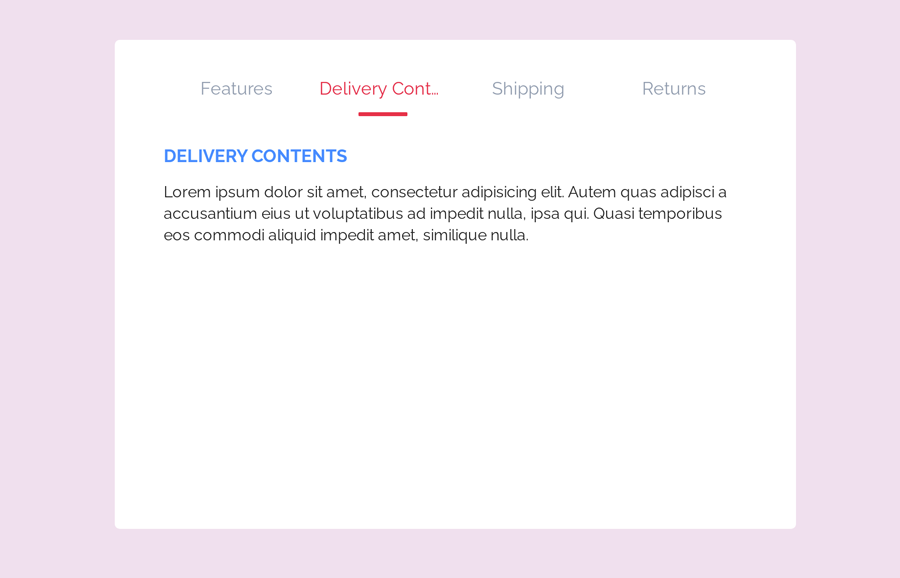
Do you want to create tabs with an indicator? If yes! then you are in the right place. Here you’ll learn how to create tabs with an animated indicator using pure CSS. The working of these tabs is that when users click the tab name/title, the indicator slide to the active tab name and tab content smoothly slide up.
The coding concept for this tabs navigation is quite similar to our previous animated content tabs. However, there is an animated visual guide (indicator) that indicates the activated tab. You can check the final output of these tabs on the demo page before getting started with coding.
HTML Structure
In HTML, create a div element with a class name "tabs" and place radio input elements (according to the number of tabs) inside it. Likewise, create the labels for inputs as tab names and wrap them into the HTML unordered list. Create a div element with a class name “indicator”, wrap it into a div element and define its class name “slider”. At last, specify sections for tabs contents and place the contents of your tab.
<div class="tabs">
   <input type="radio" id="tab1" name="tab-control" checked>
   <input type="radio" id="tab2" name="tab-control">
   <input type="radio" id="tab3" name="tab-control">
   <input type="radio" id="tab4" name="tab-control">
   <ul>
      <li title="Features"><label for="tab1" role="button"><span>Tab 1</span></label></li>
      <li title="Delivery Contents"><label for="tab2" role="button"><span>Tab 2</span></label></li>
      <li title="Shipping"><label for="tab3" role="button"><span>Tab 3</span></label></li>
      <li title="Returns"><label for="tab4" role="button"><span>Tab 4</span></label></li>
   </ul>
   <div class="slider">
      <div class="indicator"></div>
   </div>
   <div class="content">
      <section>
         <h2>Tab 1</h2>
         <p>Tab 1 content goes here.</p>
      </section>
      <section>
         <h2>Tab 2</h2>
         <p>Tab 2 content goes here.</p>
      </section>
      <section>
         <h2>Tab 3</h2>
         <p>Tab 3 content goes here.</p>
      </section>
      <section>
         <h2>Tab 4</h2>
         <p>Tab 4 content goes here.</p>
      </section>
   </div>
</div>
Inside the section tag, you can place any HTML elements like text, images, videos, and embedded content. You can also increase/decrease the number of tabs. To do so, just create another radio input, label tag, and a section related to that new tab.
CSS Styles for Tabs with Indicator
In CSS, define the styles for the main container of the tabs. Keep its position relative, define the background color, padding, and set the overflow auto. Here, the important CSS properties are min-width and min-height that you need to define 240px and 500px respectively.
.tabs {
	 left: 50%;
	 -webkit-transform: translateX(-50%);
	         transform: translateX(-50%);
	 position: relative;
	 background: white;
	 padding: 20px 50px;
	 width: 100%;
	 border-radius: 5px;
	 min-width: 240px;
     min-height: 500px;
    overflow: auto;
}
After that, specify the styles for labels that contain the tab names/titles. Define the font-size, color, and padding property. Similarly, create the styles for an unordered list, display it as flex and define flex-direction as a row. The other styles for tabs name are as follows:
 .tabs .content section h2, .tabs ul li label {
	 font-size: 18px;
	 color: #428bff;
}
 .tabs ul {
	 list-style-type: none;
	 padding-left: 0;
	 display: -webkit-box;
	 display: flex;
	 -webkit-box-orient: horizontal;
	 -webkit-box-direction: normal;
	         flex-direction: row;
	 margin-bottom: 10px;
	 -webkit-box-pack: justify;
	         justify-content: space-between;
	 -webkit-box-align: end;
	         align-items: flex-end;
	 flex-wrap: wrap;
}
 .tabs ul li {
	 box-sizing: border-box;
	 -webkit-box-flex: 1;
	         flex: 1;
	 width: 25%;
	 padding: 0 10px;
	 text-align: center;
}
 .tabs ul li label {
	 -webkit-transition: all 0.3s ease-in-out;
	 transition: all 0.3s ease-in-out;
	 color: #929daf;
	 padding: 5px auto;
	 overflow: hidden;
	 text-overflow: ellipsis;
	 display: block;
	 cursor: pointer;
	 -webkit-transition: all 0.2s ease-in-out;
	 transition: all 0.2s ease-in-out;
	 white-space: nowrap;
	 -webkit-touch-callout: none;
     user-select: none;
}
Now, define a color for the activated tab title and remove its outline by defining 0 value for it.
 .tabs ul li label:hover, .tabs ul li label:focus, .tabs ul li label:active {
	 outline: 0;
	 color: #bec5cf;
}
Likewise, specify styles for tabs indicator slider. Keep its position relative, define its width in percentages according to the number of tabs. Next, create styles for the indicator, set background color, define the width, and height property as mentioned below:
 .tabs .slider {
	 position: relative;
	 width: 25%;
	 -webkit-transition: all 0.33s cubic-bezier(0.38, 0.8, 0.32, 1.07);
	 transition: all 0.33s cubic-bezier(0.38, 0.8, 0.32, 1.07);
}
 .tabs .slider .indicator {
	 position: relative;
	 width: 50px;
	 max-width: 100%;
	 margin: 0 auto;
	 height: 4px;
	 background: #EB3349;
	 border-radius: 1px;
}
You need to hide the content of the tab that will be revealed when users click the related tab title. To do so, define the “none” value for the display property. Apply the CSS animation “content” (that we’ll create next) and define its duration as 0.3s.
 .tabs .content section {
	 display: none;
	 -webkit-animation-name: content;
	         animation-name: content;
	 -webkit-animation-direction: normal;
	         animation-direction: normal;
	 -webkit-animation-duration: 0.3s;
	         animation-duration: 0.3s;
	 -webkit-animation-timing-function: ease-in-out;
	         animation-timing-function: ease-in-out;
	 -webkit-animation-iteration-count: 1;
	         animation-iteration-count: 1;
	 line-height: 1.4;
}
Display the tab when radio input checked by targeting the selectors with the following CSS rules.
 .tabs input[name="tab-control"]:nth-of-type(1):checked ~ ul > li:nth-child(1) > label {
	 cursor: default;
	 color: #EB3349;
}
 .tabs input[name="tab-control"]:nth-of-type(4):checked ~ .slider {
	 -webkit-transform: translateX(300%);
	         transform: translateX(300%);
}
 .tabs input[name="tab-control"]:nth-of-type(4):checked ~ .content > section:nth-child(4) {
	 display: block;
}
Hide the default dots for radio input by defining "none" value for the display property.
 .tabs input[name="tab-control"] {
	 display: none;
}
Add the following CSS keyframes for sliding animation for tabs content.
 @-webkit-keyframes content {
	 from {
		 opacity: 0;
		 -webkit-transform: translateY(5%);
		         transform: translateY(5%);
	}
	 to {
		 opacity: 1;
		 -webkit-transform: translateY(0%);
		         transform: translateY(0%);
	}
}
 @keyframes content {
	 from {
		 opacity: 0;
		 -webkit-transform: translateY(5%);
		         transform: translateY(5%);
	}
	 to {
		 opacity: 1;
		 -webkit-transform: translateY(0%);
		         transform: translateY(0%);
	}
}
 @media (max-width: 1000px) {
	 .tabs ul li label {
		 white-space: initial;
	}
}
Make the Tabs Responsive
Define styles for the small screen by using CSS media queries in order to make the tabs responsive.
@media (max-width: 600px) {
	 .tabs input[name="tab-control"]:nth-of-type(1):checked ~ ul > li:nth-child(1) > label {
		 background: rgba(0, 0, 0, 0.08);
	}
}
 .tabs input[name="tab-control"]:nth-of-type(1):checked ~ .slider {
	 -webkit-transform: translateX(0%);
	         transform: translateX(0%);
}
 .tabs input[name="tab-control"]:nth-of-type(1):checked ~ .content > section:nth-child(1) {
	 display: block;
}
 .tabs input[name="tab-control"]:nth-of-type(2):checked ~ ul > li:nth-child(2) > label {
	 cursor: default;
	 color: #EB3349;
}

 @media (max-width: 600px) {
	 .tabs input[name="tab-control"]:nth-of-type(2):checked ~ ul > li:nth-child(2) > label {
		 background: rgba(0, 0, 0, 0.08);
	}
}
 .tabs input[name="tab-control"]:nth-of-type(2):checked ~ .slider {
	 -webkit-transform: translateX(100%);
	         transform: translateX(100%);
}
 .tabs input[name="tab-control"]:nth-of-type(2):checked ~ .content > section:nth-child(2) {
	 display: block;
}
 .tabs input[name="tab-control"]:nth-of-type(3):checked ~ ul > li:nth-child(3) > label {
	 cursor: default;
	 color: #EB3349;
}

 @media (max-width: 600px) {
	 .tabs input[name="tab-control"]:nth-of-type(3):checked ~ ul > li:nth-child(3) > label {
		 background: rgba(0, 0, 0, 0.08);
	}
}
 .tabs input[name="tab-control"]:nth-of-type(3):checked ~ .slider {
	 -webkit-transform: translateX(200%);
	         transform: translateX(200%);
}
 .tabs input[name="tab-control"]:nth-of-type(3):checked ~ .content > section:nth-child(3) {
	 display: block;
}
 .tabs input[name="tab-control"]:nth-of-type(4):checked ~ ul > li:nth-child(4) > label {
	 cursor: default;
	 color: #EB3349;
}

 @media (max-width: 600px) {
	 .tabs input[name="tab-control"]:nth-of-type(4):checked ~ ul > li:nth-child(4) > label {
		 background: rgba(0, 0, 0, 0.08);
	}
}
All finished! I hope now you are able to create tabs with indicator using pure CSS. If you need any further help related to tabs navigation, let me know by comment below.
Hello,
I have a question about CSS Tabs with Indicator Code.
1. What I have to remove in order to have 3 tabs instead of 4?
2. Where I have to add in order to have an icon on each tab? Like here:
https://codepen.io/dsr/pen/BajwzwY
Thank you,
Egle
Hi Egle!
If you want to have only three tabs then remove the 4th radio input:
Similarly, remove the label of 4th tab.
And also, remove the content of 4th tab wrapped in <div class=”content”>.
If you want to add icons with tab’s labels, first load the Font Awesome CSS in the head tag of your project.
Then add the icon class before the tab name:
You can browse the all icons here:
https://www.fontawesomecheatsheet.com/