Tabs are navigational items to switch between the relevant contents being on the same webpage. It makes easy to navigate specific content without loading the whole page. Besides this, tabs are useful to display contents in a short space of the webpage. Basically, tabs require JavaScript to switch contents or load content using AJAX. But, in this tutorial, we’ll create animated content tabs with CSS3 only.
Yes! it’s possible to switch tabs content using HTML radio input and label elements. As you’ve seen on the demo page (visit demo page if you didn’t check yet), tab names have an animated sliding bar. When a user clicks on a tab, this slider bar smoothly moves to the activated tab.
The coding concept for CSS only tabs is really straightforward. The coding is the same as the pure CSS vertical tabs that we’ve created a few months back. But, these tabs come with a horizontal layout and especially an animated sliding bar. So, let’s start the coding for content tabs.
HTML for Animated Content Tabs
First of all, create a radio input (with a unique id like “r1″ ) and label elements just after it. This label tag will hold a tab name, point it to the radio input (using HTML” for” attribute). After that, create a div element with class name “content” and place your first tab contents in it. Similarly, repeat the same syntax for next tabs, just update id for radio input, such as for the second tab use “r2” and so on.
After creating HTML for tabs, create a div element with id “slider” and place it at the end of tabs. Finally, wrap all these elements into a container (a div tag) and define its class “tabs”.
<div class='tabs'>
<input type='radio' id='r1' name='t' checked>
<label for='r1'>Tab One</label>
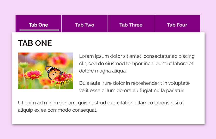
<div class='content'>First Content</div>
<input type='radio' id='r2' name='t'>
<label for='r2'>Tab Two</label>
<div class='content'>Second tab contents goes here.</div>
<input type='radio' id='r3' name='t'>
<label for='r3'>Tab Three</label>
<div class='content'>Third tab contents.</div>
<input type='radio' id='r4' name='t'>
<label for='r4'>Tab Four</label>
<div class='content'>Tab four contents.</div>
<div id='slider'></div>
</div>
Keep in mind, don’t add any extra (HTML) element between the radio input, label, and div (that has the class name “content”). It is because we’ll use CSS + selector (element placed immediately after element) method to functionalities the tabs navigations. However, you can place anything inside “content” div.
The CSS3 Styles for Tabs
OK! now declare the following CSS styles for tabs (main container) and tab names.
.tabs {
  box-shadow: 2px 2px 8px rgba(0, 0, 0, 0.5);
  position: absolute;
  top: 51%;
  left: 50%;
  height: 50%;
  min-width: 615px;
  transform: translate(-50%, -50%);
}

label, #slider {
  display: inline-block;
  font-weight: bold;
  text-align: center;
  background: purple;
  user-select: none;
  color: rgba(255, 255, 255, 0.80);
  width: 150px;
  height: auto;
  padding: 20px 30px;
  margin-left: -3px;
}

label:hover {
  color: white;
  cursor: pointer;
}
Define the CSS styles for the tab’s contents as follows. If you want to customize the content area, you can pass the custom values for the background (that is white by default), padding and box-shadow, etc.
.content {
  position: absolute;
  top: 56px; right: 0; bottom: 0; left: 0;
  background: white;
  display: none;
  min-height: 300px;
     box-shadow: 2px 2px 8px rgba(0, 0, 0, 0.5);
    margin-left: -15px;
    padding: 20px;

}
The following are some styles for a sliding bar (shown below the activated tab name). If you want to customize this slider, you can change its color and thickness by updating the values of the border-bottom attribute.
#slider {
  background-color: transparent;
  position: absolute;
  border-bottom: 3px solid white;
  margin: 7px 10px;
  transition: transform 0.5s;
  width: 130px;
}
Now we’ll functionalities tabs switch by using CSS :checked pseudo and the preceded selector.
[type=radio],#r1:checked ~ #slider {
  transform: translate(-600px, 0px);
}

[type=radio],#r2:checked ~ #slider {
  transform: translate(-450px, 0px);
}

[type=radio],#r3:checked ~ #slider {
  transform: translate(-300px, 0px);
}
[type=radio],#r4:checked ~ #slider {
  transform: translate(-150px, 0px);
}


[type=radio]:checked + label {
  color: white;
}

[type=radio]:checked + label + .content {
  display: inline-block;
}
Finally hide (default circle shape of) HTML radio input and done.
.tabs [type=radio] {
  display: none;
}
That’s all! I hope you like this tutorial to create animated content tabs using CSS3. If you have any questions or suggestions related to pure CSS3 tabs, feel free to comment below.