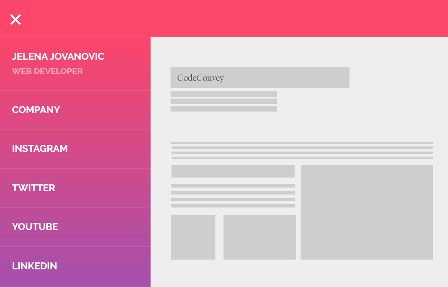
Today, I’m going to share a responsive vertical sidebar toggle menu with a step-by-step implementation guide. This sidebar navigation menu comes with an animated hamburger button to toggle the menu drawer. Likewise, the CSS gradient color used in the sidebar that makes it eye-catchy.
Generally, a hamburger menu requires a small function of JavaScript to toggle the menu drawer. But, it can also functionalize using HTML radio input and pure CSS.
This sidebar navigation menu is also built with pure CSS. So, there is no need for JavaScript/jQuery to toggle the menu. Furthermore, it can be customized with a little bit changing in CSS values according to your needs. So, let’s begin with its markup structure to implement this sidebar toggle menu in your project.
HTML for Responsive Vertical Sidebar Toggle Menu
The HTML consists of three parts, a navbar, a hamburger button and a sidebar drawer that contains navigation links. The first div element defines the navbar that is empty by default. However, you can place your site logo or title of your navigation in the navbar. The second element is HTML radio input that will be used to hide/show the menu drawer.
The third div element with id “sidebarMenu” defines the side menu drawer and contains navigations links. You can place your site’s links in it as many as you need.
<div class="header"></div>
  <input type="checkbox" class="openSidebarMenu" id="openSidebarMenu">
  <label for="openSidebarMenu" class="sidebarIconToggle">
    <div class="spinner diagonal part-1"></div>
    <div class="spinner horizontal"></div>
    <div class="spinner diagonal part-2"></div>
  </label>
  <div id="sidebarMenu">
    <ul class="sidebarMenuInner">
      <li>Jelena Jovanovic <span>Web Developer</span></li>
      <li><a href="#1">Company</a></li>
      <li><a href="#2">Instagram</a></li>
      <li><a href="#3" target="_blank">Twitter</a></li>
      <li><a href="#4">YouTube</a></li>
      <li><a href="#5" target="_blank">Linkedin</a></li>
    </ul>
  </div>
If you want to add more menu links, just add another anchor tag wrap into li inside the ul (<ul class="sidebarMenuInner">). Similarly, you can put your site logo inside the<div class="header"> tag.
The CSS Styles
As the above HTML, first of all, we’ll define some styles for the header (navbar). We keep it sticky using CSS position fixed property, if you want to make it static just remove position attribute. If you want to change its thickness, update the height value. Similarly, you are also able to change its background color according to your own theme.
.header {
    display: block;
    margin: 0 auto;
    width: 100%;
    max-width: 100%;
    box-shadow: none;
    background-color: #FC466B;
    position: fixed;
    height: 60px!important;
    overflow: hidden;
    z-index: 10;
}
The following are CSS styles for the sidebar menu drawer. All its properties are quite fit, so there is nothing to customize. However, you can change its width that is 250px and background color.
#sidebarMenu {
    height: 100%;
    position: fixed;
    user-select: none;
    left: 0;
    width: 250px;
    margin-top: 60px;
    transform: translateX(-250px);
    transition: transform 250ms ease-in-out;
    background: linear-gradient(180deg, #FC466B 0%, #3F5EFB 100%);
}
.sidebarMenuInner{
    margin:0;
    padding:0;
    border-top: 1px solid rgba(255, 255, 255, 0.10);
}
.sidebarMenuInner li{
    list-style: none;
    color: #fff;
    text-transform: uppercase;
    font-weight: bold;
    padding: 20px;
    cursor: pointer;
    border-bottom: 1px solid rgba(255, 255, 255, 0.10);
}
.sidebarMenuInner li span{
    display: block;
    font-size: 14px;
    color: rgba(255, 255, 255, 0.50);
}
Now we’ll style the menu links and their hover effect. According to the below CSS, the menu links text will be transformed to uppercase. If you want to keep your link text lowercase, just remove the text-transform: uppercase; line. Similarly, you can also set the custom color that is #fff (white) by default.
.sidebarMenuInner li a{
    color: #fff;
    text-transform: uppercase;
    font-weight: bold;
    cursor: pointer;
    text-decoration: none;
}
.sidebarMenuInner li:hover{
    background: rgba(0, 0, 0, 0.10);
}
Add the following CSS code for the animated hamburger toggle button. If you want to increase/decrease its size, just update the height and width values (that are 22px respectively).
.sidebarIconToggle {
    transition: all 0.3s;
    box-sizing: border-box;
    cursor: pointer;
    position: absolute;
    z-index: 99;
    height: 100%;
    width: 100%;
    top: 22px;
    left: 15px;
    height: 22px;
    width: 22px;
}
.spinner {
    transition: all 0.3s;
    box-sizing: border-box;
    position: absolute;
    height: 3px;
    width: 100%;
    background-color: #fff;
}
.horizontal {
    transition: all 0.3s;
    box-sizing: border-box;
    position: relative;
    float: left;
    margin-top: 3px;
}
.diagonal.part-1 {
    position: relative;
    transition: all 0.3s;
    box-sizing: border-box;
    float: left;
}
.diagonal.part-2 {
    transition: all 0.3s;
    box-sizing: border-box;
    position: relative;
    float: left;
    margin-top: 3px;
}
At last, include the following CSS snippet into your project to functionalize the hamburger toggle menu.
<pre class="prettyprint lang-html">
input[type="checkbox"]:checked ~ #sidebarMenu {
    transform: translateX(0);
}

input[type=checkbox] {
    transition: all 0.3s;
    box-sizing: border-box;
    display: none;
}
input[type=checkbox]:checked ~ .sidebarIconToggle > .horizontal {
    transition: all 0.3s;
    box-sizing: border-box;
    opacity: 0;
}
input[type=checkbox]:checked ~ .sidebarIconToggle > .diagonal.part-1 {
    transition: all 0.3s;
    box-sizing: border-box;
    transform: rotate(135deg);
    margin-top: 8px;
}
input[type=checkbox]:checked ~ .sidebarIconToggle > .diagonal.part-2 {
    transition: all 0.3s;
    box-sizing: border-box;
    transform: rotate(-135deg);
    margin-top: -9px;
}
</pre>
That’s all! Let me know by comment below if you have successfully implemented this sidebar toggle menu into your project.
this is lovely , it was responsive and looking beatiful