Do you want to create responsive side navigation menu for mobile? Let’s check out this tutorial and learn how you can create a side navigation menu. It also works on desktop as well.
Previously, We have created a JavaScript CSS slide out menu which handles through one button and today, We are going to build a different example of a responsive slide from the left navigation by using CSS3 transitions and jQuery.
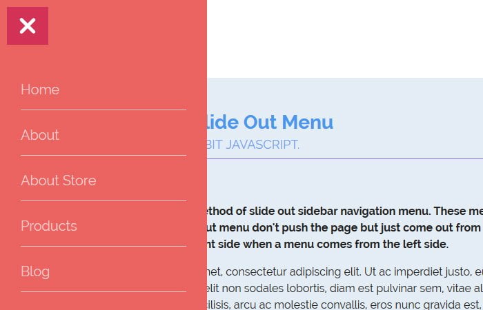
It is a sidebar navbar which shows a full height column from the left side of the page without pushing its main content area. It can be also called overlay navigation which stays on the page without pushing the content area.
Such type of navigating is very famous nowadays and it increases the beauty of the design. It gives the user to quickly find the most important menu and can be perfect for e-commerce websites which have too many links.
This animated close-able side navigation is an example of a fixed menu that slides out from the left/right sides of the page.
In this tutorial, we are going to create the sliding menu that will slide-out from the left aspect of the page by clicking a link or toggle button.
This method is very famous and mostly used nowadays in front-end development. This technique originally derived from how Facebook has popularized the off-canvas look on their app or mobile website.
It’s kind of sliding Side navigation menu which works in a way that when a toggle button clicked, The menu slide-out from the left side of the page and body content will stay behind that menu list. It will keep open until you press the toggle button again to close out a menu.
Markup for Side Navigation Menu
Let’s talk about how we can create this menu by using CSS3 transitions and a bit of JavaScript. First of all, we have to define simple HTML markup and we will do in the standard way by defining the unordered list.
Next, we need to set a toggle button that helps us to create the event for open and closes the menu. We will wrap up all of this in the main wrapper div class .NavigationSlideOut
<div class="NavigationSlideOut">
    <ul class="navbar">
      <li class="NavigationTab"><a href="#"><p>Home</p></a></li>
      <li class="NavigationTab"><a href="#"><p>About</p></a></li>
      <li class="NavigationTab"><a href="#"><p>About Store</p></a></li>
      <li class="NavigationTab"><a href="#"><p>Products</p></a></li>
      <li class="NavigationTab"><a href="#"><p>Blog</p></a></li>
      <li class="NavigationTab"><a href="#"><p>Events</p></a></li>
      <li class="NavigationTab"><a href="#"><p>Contact</p></a></li>
    </ul>
</div>
Here is simple HTML code for toggle button for open/close the menu.
<div class="menuIcon">
    <div class="line_one"></div>
    <div class="line_two"></div>
    <div class="line_three"></div>
</div>
The CSS Styles for Menu
After HTML coding, create CSS styles for responsive side navigation menu as follows:
.NavigationSlideOut {
  font-family: 'Lato', Arial, sans-serif;
  width: 300px;
  height: 100%;
  position: fixed;
  top: 0;
  left: -300px;
  background-color: #EB6361;
  float: left;
  z-index: 1000;
  transition-timing-function: ease;
}
.navbar {
  width: 300px;
  height: auto;
  display: block;
  margin: 0;
  padding: 100px 0 0 0;
}
.NavigationTab {
  width: 300px;
  height: 3em;
  display: block;
  font-size: 22px;

}
.NavigationTab a {
  text-decoration: none;
}
.NavigationTab a p {
  color: rgba(255,255,255,0.65);
  margin: 0 auto;
  padding: 0;
  vertical-align: middle;
  font-size: 0.9em;
  line-height: 3;
  width: 80%;
  border-bottom: 1px solid rgba(255,255,255,0.65);
  transition: all ease 0.35s;
}
.NavigationTab:hover p {
  width: 110px;
  border-bottom: 2px solid #fff;
  color: #fff;
  transition: all ease 0.35s;
  text-align:center;
}
.NavigationTab:hover {
  transition: ease 0.35s;
}
.menuIcon {
  background:#D33257;
  position: fixed;
  top: 0;
  left: 0px;
  margin: 10px;
  padding: 10px;
  z-index: 1002;
  cursor:pointer;
}
.menuIcon div {
  width: 30px;
  height: 5px;
  background: #fff;
  margin: 5px;
  transition: 0.35s ease-in-out;
  border-radius: 3px;
}
.on .line_one {
  transform: rotate(45deg) translate(7px, 7px);
}
.on .line_two {
  opacity: 0;
}
.on .line_three {
  transform: rotate(-45deg) translate(7px, -7px);
}
The JavaScript
Just to make sure that you should add core file of jQuery. You can download from here.
$(document).ready(function () {
  $('.menuIcon').click(function () {
      if ($('.NavigationSlideOut').css("left") == "-300px") {
          $('.NavigationSlideOut').animate({left: '0px'}, 350);
      }
      else  {
          $('.NavigationSlideOut').animate({left: '-300px'}, 350);
      }
  });
  $(document).click(function(){
    if($('.NavigationSlideOut').css('left') == '0px' && $('.menuIcon').hasClass('on') ) {
      $('.NavigationSlideOut').animate({left: '-300px'}, 350);
      $('.menuIcon').toggleClass("on");
    }
  })
  $('.menuIcon').click(function () {
    $(this).toggleClass("on");
  }); // animation = -> x
});
Hope you enjoy this simple sliding-out menu tutorial and it will help you with your next project building. Let’s us know in below comment section how it helps you.