Looking for a solution to create an automatic image slider with the help of HTML & CSS? Check out the demo and download the source code of this multi-photo Carousel.
You surely try out many JavaScript or jQuery sliders for your website. But how about one build with CSS only? You may be thinking such sliders are limited in their functionality, right?
But with the help of CSS3 animations, we are able to build a nice-looking & multi-function slider. One such function is called automation and we can create a CSS-only slider that supports the automatic function.
Such sliders allow us to automatically slide the images within the time limit we set through CSS animation functions.
Furthermore, you can also convert this slider into a text or content base automatic slider by simply removing the tag img and place the text.
Properly, you don’t know that the JavaScript slider slows down your site or webpage. Additionally, they don’t work well if the user has disabled the JavaScript interpretation in the browser.
One of the best solutions to this problem is don’t use the slider or go with the CSS build slideshow.
Create HTML for Automatic Slider
We will start the HTML with a hidden element. It’s an input type checkbox with a unique ID and a class. This class will help us to control the label.
The label actually will be a toggle button which will we can switch ON/OFF to play the slider automatically. When we set the toggle ON, the slider images will automatically slide from right to left.
<input id="sliderSwitch" class="slider__switch" type="checkbox" name="sliderSwitch" hidden />
The next step for HTML source code is to define the images for the slider and for this, We will create a div with a class name slider. We will place the images with the help of the unordered list element to keep the HTML nice and clean.
For each list element, we have a class name slider__slide.
<div class="slider">
<ul class="slider__list">
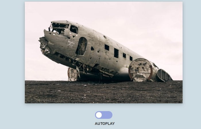
<li class="slider__slide"><img src="https://source.unsplash.com/rHi-KR_NA24/650x420" alt="Slide image number 1 with plane" /></li>
<li class="slider__slide"><img src="https://source.unsplash.com/FxU8KV7psMY/650x420" alt="Slide image number 2 with Golden Gate Bridge" /></li>
<li class="slider__slide"><img src="https://source.unsplash.com/Aa8_X_YgrO4/650x420" alt="Slide image number 3 with Flatiron Building in New York" /></li>
<li class="slider__slide"><img src="https://source.unsplash.com/8bzsuFNkiT8/650x420" alt="Slide image number 4 with mountain climber" /></li>
</ul>
</div>
Finally, We will define our last HTML element controller.
<div class="slider__control">
  <label for="sliderSwitch"></label>
</div>
Apply Styling Over Slider
Now we will apply the styling over the slider to make it work with HTML. We will start with base styles that are our body of the page and of course a fallback for the hidden attribute.
/**
 * Base
 */
body {
  font-size: 100%;
  background: #cedce3;
}

/* Fallback for hidden attribute */
hidden {
  display: none;
}
The basic styling starts from here. We will apply position relative to .slider so the absolute position works with list items.
Moreover, We will add some margin, width/height according to our need, and box-shadow to stand out the slider.
.slider {
  position: relative;
  margin-top: 3rem;
  margin-right: auto;
  margin-left: auto;
  overflow: hidden;
  width: 40.625rem;
  height: 26.25rem;
  box-shadow: 0 4px 14px rgba(0, 0, 0, 0.25);
}
.slider__list {
  position: absolute;
  left: 0;
  width: 162.5rem;
}
.slider__slide {
  float: left;
}
In order to create an automatic image slider in HTML, the following CSS code is required. Also, add it to your project.
.slider__control {
  margin-right: auto;
  margin-left: auto;
  width: 4.5rem;
  font-family: sans-serif;
}
.slider__control label {
  position: relative;
  display: block;
  margin-top: 2rem;
  margin-bottom: 1rem;
  width: 4.5rem;
  height: 2rem;
  font-size: 1rem;
  font-weight: normal;
  line-height: 1.5;
  color: transparent;
  background: #ddd;
  border-radius: 2rem;
  cursor: pointer;
  -webkit-transition: left 0.15s ease-out;
  transition: left 0.15s ease-out;
}
.slider__control label:before {
  content: "autoplay";
  position: absolute;
  top: 2.5rem;
  left: 0;
  color: #333;
 font-size: .95rem;
  font-weight: bold;
  text-transform: uppercase;
}
.slider__control label:after {
  content: "";
  position: absolute;
 top: .25rem;
 left: .25rem;
  display: block;
  width: 1.5rem;
  height: 1.5rem;
  border-radius: 2rem;
  background: #fff;
  -webkit-transition: left 0.15s ease-out;
  transition: left 0.15s ease-out;
  -webkit-transform: translate3d(0, 0, 0);
  transform: translate3d(0, 0, 0);
}
.slider__switch:checked + .slider > .slider__list {
  -webkit-animation-name: autoplay;
  animation-name: autoplay;
  /* This will change the time it takes to move to next slide */
  -webkit-animation-duration: 10s;
  animation-duration: 10s;
  -webkit-animation-iteration-count: infinite;
  animation-iteration-count: infinite;
}
.slider__switch:checked + .slider + .slider__control > label { background: #455a64; }
.slider__switch:checked + .slider + .slider__control > label:after { left: 2.75rem; }
To enable the autoplay function, We will use the CSS3 animation. We will set a different position for each slide so they move accordingly.
@-webkit-keyframes
autoplay {   /* position of the first slide */
  0% {
 left: 0;
}
  /* position of the second slide */
  25% {
 left: -40.625rem;
}
  /* position of the third slide */
  50% {
 left: -81.25rem;
}
  /* position of the fourth slide */
  100% {
 left: -121.875rem;
}
}
@keyframes
autoplay {   /* position of the first slide */
  0% {
 left: 0;
}
  /* position of the second slide */
  25% {
 left: -40.625rem;
}
  /* position of the third slide */
  50% {
 left: -81.25rem;
}
  /* position of the fourth slide */
  100% {
 left: -121.875rem;
}
}
Conclusion
That’s it. We are done with the slider and it’s ready for implementation. You can check out the demo and download the source code.
Just to mention here, It will not overload your site and also consumes less browser memory. It will also work if the Javascript is disabled in the browser.
I’m liking your slider but there is one thing that isn’t all that obvious. That is the slide display duration. Even though you can change the rate of transition, the length of display is always the same and the last slide always transitions slower than all the rest. What’s up?
Hello Joe!
You need to change the value of animation-duration instead of transition.
.slider__switch:checked + .slider > .slider__list { /* This will change the time it takes to move to next slide */ -webkit-animation-duration: 20s; animation-duration: 20s; }Your Slideshow works great; but, My question regards to BACKGROUND Image Slideshow Auto-Scrolling, as I have Open-Close Curtains [= working perfectly] that COVER your Slideshow ….
But the situation remains that, while your Auto-Scrolling shows up ALSO [= working perfectly], it IS SHOWING UP OVER the curtains, and NOT BEHIND them …
Both, codes for the Curtains and Slideshow still work PERFECTLY simultaneously, except for the Slideshow BEHIND the Curtains …
I am sure that it is something to do with LAYERED Coding, or not?
Please advise at your earliest convenience …
Best of Regards
Hello Peter!
Yes, you need to use the z-index property if you have placed your images as a background but slides are behind the Curtains. You can bring the slides to the front using:
.slider__slide{ z-index: 999; }Could this slider be responsive?
Hi David!
Did you try 100% width of the slider for tablet and mobile media screens? Use the following CSS snippet:
/* Responsive Slider */ @media only screen and (max-wdith: 720px){ .slider { width: 100%; height: 100% } .slider__slide img{ width: 100%; height: auto; } }Why did you decide to activate with a button? I feel like most sliders start on auto slide..
Just curious.