A navbar is an important element to navigate the webpage contents. It allows users to directly access the main pages of a website. A navigation system can be designed in various formats including vertical side menu and multilevel dropdown menu. In this tutorial, we are going to build a simple but responsive navbar using pure CSS.
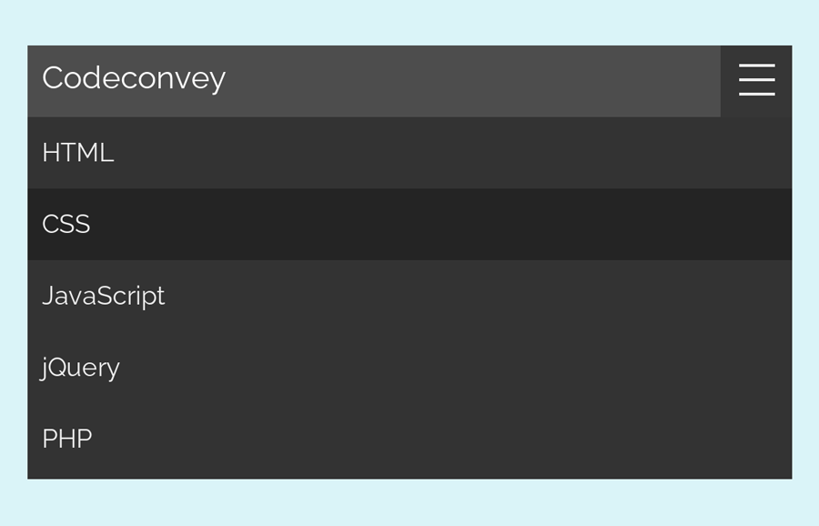
Before going further, I’ll suggest you check out the final output of this navbar on the demo page. This navbar converts into a hamburger menu on (small media screens) mobile devices. Besides this, there is also a place for the brand logo/ nav title.
Although it looks really simple on the desktop but on mobile devices the hamburger icon and smooth toggle effect make it attractive. So, it’s a good choice to implement this navbar in mobile-friendly web projects. OK! let’s get started with HTML coding to create a responsive navbar.
HTML Structure for Navbar
The HTML coding concept is really straightforward that consists of four main elements. You need to create a checkbox, nav logo place, hamburger icon, and navigation links. The checkbox input will be used to toggle the menu when the user clicks the hamburger button. So, create all these elements (like the following code) and wrap them into a div with a class name “nav”.
<div class="nav">
  <input type="checkbox" id="nav-check">
  <div class="nav-header">
    <div class="nav-title">
      Codeconvey
    </div>
  </div>
  <div class="nav-btn">
    <label for="nav-check">
      <span></span>
      <span></span>
      <span></span>
    </label>
  </div>

  <div class="nav-links">
    <a href="#1">HTML</a>
    <a href="#2">CSS</a>
    <a href="#3">JavaScript</a>
    <a href="#4">jQuery</a>
    <a href="#5">PHP</a>
  </div>
</div>
In the "nav-title" div tag, you can also place your logo (in image format) and style it with additional CSS.
Basic Styles
In CSS, set some basic styles for the “.nav” selector. In order to define its thickness, use the CSS height property. You can set the custom value for height (that is 50px) to increase/decrease the size of the navbar. Similarly, set the background color according to your project’s theme. Display the nav header (logo area) as inline-block.
.nav {
  height: 50px;
  width: 100%;
  background-color: #4d4d4d;
  position: relative;
}

.nav > .nav-header {
  display: inline;
}
Now, define the CSS styles for nav title/logo. Display it as inline-block, set font-size, color, and padding property.
.nav > .nav-header > .nav-title {
  display: inline-block;
  font-size: 22px;
  color: #fff;
  padding: 10px 10px 10px 10px;
}
After that, style the navigation links and their hover style. Float them to right (for RTL, use the left value for floating). Similarly, define the other CSS properties mentioned below.
.nav > .nav-links {
  display: inline;
  float: right;
  font-size: 18px;
}

.nav > .nav-links > a {
  display: inline-block;
  padding: 13px 10px 13px 10px;
  text-decoration: none;
  color: #efefef;
}

.nav > .nav-links > a:hover {
  background-color: rgba(0, 0, 0, 0.3);
}
We need to hide the hamburger icon (for desktop) and checkbox input. To do so, use the CSS display none property just like the below code.
.nav > .nav-btn,
.nav > #nav-check {
  display: none;
}
CSS to Make Navbar Responsive
Now it’s time to make the hamburger icon and show it only on the mobile screen. Use the CSS media queries with 600px max-width that is ideal for mobile devices. Finally, define the following code:
@media (max-width:600px) {
  .nav > .nav-btn {
    display: inline-block;
    position: absolute;
    right: 0px;
    top: 0px;
  }
  .nav > .nav-btn > label {
    display: inline-block;
    width: 50px;
    height: 50px;
    padding: 13px;
  }
  .nav > .nav-btn > label:hover,.nav  #nav-check:checked ~ .nav-btn > label {
    background-color: rgba(0, 0, 0, 0.3);
  }
  .nav > .nav-btn > label > span {
    display: block;
    width: 25px;
    height: 10px;
    border-top: 2px solid #eee;
  }
  .nav > .nav-links {
    position: absolute;
    display: block;
    width: 100%;
    background-color: #333;
    height: 0px;
    transition: all 0.3s ease-in;
    overflow-y: hidden;
    top: 50px;
    left: 0px;
  }
  .nav > .nav-links > a {
    display: block;
    width: 100%;
  }
  .nav > #nav-check:not(:checked) ~ .nav-links {
    height: 0px;
  }
  .nav > #nav-check:checked ~ .nav-links {
    height: calc(100vh - 50px);
    overflow-y: auto;
  }
That’s all! I hope you like this pure CSS responsive navbar and successfully implemented into your web project. If you have any questions or suggestions related to this navbar, don’t hesitate to comment below.
I Liked it a lot.Thanks , Keep uploading contents
Hi Shahab Uddin!
You are welcome. Keep visiting us for more awesome content.
Hey there! Thanks for the the great tutorial: this is a perfect and simple pure-CSS ham nav.
I’ve been trying to figure out how to do a mobile-first version, and I can’t figure it out. Do you have any ideas?
Thanks 🙂
Hi Cheyenne!
Remove the CSS code form @media (max-width:600px) { } and place the other CSS code inside the desktop media screen. You also need to do some changes in CSS to make it mobile-first version. Like, hide the hamburger button on desktop:
@media only screen and (min-width: 720px){
.nav > .nav-btn,
.nav > #nav-check {
  display: none;
}
}