One day, we were working on a project to create a lite web page template. One of my juniors asked me to suggest a lightweight jQuery plugin for the drop-down menu. I wondered to hear that and suggest him to create a navigation menu using CSS only. Actually, that’s was a really simple project, so we didn’t add any JavaScript library in that. So, we just created a pure CSS responsive drop down menu that we are going to share in this tutorial.
This navigation menu consists of a logo, a toggle button (that will show on mobile) and dropdown links. The drop-down can be nested up to 3 levels to make a multilevel dropdown menu. Besides this, you can fully customize background color, the thickness of menubar, etc by minor changing in CSS code.
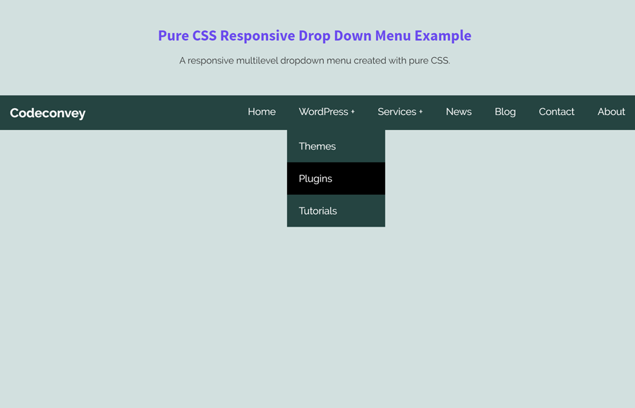
OK! now let’s begin the coding process to build a responsive dropdown menu.
HTML for Responsive Drop Down Menu
First of all, create the HTML5 nav element and place a div element (for logo), label element and radio input with id “drop”. Similarly, create a list of navigation links using ul with class name “menu”. You can nest list items for multilevel dropdowns. Just follow the given below HTML coding structure.
     <nav>
        <div id="logo">Codeconvey</div>

        <label for="drop" class="toggle">Menu</label>
        <input type="checkbox" id="drop" />
            <ul class="menu">
                <li><a href="#">Home</a></li>
                <li>
                    <!-- First Tier Drop Down -->
                    <label for="drop-1" class="toggle">WordPress +</label>
                    <a href="#">WordPress</a>
                    <input type="checkbox" id="drop-1"/>
                    <ul>
                        <li><a href="#">Themes</a></li>
                        <li><a href="#">Plugins</a></li>
                        <li><a href="#">Tutorials</a></li>
                    </ul>

                </li>
                <li>

                <!-- First Tier Drop Down -->
                <label for="drop-2" class="toggle">Services +</label>
                <a href="#">Services</a>
                <input type="checkbox" id="drop-2"/>
                <ul>
                    <li><a href="#">Graphic Design</a></li>
                    <li><a href="#">Logo Design</a></li>
                    <li>

                    <!-- Second Tier Drop Down -->
                    <label for="drop-3" class="toggle">Coding +</label>
                    <a href="#">Coding</a>
                    <input type="checkbox" id="drop-3"/>

                    <ul>
                        <li><a href="#">HTML/CSS</a></li>
                        <li><a href="#">JavaScript/jQuery</a></li>
                        <li><a href="#">PHP/MySQL</a></li>
                    </ul>
                    </li>
                </ul>
                </li>
                <li><a href="#">News</a></li>
                <li><a href="#">Blog</a></li>
                <li><a href="#">Contact</a></li>
                <li><a href="#">About</a></li>
            </ul>
        </nav>
OK! your menu HTML is ready to style it with CSS. If you want to add an image for the logo (instead of text), you can add your logo inside the <div id="logo"> tag.
The CSS Styles
In CSS, first of all, we’ll give a background-color to the nav container and style the logo container. You can set a custom color for the background (that is #254441; by default). Likewise, if you added an image for the logo, adjust the logo size using #logo img{ width: 120px; height: auto} CSS code.
nav {
	margin:0;
	padding: 0;
	background-color: #254441;
}

#logo {
	display: block;
	padding: 0 30px;
	float: left;
	font-size:22px;
    font-weight: 700;
	line-height: 60px;
    color: #fff;
}
Since we’ll have the “ul” and “li” “float:left” we need to add a CSS clear property after the container.
nav:after {
	content:"";
	display:table;
	clear:both;
}
Now, we’ll remove the default padding, margin and “list-style” values from the “ul”, and adding “position:reltive”. Also, we’ll set the inline position for the navigation items.
nav ul {
	float: right;
	padding:0;
	margin:0;
	list-style: none;
	position: relative;
	}

nav ul li {
	margin: 0px;
	display:inline-block;
	float: left;
	background-color: #254441;
	}
Define some CSS styles for the navigation links. If you want to customize these links, you can set the custom values for color (that is #FFF), padding, etc.
nav a {
	display:block;
	padding:14px 20px;
	color:#FFF;
	font-size:17px;
	text-decoration:none;
}


nav ul li ul li:hover { background: #000000; }

/* Background color change on Hover */
nav a:hover {
	background-color: #000000;
}
Hide the dropdowns by default and giving it a position of absolute and display dropdowns on hover.
nav ul ul {
	display: none;
	position: absolute;
	/* has to be the same number as the "line-height" of "nav a" */
	top: 60px;
}

/* Display Dropdowns on Hover */
nav ul li:hover > ul {
	display:inherit;
}
The following CSS set the styles for dropdown levels. Each drop down will have a plus symbol (+) at the end to indicate a dropdown. If you want to change this symbol (or use an icon) update the value of content: ' +'; from the last two lines.
/* Fisrt Tier Dropdown */
nav ul ul li {
	width:170px;
	float:none;
	display:list-item;
	position: relative;
}

/* Second, Third and more Tiers
 * We move the 2nd and 3rd etc tier dropdowns to the left
 * by the amount of the width of the first tier.
*/
nav ul ul ul li {
	position: relative;
	top:-60px;
	/* has to be the same number as the "width" of "nav ul ul li" */
	left:170px;
}


/* Change ' +' in order to change the Dropdown symbol */
li > a:after { content:  ' +'; }
li > a:only-child:after { content: ''; }
Finally, add the following CSS into your project to make the drop down menu responsive.
@media all and (max-width : 768px) {

	#logo {
		display: block;
		padding: 0;
		width: 100%;
		text-align: center;
		float: none;
	}

	nav {
		margin: 0;
	}

	/* Hide the navigation menu by default */
	/* Also hide the  */
	.toggle + a,
	.menu {
		display: none;
	}

	/* Stylinf the toggle lable */
	.toggle {
		display: block;
		background-color: #254441;
		padding:14px 20px;
		color:#FFF;
		font-size:17px;
		text-decoration:none;
		border:none;
	}

	.toggle:hover {
		background-color: #000000;
	}

	/* Display Dropdown when clicked on Parent Lable */
	[id^=drop]:checked + ul {
		display: block;
	}

	/* Change menu item's width to 100% */
	nav ul li {
		display: block;
		width: 100%;
		}

	nav ul ul .toggle,
	nav ul ul a {
		padding: 0 40px;
	}

	nav ul ul ul a {
		padding: 0 80px;
	}

	nav a:hover,
 	nav ul ul ul a {
		background-color: #000000;
	}

	nav ul li ul li .toggle,
	nav ul ul a,
  nav ul ul ul a{
		padding:14px 20px;
		color:#FFF;
		font-size:17px;
	}


	nav ul li ul li .toggle,
	nav ul ul a {
		background-color: #212121;
	}

	/* Hide Dropdowns by Default */
	nav ul ul {
		float: none;
		position:static;
		color: #ffffff;
		/* has to be the same number as the "line-height" of "nav a" */
	}

	/* Hide menus on hover */
	nav ul ul li:hover > ul,
	nav ul li:hover > ul {
		display: none;
	}

	/* Fisrt Tier Dropdown */
	nav ul ul li {
		display: block;
		width: 100%;
	}

	nav ul ul ul li {
		position: static;
		/* has to be the same number as the "width" of "nav ul ul li" */

	}

}

@media all and (max-width : 330px) {

	nav ul li {
		display:block;
		width: 94%;
	}

}
That’s all! I hope you like this pure CSS responsive drop down menu and find this tutorial helpful. If you have any questions or suggestions related to this menu, don’t hesitate to comment below.
Very nice! There is a problem with the drop-downs though. Moving the mouse down to select a sub-menu item closes the sub-menu.
Hello Jim!
Thanks for your feedback. It can be fixed by updating the top value of drop-down that is 60px. Just decrease it:
nav ul ul { top: 58px; }Several very interesting ideas here; thanks.
Changing the top doesn’t change the behaviour of the drop-down. Moving the mouse off the first tier will close the drop-down.
Very nice! I have one question, though. What do I change to make the menu bar stay on top of the page?
Hi Francis!
You can make the navbar sticky by defining its fixed position. To do so, add a class name to nav element and define its CSS style. Like:
Then define CSS for
"sticky"class as follows:.sticky{ position: fixed; top: 0; width: 100%; }