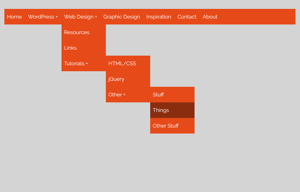
Are you looking for a responsive drop down navigation menu created with HTML and CSS? if yes, then you are in the right place. Here, I’m going to share awesome multilevel dropdown navigation with a step-by-step implementation guide.
No doubt, a dropdown menu plays an important role in modern web design. It lets users navigate the contents of your website more easily. Basically, dropdown navigations require JavaScript to toggle dropdown items on mouse hover or click event. But, it can be created with CSS only.
Yes, off course! it’s quite possible with CSS to toggle (hide/show) dropdown items on hover event. The main benefit of such navigations is that they reduce the size of source code. On the other hand, the page speed (loading time) also improve using pure CSS elements.
HTML Structure for Drop Down Navigation Menu
In HTML, we’ll create a nav element and place navigation links. In order to create a dropdown, create a nested list of your links. You can add multiple dropdowns (as your requirements) using the same method.
    <nav>
        <ul>
            <li><a href="#">Home</a></li>
            <li><a href="#">WordPress</a>
            <!-- First Tier Drop Down -->
            <ul>
                <li><a href="#">Themes</a></li>
                <li><a href="#">Plugins</a></li>
                <li><a href="#">Tutorials</a></li>
            </ul>
            </li>
            <li><a href="#">Web Design</a>
            <!-- First Tier Drop Down -->
            <ul>
                <li><a href="#">Resources</a></li>
                <li><a href="#">Links</a></li>
                <li><a href="#">Tutorials</a>
            	<!-- Second Tier Drop Down -->
                <ul>
                    <li><a href="#">HTML/CSS</a></li>
                    <li><a href="#">jQuery</a></li>
                    <li><a href="#">Other</a>
                        <!-- Third Tier Drop Down -->
                        <ul>
                            <li><a href="#">Stuff</a></li>
                            <li><a href="#">Things</a></li>
                            <li><a href="#">Other Stuff</a></li>
                        </ul>
                    </li>
                </ul>
                </li>
            </ul>
            </li>
            <li><a href="#">Graphic Design</a></li>
            <li><a href="#">Inspiration</a></li>
            <li><a href="#">Contact</a></li>
            <li><a href="#">About</a></li>
        </ul>
    </nav>
The above HTML code creates multilevel dropdown. If you want to make a simple (one level) dropdown navigation, don’t nest lists.
CSS Style for Dropdown Navigation
Now, the first thing is the navigation bar to style using CSS. We’ll use the nav selector and its child elements (ul, li and a) to set up a basic navigation layout.
nav {
	background-color: #E64A19;
}

nav ul {
	padding: 0;
    margin: 0;
	list-style: none;
	position: relative;
	}

nav ul li {
	display:inline-block;
	background-color: #E64A19;
	}

nav a {
	display:block;
	padding:0 10px;
	color:#FFF;
	font-size:20px;
	line-height: 60px;
	text-decoration:none;
}

nav a:hover {
	background-color: rgba(0, 0, 0, 0.4);
    color: #fff;
}
Here, we used an orange color for the navigation bar (background-color: #E64A19;), if you want to customize, just place your own color in nav code block. You may also customize the thickness of the menubar by editing in the nav a {} code block, just change the line-height property that is 60px.
The next thing is to define the style for dropdowns items. We’ll set the relative position for child lists.
/* Fisrt level Dropdown */
nav ul ul li {
	width:170px;
	float:none;
	display:list-item;
	position: relative;
}

/* Second, Third and more levels	*/
nav ul ul ul li {
	position: relative;
	top:-60px;
	left:170px;
}
In the above code, the width property defines the width of a dropdown list (that is 170px). You can edit it to increase/decrease dropdown width.
Now, we’ll set a symbol at the end of the dropdown item to indicate that it has sub-menu. Here, you can use any symbol instead of a “+” sign. If you are using the Font Awesome CSS library, then simply add the value of the chevron-down icon. (\f078)
li > a:after { content:  ' +'; }
li > a:only-child:after { content: ''; }
At last, we’ll hide all the dropdowns and open when a user hovers its parent element.
/* Hide Dropdowns by Default */
nav ul ul {
	display: none;
	position: absolute;
	top: 60px; /* the height of the main nav */
}

/* Display Dropdowns on Hover */
nav ul li:hover > ul {
	display:inherit;
}
That’s all! if you have any questions or suggestions related to this navigation menu, don’t hesitate to comment below.
Hello, great menu. Is it possible to expand it to smothely slideout the submenus like in this menu: https://codeconvey.com/Tutorials/advanced-css-multi-level-dropdown-menu/