A radial menu is a context navigation system to select an item based on direction. This navigation is also known as a circular or pie menu that is most commonly used in games to select weapons. In this tutorial, you will come to know how to create a simple radial menu using HTML and pure CSS.
The menu concept is that we’ll create a nav element and place a list of links inside it. We’ll arrange these links in a circular order using CSS rotate transformation. Initially, we’ll hide these menu items and show them with a hamburger toggle button. This hamburger button made with the HTML checkbox to detect checked/unchecked values.
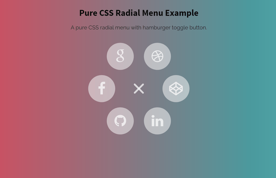
Before going further, I would suggest you checking the demo page to see the radial menu in action. Keep an eye on menu opening and closing effects that looks really awesome!
HTML Structure for Radial Menu
The HTML structure for the radial menu is quite simple, you just need to create a nav element with a class name "menu". Inside the nav, the very first element should be checkbox input with an id "menu-toggler" having a label. This label tag will be used to toggle the radial menu. Place your navigation links just after the label wrapped in an unordered list. So, a complete HTML code for a simple radial menu is as follows:
<nav class='menu'>
  <input checked='checked' class='menu-toggler' id='menu-toggler' type='checkbox'>
  <label for='menu-toggler'></label>
  <ul>
    <li class='menu-item'>
      <a class='fa fa-facebook' href='https://www.facebook.com/' target='_blank'></a>
    </li>
    <li class='menu-item'>
      <a class='fa fa-google' href='https://www.google.com/' target='_blank'></a>
    </li>
    <li class='menu-item'>
      <a class='fa fa-dribbble' href='https://dribbble.com/' target='_blank'></a>
    </li>
    <li class='menu-item'>
      <a class='fa fa-codepen' href='https://codepen.io/' target='_blank'></a>
    </li>
    <li class='menu-item'>
      <a class='fa fa-linkedin' href='https://www.linkedin.com/' target='_blank'></a>
    </li>
    <li class='menu-item'>
      <a class='fa fa-github' href='https://github.com/' target='_blank'></a>
    </li>
  </ul>
</nav>
In the above HTML, we used Font Awesome icons inside the menu items. If you are new to Font Awesome, then you must need to include its CSS file inside the head tag of your HTML page in order to use icons. To do so, load the Font Awesome CSS by adding the following CDN link:
<!-- Font Awesome CSS -->
<link rel="stylesheet" href="https://cdnjs.cloudflare.com/ajax/libs/font-awesome/4.3.0/css/font-awesome.min.css" integrity="sha512-i8+QythOYyQke6XbStjt9T4yQHhhM+9Y9yTY1fOxoDQwsQpKMEpIoSQZ8mVomtnVCf9PBvoQDnKl06gGOOD19Q==" crossorigin="anonymous" />
Styling Radial Menu with CSS
After creating HTML, now we are ready to style the menu. Therefore, target the "menu-toggler" class that controls the menu toggle functionality. Basically, we placed this class inside the checkbox input to detect the checked and unchecked value. Keep its absolute position with 0 value for the top, bottom, right, and left direction.
Here, the goal is that we need to style it as a blank container for the hamburger button to toggle the menu on its checked and unchecked value. So, keep its opacity 0, auto margin with 40px value for both width and height.
.menu-toggler {
  position: absolute;
  display: block;
  top: 0;
  bottom: 0;
  right: 0;
  left: 0;
  margin: auto;
  width: 40px;
  height: 40px;
  z-index: 2;
  opacity: 0;
  cursor: pointer;
}
After that, target the label element using the CSS plus (+) selector and define its width and absolute position values according to the "menu-toggler" class. Similarly, define the 5px height that will define the thickness of the one bar of the hamburger menu. The other two bars of the hamburger menu define inside the before and after pseudo selector.
You can set the custom background color if you wanted to customize the hamburger button. Likewise, you can change the width and height to reduce/increase the size or thickness of bars.
.menu-toggler + label {
  width: 40px;
  height: 5px;
  display: block;
  z-index: 1;
  border-radius: 2.5px;
  background: rgba(255, 255, 255, 0.7);
  transition: transform 0.5s, top 0.5s;
  position: absolute;
  display: block;
  top: 0;
  bottom: 0;
  right: 0;
  left: 0;
  margin: auto;
}
.menu-toggler + label:before, .menu-toggler + label:after {
  width: 40px;
  height: 5px;
  display: block;
  z-index: 1;
  border-radius: 2.5px;
  background: rgba(255, 255, 255, 0.7);
  transition: transform 0.5s, top 0.5s;
  content: "";
  position: absolute;
  left: 0;
}
.menu-toggler + label:before {
  top: 10px;
}
.menu-toggler + label:after {
  top: -10px;
}
In order to set hover style, use the CSS hover pseudo-selector for the menu-toggler label with both before and after selector as mentioned below:
.menu-toggler:hover + label, .menu-toggler:hover + label:before, .menu-toggler:hover + label:after {
  background: white;
}
Radial Menu Links Items
The "menu-item" is the class for the list item of the radial menu. We’ll arrange this list in circular order to make the menu items radial. So, use the CSS absolute position with 0 values for all directions and keep the margin auto. Similarly, define the width, height, and keep the opacity value 0 to initially hide all menu items.
.menu-item {
  position: absolute;
  display: block;
  top: 0;
  bottom: 0;
  right: 0;
  left: 0;
  margin: auto;
  width: 80px;
  height: 80px;
  display: block;
  opacity: 0;
  transition: 0.5s;
}
Likewise, target the hyperlink of the menu item and display it as a block element. Keep the inherit value for both width and height along with the 80px line height. Specify font size, color, and background color according to your needs.
.menu-item a {
  display: block;
  width: inherit;
  height: inherit;
  line-height: 80px;
  color: rgba(255, 255, 255, 0.7);
  background: rgba(255, 255, 255, 0.5);
  border-radius: 50%;
  text-align: center;
  text-decoration: none;
  font-size: 40px;
  pointer-events: none;
  transition: 0.2s;
}
To arrange the hyperlinks in a circular order, target each link using the nth-child selector and use the CSS transform rotate property.
.menu-item:nth-child(1) a {
  transform: rotate(0deg);
}

.menu-item:nth-child(2) a {
  transform: rotate(-60deg);
}

.menu-item:nth-child(3) a {
  transform: rotate(-120deg);
}

.menu-item:nth-child(4) a {
  transform: rotate(-180deg);
}

.menu-item:nth-child(5) a {
  transform: rotate(-240deg);
}

.menu-item:nth-child(6) a {
  transform: rotate(-300deg);
}
Off course! you need a hover effect for the radial menu’s links. For this purpose, target the "a" tag of menu-item with hover pseudo-selector and specify CSS styles. You can define custom CSS styles for the hover effect or check this shine/glow hover effect if you want to make your menu items more attractive.
.menu-item a:hover {
  box-shadow: 0 0 0 2px rgba(255, 255, 255, 0.3);
  color: white;
  background: rgba(255, 255, 255, 0.3);
  font-size: 44px;
}
Finally, target the checked menu-toggler and define the 1 value for the menu-item’s opacity in order to show items. Similarly, define the hamburger cross effect by rotating after “label” tag as -45 degrees.
.menu-toggler:checked + label:before, .menu-toggler:checked + label:after {
  top: 0;
  width: 40px;
  transform-origin: 50% 50%;
}
.menu-toggler:checked + label:before {
  transform: rotate(45deg);
}
.menu-toggler:checked + label:after {
  transform: rotate(-45deg);
}

.menu-toggler:checked ~ ul .menu-item {
  opacity: 1;
}
.menu-toggler:checked ~ ul .menu-item:nth-child(1) {
  transform: rotate(0deg) translateX(-110px);
}
.menu-toggler:checked ~ ul .menu-item:nth-child(2) {
  transform: rotate(60deg) translateX(-110px);
}
.menu-toggler:checked ~ ul .menu-item:nth-child(3) {
  transform: rotate(120deg) translateX(-110px);
}
.menu-toggler:checked ~ ul .menu-item:nth-child(4) {
  transform: rotate(180deg) translateX(-110px);
}
.menu-toggler:checked ~ ul .menu-item:nth-child(5) {
  transform: rotate(240deg) translateX(-110px);
}
.menu-toggler:checked ~ ul .menu-item:nth-child(6) {
  transform: rotate(300deg) translateX(-110px);
}
.menu-toggler:checked ~ ul .menu-item a {
  pointer-events: auto;
}
You have done it! hopefully, you have successfully created a pure CSS radial menu with the help of this tutorial. If you have any questions or suggestions, let me know by comment below.
That’s really cool, but what if you want more (or less) icons in the menu?