A smooth zoom effect while mouseover the image provides the users a relaxing feel. Whether you want to apply this effect for gallery images or on the grid of images, this pure CSS tutorial is quite helpful to zoom an image on hover inside a div element.
Before going further, you can check the example of the zoom image on the demo page. You can set the custom limit for zoom and transition speed according to your needs. So, without wasting time, let’s get started with coding to create a zoom image effect on hover events.
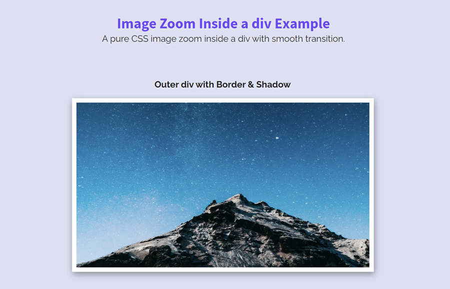
Place an Image Inside a div Element
In the very first step of coding, place your image inside a div element. To do so, create a div tag with a class name "image-box" and place your image in it. The following is the code of the sample image (from Unsplash) wrapped in a div.
<div class="image-box">
  <img src="https://source.unsplash.com/featured/?minimal,wallpaper,dark" alt="Unsplashed Random" width="640" height="320" />
</div>
If you want to add some border and shadow effect for the image container, add a class name "border-box". In the CSS we’ll define border and shadow for this class.
<div class="image-box border-box">
  <img src="path/to/image.jpg" />
</div>
You can place some other elements inside the image container (div tag). Such as image title or caption text etc. OK! now get let’s started with CSS to create the zoom effect.
CSS Styles to Zoom Image on Hover
In CSS styling, target the "image-box" class and set its relative position. Define its width (according to your needs) and margin property. The very important thing to keep in mind for this container is the overflow property. Basically, it should be hidden if you don’t wanna see your image overlap the container. On the other hand, you can also set the overflow auto if you want to scroll the image after zooming.
I used the margin "10px auto" (top & bottom 10px while left & right auto) to align the image container to the center of its parent element/page. You can set the custom value for the margin as per your requirements.
.image-box {
    position: relative;
    margin: 10px auto;
    overflow: hidden;
    width: 540px;
}
As I mentioned above about the box shadow for the image container, you need to add the class name "border-box". Now, let’s create the border and shadow for this class. In order to make a shadow effect, use the CSS box-shadow property and set 1px 4px 12px rgba(0, 0, 0, 0.4) value. Similarly, use the border property to set the 8px solid border. You can set the custom value for the border thickness and color.
 .border-box{
     border: 8px solid #fff;
     box-shadow: 1px 4px 12px rgba(0, 0, 0, 0.4);
 }
Now, target the (child of .image-box) img element and define styles for it. In order to make it responsive, use the 100% value for the max-width and set "auto" height. Use the CSS transition property to add some smoothness while zooming on hover. Display it as a block element and transform it with default scaling value (1).
.image-box img {
    max-width: 100%;
    transition: all 0.3s;
    display: block;
    width: 100%;
    height: auto;
    transform: scale(1);
}
Finally, target the image container with hover pseudo-selector and transform the img element with scale value 1.1. You can set the custom value for the scaling according to how much you want to zoom the image.
.image-box:hover img {
    transform: scale(1.1);
}
Cross-Browser Support
For cross-browser support, use the CSS browser prefixes for scaling transformation. You can also define the transform-origin where you want to zoom the image on hover event.
.image-box:hover img {
    transform: scale(1.1);
    -webkit-transform: scale(1.1);
    -moz-transform: scale(1.1);
    -ms-transform: scale(1.1);
    -o-transform: scale(1.1);
    transform: scale(1.1);

    -webkit-transform-origin: 0px 0px;
    -moz-transform-origin: 0px 0px;
    -ms-transform-origin: 0px 0px;
    -o-transform-origin: 0px 0px;
    transform-origin: 0px 0px;
}
That’s all! I hope this tutorial was helpful for you to zoom an image inside a div on hover using pure CSS. If you have any questions or suggestions, let me know by comment below.