A few months ago, we created a tutorial to arrange your images side by side with the caption text below them. Today, we are again come back with the relevant tutorial to create a responsive image grid with hover effects. The caption text over the image fades in/out on hover event with a dim background overlay.
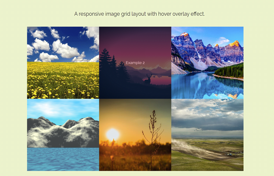
In this tutorial, we are going to use the CSS flexible box layout module to arrange images in a responsive grid. As you have seen in the above preview, there are six images arranged in an equal dimension grid. You can add more images with the same coding method that we are going to code. So, let’s have a look at the demo page before starting coding.
You can easily implement this image grid as a thumbnails gallery or posts grid. Similarly, you can also integrate an image lightbox to make this an inline grid photo gallery with hover effects. OK! now let’s get started with HTML to make the image grid.
The HTML Structure for Image Grid
The HTML structure consists of a flexbox row and column concept to make the image grid. So, create a div element with a class name "row" and place three child div elements with a class name "column" inside it. Likewise, place a container that contains an image and overlay elementt inside each column. So, the basic HTML structure for a single row that contains three images is as follows:
<div class="row">
  <div class="column">
    <a href="#">
      <div class="container">
        <img src="img/image-1.jpg" class="image">
        <div class="overlay">
          <div class="text">Example 1</div>
        </div>
      </div>
    </a>
  </div>
  <div class="column">
    <a href="#">
      <div class="container">
        <img src="img/image-2.jpg" class="image">
        <div class="overlay">
          <div class="text">Example 2</div>
        </div>
      </div>
    </a>
  </div>
  <div class="column">
    <a href="#">
      <div class="container">
        <img src="img/image-3.png" class="image">
        <div class="overlay">
          <div class="text">Example 3</div>
        </div>
      </div>
    </a>
  </div>
</div>
You can create multiple rows in the same way as described in the above HTML code.
CSS to Making Responsive Grid and Hover Effect
In CSS, target the "row" class and display it as flex with wrap property as follows:
.row {
  display: flex;
  flex-wrap: wrap;
  padding: 0 4px;
}
Define the 100% flex and set the max-width 100% for the column class.
.column {
  flex: 100%;
  max-width: 100%;
}
Align the column image to the vertical middle using CSS vertical-align property.
.column img {
  vertical-align: middle;
}
The "container" class contains the image, caption text, and dim background overlay on the image. So, we need to make this element relative positioned with 100% width.
.container {
  position: relative;
  width: 100%;
}
As we have defined the "image" class in HTML for each photo, we can set styles for each image. Here we just need to make the image responsive to fit in the container. To do so, display the image as a block element and set 100% width along with the auto height.
.image {
  display: block;
  width: 100%;
  height: auto;
}
The "overlay" class contains the caption text that we need to set over the image. Keep its absolute position and set 0 values for the top, bottom left, and right to fit this div to the center of the image container. Likewise, define the background color, and opacity as 0 to hide it in normal condition.
.overlay {
  position: absolute;
  top: 0;
  bottom: 0;
  left: 0;
  right: 0;
  height: 100%;
  width: 100%;
  opacity: 0;
  transition: 0.5s ease;
  background-color: black;
}
Now, show the overlay by defining opacity 0.5 (half transparent) on the container hover.
.container:hover .overlay {
  opacity: 0.5;
}
Specify the CSS styles for the caption text. Keep its absolute position and 50% value for the “top” and “left” property to place the text center of the image.
.text {
  color: white;
  font-size: 20px;
  position: absolute;
  top: 50%;
  left: 50%;
  transform: translate(-50%, -50%);
  -ms-transform: translate(-50%, -50%);
  text-align: center;
}
Finally, make the image grid responsive using CSS media queries. Use the 50% value for the flex property on the 480px screen (mobile devices). Similarly, define the 33.3% flex value for the large screens.
/* Tablet Styles */
@media only screen and (min-width: 480px) {
    .column {
      flex: 50%;
      max-width: 50%;
    }
}


/* Desktop Styles */
@media only screen and (min-width: 1024px) {
    .column {
      flex: 33.3%;
      max-width: 33.3%;
    }
}
That’s all! I hope you got this tutorial helpful to make a responsive image grid with hover effects. If you have any questions or need further help, let me know by comment below.