A donut chart is a type of circular chart to visualize percentage data in a ring shape. It is most commonly used to represent the progress of a task or some value out of a hundred. The donut and pie chart both are the type of circular charts but unlike a pie chart, it displays the percentage value of a singular object. So, if you want to show a report of a single object then a donut chart is quite fit for your needs. But! how you can make it? well, this tutorial explains how to create an animated donut chart using SVG and pure CSS.
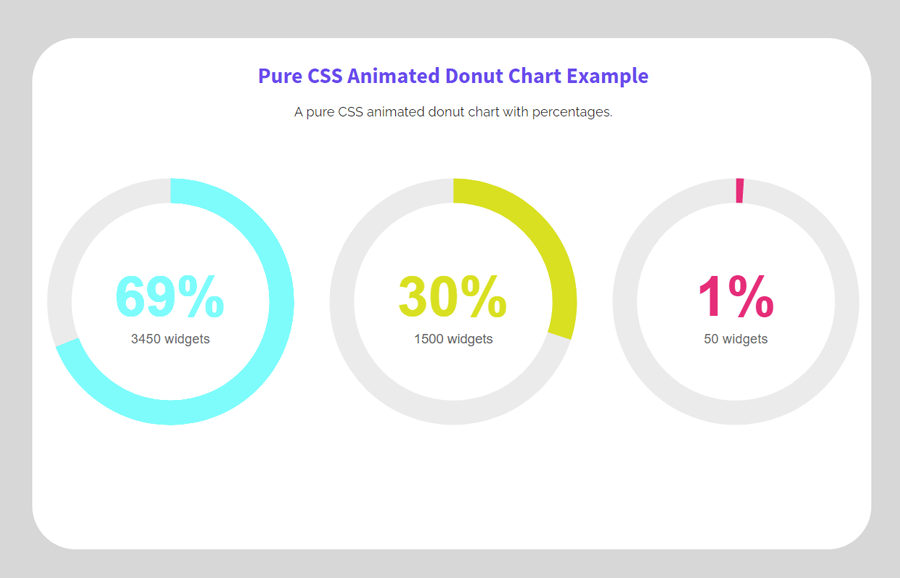
Before going further, I would suggest you check out the demo page to see the ring filling animation for the donuts chart. There you can see three donut charts with different percentage values and different fill colors. These colors (and percentage values) can be customized according to your needs. The percentage values can be set/update in the donut chart’s HTML while colors can be customized through CSS.
Besides this, you can easily attach a JS function if you want to update its values through a function. Similarly, you can control the fill area by setting the value inside an attribute "stroke-dasharray" to show the filled area according to the percentage values. So, let’s get started with HTML to create a donut chart.
The HTML Structure
In HTML, create SVG element with 100% width and height and set "0 0 40 40" viewBox attribute and define a class name "donut". Draw three circle elements inside it with the class name "donut-hole" and define the following attributes. Similarly, create a text element with attributes and place your percentage value inside it.
Wrap this SVG tag inside a div element and define its class name "svg-item". So, the following is the complete HTML structure for a single donut chart.
<div class="svg-item">
  <svg width="100%" height="100%" viewBox="0 0 40 40" class="donut">
    <circle class="donut-hole" cx="20" cy="20" r="15.91549430918954" fill="#fff"></circle>
    <circle class="donut-ring" cx="20" cy="20" r="15.91549430918954" fill="transparent" stroke-width="3.5"></circle>
    <circle class="donut-segment donut-segment-2" cx="20" cy="20" r="15.91549430918954" fill="transparent" stroke-width="3.5" stroke-dasharray="69 31" stroke-dashoffset="25"></circle>
    <g class="donut-text donut-text-1">

      <text y="50%" transform="translate(0, 2)">
        <tspan x="50%" text-anchor="middle" class="donut-percent">69%</tspan>
      </text>
      <text y="60%" transform="translate(0, 2)">
        <tspan x="50%" text-anchor="middle" class="donut-data">3450 widgets</tspan>
      </text>
    </g>
  </svg>
</div>
If you want to make more than one donut chart, just copy/paste the above HTML and update the percentages values. You can control the fill area by defining the value for stroke-dasharray attribute.
If you want to update percentage value through JavaScript/jQuery, you can select the "donut-percent" class and write to its inner HTML. Similarly, you can select the "donut-segment" class and update the value of its “stroke-dasharray” attribute to fill the ring area.
The CSS Styles for Animated Donut Chart
The "svg-item" is the container element for the donut chart. Define its 100% width, font size, and margin value “0 auto” in order to align it to the center. Likewise, define the animation-name "donutfade" with 1s play duration.
.svg-item {
    width: 100%;
    font-size: 16px;
    margin: 0 auto;
    animation: donutfade 1s;
}
The "donut-ring" class represents the circle element. Target this class and define a color for stroke property.
.donut-ring {
    stroke: #EBEBEB;
}
Select the "donut-segment" class and define the stroke color. It represents percentages fill area. Define CSS transform-origin property and set its value “center”.
.donut-segment {
    transform-origin: center;
    stroke: #FF6200;
}
Similarly, select the “donut-segment-2”, “donut-segment-3”, and “donut-segment-4” classes and define a stroke color and their respective animation as follows. You can set the custom value for animation duration to increase/decrease the speed of ring filling.
.donut-segment-2 {
    stroke: aqua;
    animation: donut1 3s;
}

.donut-segment-3 {
    stroke: #d9e021;
    animation: donut2 3s;
}

.donut-segment-4 {
    stroke: #ed1e79;
    animation: donut3 3s;
}

.segment-1{fill:#ccc;}
.segment-2{fill:aqua;}
.segment-3{fill:#d9e021;}
.segment-4{fill:#ed1e79;}
Now, define the CSS keyframes for the "donutfade", "donutfadelong", and “donut1 to donut3” animations as follows:
@keyframes donutfade {
  /* this applies to the whole svg item wrapper */
    0% {
        opacity: .2;
    }
    100% {
        opacity: 1;
    }
}
@keyframes donutfadelong {
    0% {
        opacity: 0;
    }
    100% {
        opacity: 1;
    }
}

@keyframes donut1 {
    0% {
        stroke-dasharray: 0, 100;
    }
    100% {
        stroke-dasharray: 69, 31;
    }
}

@keyframes donut2 {
    0% {
        stroke-dasharray: 0, 100;
    }
    100% {
        stroke-dasharray: 30, 70;
    }
}

@keyframes donut3{
    0% {
        stroke-dasharray: 0, 100;
    }
    100% {
        stroke-dasharray: 1, 99;
    }
}
After that, target the “donut-percent” class and apply "donutfadelong" animation with a 1s duration. Similarly, target the "donut-data" class and set font-size, line-height, text-align, and animation property as described below:
.donut-percent {
    animation: donutfadelong 1s;
}
.donut-data {
    font-size: 0.12em;
    line-height: 1;
    transform: translateY(0.5em);
    text-align: center;
    text-anchor: middle;
    color:#666;
    fill: #666;
    animation: donutfadelong 1s;
}
In the final step, define the CSS styles for the donut text and percentage values. To do so, select the “donut-text” class and define its font family and fill color. Likewise, select the "donut-text-1 ", "donut-text-3", and “donut-text-3” classes and define different fill colors according to your needs.
In the same way, select the "donut-label" and "donut-percent" classes and define font-size, font-weight, line-height, fill, and transform property as described below:
.donut-text {
    font-family: Arial, Helvetica, sans-serif;
    fill: #FF6200;
}
.donut-text-1 {
    fill: aqua;
}
.donut-text-2 {
    fill: #d9e021;
}
.donut-text-3 {
    fill: #ed1e79;
}

.donut-label {
    font-size: 0.28em;
    font-weight: 700;
    line-height: 1;
    fill: #000;
    transform: translateY(0.25em);
}

.donut-percent {
    font-size: 0.5em;
    line-height: 1;
    transform: translateY(0.5em);
    font-weight: bold;
}
That’s all! Hopefully, this tutorial was helpful to create an animated donut chart using pure CSS. If you have any questions or suggestions, let me know by comment below.
Congratulations for your work.
It’s excellent
Thanks Pablo, My pleasure, you like it.