A pie chart is a useful visual element to visualize percentages data in a circle. It can be used to display statics of a report or process on a webpage. Basically, there are multiple JavaScript libraries (or jQuery plugins) to create a pie chart. But a general-purpose simple pie chart can be created in HTML without JavaScript.
So, what do you think about a pure CSS pie chart? well! you can check on the demo page to see the difference between a JavaScript-generated and pure CSS pie chart. Generally, the JS charts are also designed with HTML and CSS (or canvas) but these are rendered dynamically through functions. Although, there are multiple benefits in regards to using JavaScript charts like dynamic statics and callbacks features. But for the lightweight projects, pure CSS charts are quite fit.
The coding concept is that we’ll create a div element in HTML and place child div elements inside it. Each child div will consist of percentage values wrapped with a span tag. Then we’ll style the main div element as a circle and child div elements as pie. To get the final output, we’ll use different classes and CSS styles. So, let’s get started with HTML to create a pie chart.
HTML Structure for Pie Chart
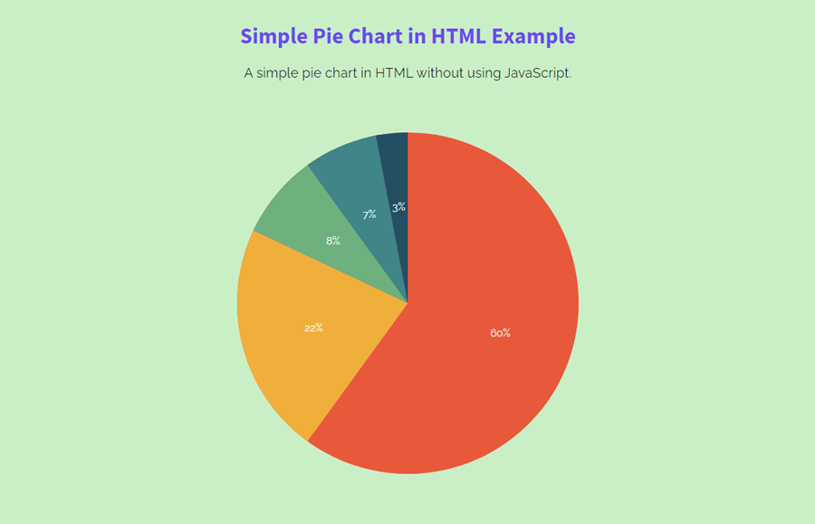
In HTML, create a div element with a class name "wrapper" and place div elements inside it with class names d1 to d5. Place percentages inside these div elements wrapped with a span tag.
<div class="wrapper">
  <div class="d1"><div><span>60%</span></div></div>
  <div class="d2"><div><span>22%</span></div></div>
  <div class="d3"><div><span>8%</span></div></div>
  <div class="d4"><div><span>7%</span></div></div>
  <div class="d5"><div><span>3%</span></div></div>
</div>
If you want to create multiple pie charts, create the same HTML structure as described above. Moreover, you can wrap all these circles in a container to style them according to your requirements. You can also try an animated percentage circle along with a pie chart.
Styling Pie Chart using CSS
In CSS, select the "wrapper" class and define equal width and height along with 50% border-radius to make a circle. Similarly, define margin and background color according to your needs. Basically, you can increase/decrease the size of the circle by defining custom values for the width and height.
Here the important properties are overflow, position, and transform. Therefore, set overflow value hidden to forbade overlap, define relative value for the position and rotate(108deg) value for the transform.
.wrapper {
  width: 400px;
  height: 400px;
  background: #FC5B3F;
  margin: 10px auto;
  border-radius: 50%;
  overflow: hidden;
  position: relative;
  transform: rotate(108deg);
}
After styling the circle (the wrapper element), now it’s time to style inner div elements (that are d1 to d5). These elements should be doubled in size as compared to the wrapper. So, target the "d1" class and specify its width and height. Keep its absolute position and specify top and left values as follows:
.wrapper .d1 {
  width: 800px;
  height: 800px;
  position: absolute;
  top: -200px;
  left: -200px;
  transform: rotate(0deg);
}
.wrapper .d1 div {
  width: 800px;
  height: 800px;
}
Similarly, target the d1 after pseudo-class and its child element “span”. In the :after pseudo-class, define the 0 values for the width and height and display it as a block element. Define transparent border and set border-width same to the circle/wrapper. Define a color for the border-top-color property and define scaleX value in transform property to set its area according to your percentage value for that pie.
.wrapper .d1 div:after {
  content: '';
  width: 0;
  height: 0;
  display: block;
  border: solid transparent;
  border-width: 400px;
  border-top-color: #FC5B3F;
  position: relative;
  transform: scaleX(-3.07768);
}
.wrapper .d1 div span {
  display: block;
  width: 100%;
  position: absolute;
  left: 0;
  top: 34%;
  font-size: 12px;
  text-align: center;
  z-index: 100;
  color: #fff;
  transform: rotate(-108deg);
}
In the same way, style the "d2" class and rotate it with a 147.6deg value. Set a different border-top color and scaleX value according to your percentage data.
.wrapper .d2 {
  width: 800px;
  height: 800px;
  position: absolute;
  top: -200px;
  left: -200px;
  transform: rotate(147.6deg);
}
.wrapper .d2 div {
  width: 800px;
  height: 800px;
}
.wrapper .d2 div:after {
  content: '';
  width: 0;
  height: 0;
  display: block;
  border: solid transparent;
  border-width: 400px;
  border-top-color: #FCB03C;
  position: relative;
  transform: scaleX(0.82727);
}
.wrapper .d2 div span {
  display: block;
  width: 100%;
  position: absolute;
  left: 0;
  top: 34%;
  font-size: 12px;
  text-align: center;
  z-index: 100;
  color: #fff;
  transform: rotate(-255.6deg);
}
Similarly, select the "d3" class and define the 201.6deg value for transform property. You can calculate the rotate value using 2π’s value multiplying with your percentage value.
.wrapper .d3 {
  width: 800px;
  height: 800px;
  position: absolute;
  top: -200px;
  left: -200px;
  transform: rotate(201.6deg);
}
.wrapper .d3 div {
  width: 800px;
  height: 800px;
}
.wrapper .d3 div:after {
  content: '';
  width: 0;
  height: 0;
  display: block;
  border: solid transparent;
  border-width: 400px;
  border-top-color: #6FB07F;
  position: relative;
  transform: scaleX(0.25676);
}
.wrapper .d3 div span {
  display: block;
  width: 100%;
  position: absolute;
  left: 0;
  top: 34%;
  font-size: 12px;
  text-align: center;
  z-index: 100;
  color: #fff;
  transform: rotate(-309.6deg);
}
Target the "d4" class and set rotate value and border-top-color value. Likewise, define sclaeX value according to your percentages and transform the span element with rotate(-336.6deg) value.
.wrapper .d4 {
  width: 800px;
  height: 800px;
  position: absolute;
  top: -200px;
  left: -200px;
  transform: rotate(228.6deg);
}
.wrapper .d4 div {
  width: 800px;
  height: 800px;
}
.wrapper .d4 div:after {
  content: '';
  width: 0;
  height: 0;
  display: block;
  border: solid transparent;
  border-width: 400px;
  border-top-color: #068587;
  position: relative;
  transform: scaleX(0.22353);
}
.wrapper .d4 div span {
  display: block;
  width: 100%;
  position: absolute;
  left: 0;
  top: 34%;
  font-size: 12px;
  text-align: center;
  z-index: 100;
  color: #fff;
  transform: rotate(-336.6deg);
}
Finally, select the "d5" class and transform it with rotate(246.6deg) value. Specify a different “border-top-color” and scaleX value and done.
.wrapper .d5 {
  width: 800px;
  height: 800px;
  position: absolute;
  top: -200px;
  left: -200px;
  transform: rotate(246.6deg);
}
.wrapper .d5 div {
  width: 800px;
  height: 800px;
}
.wrapper .d5 div:after {
  content: '';
  width: 0;
  height: 0;
  display: block;
  border: solid transparent;
  border-width: 400px;
  border-top-color: #1A4F63;
  position: relative;
  transform: scaleX(0.09453);
}
.wrapper .d5 div span {
  display: block;
  width: 100%;
  position: absolute;
  left: 0;
  top: 34%;
  font-size: 12px;
  text-align: center;
  z-index: 100;
  color: #fff;
  transform: rotate(-354.6deg);
}
That’s all! hopefully, now you are able to create a simple pie chart in HTML without using JavaScript. If you have any questions or suggestions, let me know by comment below.
i used this chart in my website…nice..thank you for your help..
That’s great to hear. It’s my pleasure to help you.
nice coding. Thank you for helping me..