Are you working on a navigation menu and need the code? If yes! then you are in the right place. Here, you will come to know an easy way to create a navigation bar design with ready-to-use code snippets. This navigation menu is quite fit for the mobile-friendly website projects/templates.
This navigation bar design is inspired by our previous responsive navbar with a search box. But this navbar uses the JS function to toggle the menu (on mobile) and expand the search box. On the other hand, we used Font Awesome icons for a better user experience.
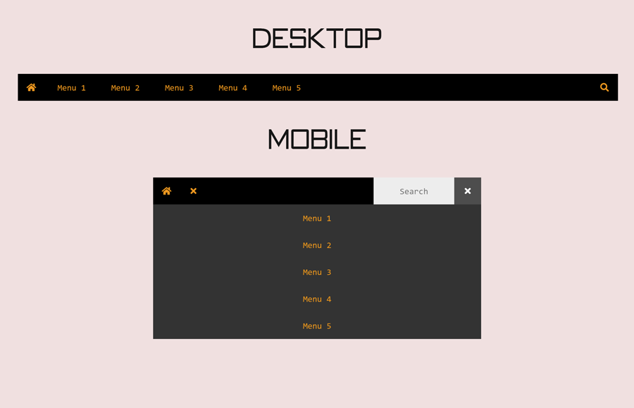
Before going further, let’s have a look at the demo page to check this navigation bar. Well! did you resize the window to see the mobile version of this navigation bar? You may have noticed, the hamburger menu icon along with the search and home icon look much pretty. Similarly, the search box toggle animation enhances the user experience.
HTML Code for Navigation Bar
In order to build the HTML structure for the navigation bar, create a nav element with a class name “block-relative-left”. Likewise, create a div element with the same class inside it and place your navigation links with the following mentioned classes.
Also, call the openMenu() and openSearch() functions (that we’ll create at the end) on the click event for the btnMenu and btnSearch element respectively.
<nav class="block-relative-left">
   <div class="block-relative-left">
      <a class="flexbox" href="#"><i class="fa fa-home"></i></a>
      <button class="flexbox" id="btnMenu" onclick="openMenu()">
      <i class="fa fa-bars"></i>
      <i class="fa fa-times"></i>
      </button>
   </div>
   <div class="block-relative-left menu" id="thisMenu">
      <a href="#" class="flexbox btn-list">Menu 1</a>
      <a href="#" class="flexbox btn-list">Menu 2</a>
      <a href="#" class="flexbox btn-list">Menu 3</a>
      <a href="#" class="flexbox btn-list">Menu 4</a>
      <a href="#" class="flexbox btn-list">Menu 5</a>
   </div>
   <div class="block-relative-right">
      <button class="flexbox" id="btnSearch" onclick="openSearch()">
      <i class="fa fa-search"></i>
      <i class="fa fa-times"></i>
      </button>
      <form class="search" id="thisSearch">
         <input type="text" placeholder="Search"/>
      </form>
   </div>
</nav>
You can also place your brand logo instead of the home icon if you want to make the menu fit into your project. Moreover, you can place multiple menu links with the same method as described in the HTML code.
The CSS Styles
First of all, import Google fonts and Font Awesome CSS file by adding the following URLs at the top of your style file. You can skip this step if you’ve already loaded Font Awesome icons by the CDN link.
@import url('https://fonts.googleapis.com/css?family=Acme|Amaranth|Courgette|Fira+Sans+Condensed|Lato|Open+Sans|Oswald|PT+Sans|Raleway|Rancho|Roboto|Sacramento|Roboto+Condensed|Sarala|Signika|Source+Sans+Pro&display=swap');
@import url('https://use.fontawesome.com/releases/v5.14.0/css/all.css');
Now, target the “nav” element and make it a full-width item by defining the width value as 100%. Specify a background color according to your needs.
nav {
  background: #000;
  width: 100%;
}
Similarly, target the hyperlinks of the nav element and define the 50px value for both width and height property. If you don’t want to have equal width for the nav links, define the “auto” value for the width. Likewise, define the font, margin, and text-align property as described below:
nav a{
  width: 50px;
  height: 50px;
  margin: 0;
  color: #ff9800;
  font: 400 16px "Consolas";
  text-align: center;
}
Specify the hover and focus style for the navigation links. In order to make a solid hover effect, set the gray (#4d4d4d) background color and keep the text color #fff (white). In the same way, define the background and color value for the focus pseudo-class.
nav a:hover, nav button:hover {
  background: #4d4d4d;
  color: #fff;
}
nav a:focus, nav button:focus {
  background: #ff9800;
  color: #000;
}
CSS Code for Navigation Search Box Design
After defining the basic styles for the navigation bar, now its time to design the expandable search box. So, target the "search" class (that is the container of the search form) and keep its width value as 0. Specify the same height value as defined for the links and display it as a block.
Here, the important thing is that we want to make the search box animatable. So, keep its absolute position and define 0 value for the opacity.
.search {
  background: #eee;
  width: 0;
  height: 50px;
  top: 0;
  right: 50px;
  display: block;
  position: absolute;
  opacity: 0;
}
Now, target the search input and define 100% width for both height and width property. Specify the “none” value for the border attribute in order to remove the default border. The other properties like font size and text-align can be described as your requirements.
.search input {
  background: transparent;
  width: 100%;
  height: 100%;
  font: 400 16px "Consolas";
  text-align: center;
  border: none;
}
Create the CSS animation keyframes to expand the search box. You just need to define the ending value for the width and opacity value as 1 in the “to” section of the animation. Afterward, create an additional class name "show-search" and dedicate this animation to it. We’ll use this class name (in JavaScript) to toggle the search box.
@-webkit-keyframes search {
  to {
    width: 150px;
    opacity: 1;
  }
}
@keyframes search {
  to {
    width: 150px;
    opacity: 1;
  }
}
.show-search {
  -webkit-animation: search 0.5s ease both;
          animation: search 0.5s ease both;
}
In the same way, create some helper classes with the following mentioned properties that will be used in JavaScript to functionalize the navigation bar.
.visible {
  display: inline-block;
}

.hidden {
  display: none;
}
#btnMenu, .fa-times {
  display: none;
}

.btn-list {
  width: 100px;
}
Make the Navigation Bar Responsive
In order to make the navigation bar mobile-friendly, define the 767px max-width for CSS media query. Show the hamburger menu toggle button by displaying the #btnMenu item as flex. Likewise, define the CSS attributes for the menu, button, and show-menu element as described below:
@media (max-width: 767px) {
  #btnMenu {
    display: -webkit-box;
    display: flex;
  }

  .menu {
    background: #333;
    width: 100%;
    top: 50px;
    display: none;
    position: absolute;
  }
  .menu button {
    width: 100%;
  }

  .show-menu {
    display: block;
  }
}
JavaScript Code for the Navigation
Now we need a little JavaScript function to toggle the classes in the menu and search container. To do so, add the following script at the end of the navigation HTML code to functionalize the menu bar design.
<script>
// DROPDOWN MENU WITH TOGGLE ICON
function _drop(a, b, c){
    const d = document.getElementById(a),
          e = document.getElementById(b).getElementsByTagName('i');
    d.classList.toggle(c);
    e[0].classList.toggle('hidden');
    e[1].classList.toggle('visible')
}

// TOGGLE
function _tgl(a, b){
    document.getElementById(a).classList.toggle(b)
}

    function openSearch(){
    _drop('thisSearch', 'btnSearch', 'show-search')
}

function openMenu(){
    _drop('thisMenu', 'btnMenu', 'show-menu')
}
</script>
That’s all! I hope now you are able to create/customize this navigation bar. If you have any questions or suggestions, let me know by comment below.