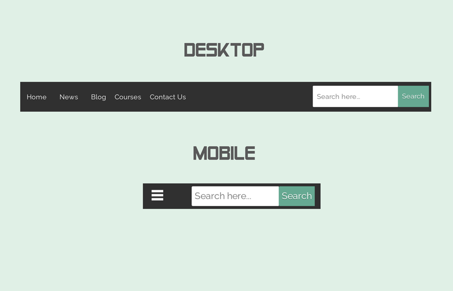
You may have seen many websites that has a search box inside the navbar. Off course! it provides the best user experience while browsing and searching site content. If you are a beginner in web designing you may have tried to build such a navbar. Didn’t get the best result? don’t worry! In this tutorial, you’ll come to know the basic concept to create a responsive navbar with a search box.
Basically, this is a pure CSS based navbar project that comes with a search box, dropdown, and hamburger image icon. The menu items are handled in HTML unordered lists and dropdown are based on nested lists.
HTML for Search Box Responsive Navbar
In HTML, create a wrapper with the class name "content-wrapper" and place a search form in the beginning. After that, place base 64 data of hamburger iconic image and wrap it inside the span element. Then, create the anchor links and arrange them inside the HTML unordered lists. The complete HTML structure for the navbar is as follows:
<div class='content-wrapper'>
   <div class='navmenu'>
      <form action='/search' autocomplete='off' id='search-form' method='get'>
         <input name='q' placeholder='Search here...' size='15' type='text'/>
         <input id='button-submit' type='submit' value='Search'/>
      </form>
      <span id='menu'><img src='data:image/png;base64,iVBORw0KGgoAAAANSUhEUgAAABQAAAAUCAYAAACNiR0NAAAAGXRFWHRTb2Z0d2FyZQBBZG9iZSBJbWFnZVJlYWR5ccllPAAAAC9JREFUeNpi/P//PwM1AQsQU9VEJgYqg8FvICgMGUeel0eTzWiyGU02Qz/ZAAQYAOPcBjEdYroKAAAAAElFTkSuQmCC'  /></span>
      <nav id='navbar' itemprop='mainEntity' itemscope='itemscope' itemtype='https://schema.org/SiteNavigationElement'>
         <ul class='navbar'>
            <li><a href='#1' itemprop='url' title='Home'><span itemprop='name'>Home</span></a></li>
            <li><a href='#2' itemprop='url' title='Home'><span itemprop='name'>News</span></a></li>
            <li><a href='#3' itemprop='url' title='Home'><span itemprop='name'>Blog</span></a></li>
            <li id='sub-menu'>
               <span itemprop='name'>Courses</span>
               <ul class="sub-menu">
                  <li><a href='#4' itemprop='url' title='Home'><span itemprop='name'>HTML</span></a></li>
                  <li><a href='#5' itemprop='url' title='Home'><span itemprop='name'>CSS</span></a></li>
                  <li><a href='#6' itemprop='url' title='Home'><span itemprop='name'>JavaScript</span></a></li>
               </ul>
            </li>
            <li><a href='#7' itemprop='url' title='Home'><span itemprop='name'>Contact Us</span></a></li>
         </ul>
      </nav>
   </div>
</div>
<div style='clear: both;'/>
The CSS Styles
First, you need to define styles for the navmenu selector in CSS coding. Keep its full width, define a background color, and display it as inline-block. Similarly, define the styles for hamburger (image) icon (#menu id) that will be displayed on mobile. You need to set a relative position for this, the values for color, padding, and font-size define as follows:
.navmenu {
	width: 100%;
	background: #303030;
	display: inline-block
}

#menu {
	color: #fff;
	font-size: 18px;
	position: relative;
	top: 5px;
	font-weight: 500;
	cursor: pointer;
	padding-left: 10px;
}
After that, target the navbar anchor links and define their styles as described below. Here, the important thing is that you need to hide the nav links that we’ll toggle on mobile.
#menu a {
	text-decoration: none
}

nav {
	display: none
}

nav ul {
	list-style-type: none;
	padding-left: 0;
	font-size: 0;
	background-color: #303030
}

nav li {
	display: block;
	font-size: 16px;
	color: white;
        margin: 0 5px;
}

ul.navbar>li>a {
	color: #fff
}

nav a {
	display: block;
	padding: 10px;
	text-decoration: none;
	color: inherit
}
Likewise, create CSS styles for submenu items in order to add dropdown support based on the nested list items. Keep the child list hidden (using CSS display none) and reveal it when the parent element hovered. The other values like color, font-size, etc can be set as you require.
.sub-menu li {
	list-style-type: none;
	display: inline-block
}

ul.navbar li ul.sub-menu {
	display: none;
	position: absolute
}

ul.navbar li {
	position: relative;
}

ul.navbar li:hover ul.sub-menu {
	display: block
}

.sub-menu li {
	margin-left: 0!important
}

ul.sub-menu>li>a {
	color: #fff;
}
ul.navbar>li>a:hover,
ul.sub-menu>li>a:hover {
	color: #66a992;
}
Now, specify the styles for search form and input. Float the search form to the right and display it as inline-block. Likewise, float the search text input to the left and define its width as 200px. If you want to customize this search form check out this search box with an icon inside.
#search-form {
	display: inline-block;
	padding-top: 4px;
	padding-right: 5px;
	float: right
}

#search-form input {
	width: 200px;
	float: left;
	border-radius: 2px 0 0 2px;
	font-size: 13px;
	-webkit-box-sizing: border-box;
	-moz-box-sizing: border-box;
	box-sizing: border-box;
	border: 0;
        outline: 0;
	font-size: 100%;
	font: inherit
}
Create CSS styles for the search form submit button. You need to float it to the right and the width should be auto. You can set custom values for background color, font-size, and border-radius, etc. If you want to style it differently, browse a cool pack of CSS stylish buttons.
#button-submit {
	width: auto!important;
	float: right;
	border-radius: 0 2px 2px 0;
	background: #66a992;
	font-size: 13px;
	font-weight: 600;
	text-shadow: 0 1px 0 rgba(0, 0, 0, 0.3);
	color: #fff
}
Finally, use the CSS media queries to make the navbar responsive. You can also add or hide some elements on the mobile navbar.
@media only screen and (max-width:720px) {
	nav ul {
		width: 100%!important
	}
	#sub-menu {
		display: none
	}
	nav a {
		padding: 5px 10px
	}
    .navmenu {
        padding: 5px;
    }
    #navbar{
         display: none;
        height: 24px;
        line-height: 24px;
    }
	.toggle-nav {
		padding: 6px 10px
	}
	#search-form input {
		width: 150px;
        padding: 5px;
        margin: 0;
	}
}

@media only screen and (min-width:720px) {
	#menu {
		display: none
	}
    #navbar{
    height: 50px;
    line-height: 50px;
}
	nav {
		display: block!important
	}
	nav li {
		display: inline-block
	}
    #search-form input {
	height: 50px;
    padding: 10px;
	margin: 5px 0;
 }
}
That’s all! I hope you found this tutorial helpful to create a responsive navbar with a search box. If you have any questions or suggestions related to this menu, feel free to comment below.
wow