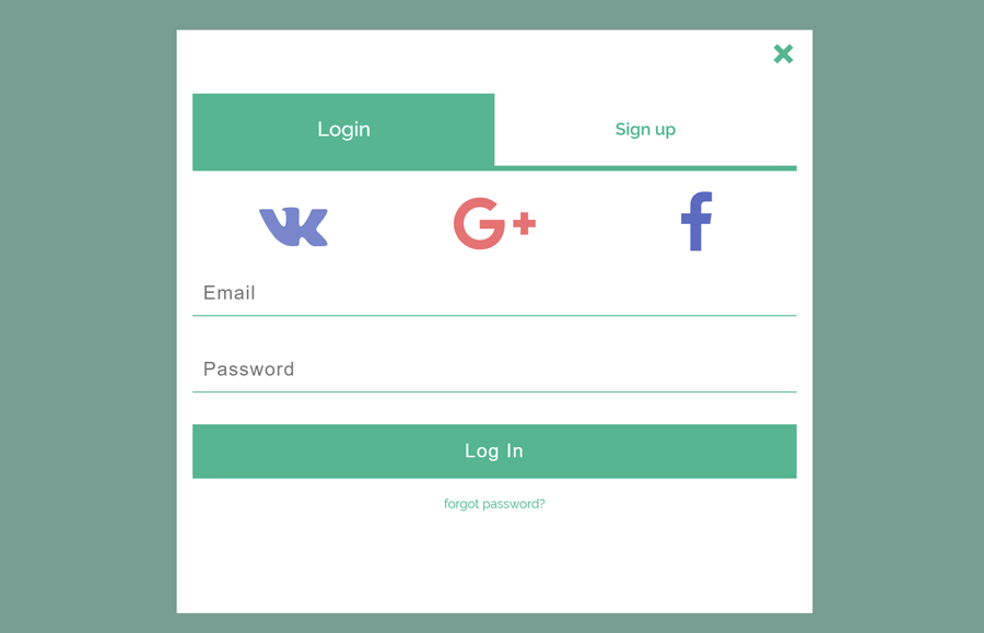
In this tutorial, we are going to build a Login Form Popup In HTML & CSS. We’ve used the tabs feature to switch between the login and sign-up forms. Besides this, there is also an SVG popup close button, and social icons (based on Font Awesome) are placed in the popup model. The final output of this project is shown in the above image. In order to check it live, don’t forget to browse the demo page.
The design concept for this popup login/signup form is really simple. It allows the users to trigger the popup model by clicking on a button (or link). In the model popup, there are two main tabs for login and signup forms and social media icons. Similarly, there is also a collapsible forgotten password input that is shown when a user clicks the “Forget Password” link.
All the functionalities for this project rely on HTML checkbox input and CSS pseudo sector. So, there is no JavaScript used in this login popup form.
How to Create Popup Login Form Html and CSS
To create the login form HTML CSS, First, we need to create a label element that will be used to trigger the popup model. You can further style this label as a button or link according to your needs. After this, create a checkbox input associated with “modal-toggle”. Similarly, create another label and checkbox input that will be used to close the popup model.
We’ve placed an SVG close button in the “modal-close-btn”, if you don’t want to use it, you can replace it with Font Awesome icon.
<label class="modal-btn" for="modal-toggle">Login/Signup</label>
    <input id="modal-toggle" type="checkbox">
    <label class="modal-backdrop" for="modal-toggle"></label>
    <div class="modal-content">
        <label class="modal-close-btn" for="modal-toggle">
		      <svg width="30" height="30">
            <line x1="5" y1="5" x2="20" y2="20"/>
		        <line x1="20" y1="5" x2="5" y2="20"/>
		      </svg>
	      </label>
After that, create a div element with class name “tabs” and place both login and signup forms. You can place any extra element or remove elements in these forms as your requirements. The following is the complete HTML code for login/signup forms.
        <div class="tabs">
<!--  LOG IN  -->
            <input class="radio" id="tab-1" name="tabs-name" type="radio" checked>
            <label for="tab-1" class="table"><span>Login</span></label>
            <div class="tabs-content">
               <div class="login_socnet">
                   <a href="" class="fa fa-vk" aria-hidden="true"></a>
                   <a href="" class="fa fa-google-plus" aria-hidden="true"></a>
                   <a href="" class="fa fa-facebook" aria-hidden="true"></a>
               </div>
               <form action="">
                   <input type="email" placeholder="Email" required>
                   <input type="password" placeholder="Password" required>
                   <input type="submit" value="Log In">
               </form>
               <form class="forgot-password" action="">
                   <input id="forgot-password-toggle" type="checkbox">
                   <label for="forgot-password-toggle">forgot password?</label>
                   <div class="forgot-password-content">
                       <input type="email" placeholder="enter your email" required>
                       <input type="submit" value="go">
                   </div>
               </form>
            </div>
<!--  SIGN UP  -->
            <input class="radio" id="tab-2" name="tabs-name" type="radio">
            <label for="tab-2" class="table"><span>Sign up</span></label>
            <div class="tabs-content">
                <div class="login_socnet">
                   <a href="" class="fa fa-vk" aria-hidden="true"></a>
                   <a href="" class="fa fa-google-plus" aria-hidden="true"></a>
                   <a href="" class="fa fa-facebook" aria-hidden="true"></a>
               </div>
               <form action="">
                   <input type="email" placeholder="Email" required>
                   <input type="password" placeholder="Password" required>
                   <input type="password" placeholder="Confirm password" required>
                   <input type="submit" value="Sign Up">
               </form>
            </div>
        </div>
    </div>
The CSS Styles
Now decide how do you want to open the modal popup, you can style the “.modal-btn” as a button or a link. In order to display this model trigger as a button, define the CSS padding, font size, and outline property. You can set custom HTML colors according to your theme design in which you are going to integrate this popup login form.
    .modal-btn {
      padding: 10px 20px;
      color: #01b491;
      font-size: 16px;
      font-weight: bold;
      outline: solid #01b491 2px;
      cursor: pointer;
    }
After that, define the CSS styles for the modal content area, keep its opacity to zero to hide it. To set the modal dialog in the center, set its position fixed and keep the top, bottom, left, and right values to 0. The “.modal-backdrop” selector defines the overlay effect, keeps its height and width value as 100%.
.modal-content,
.modal-backdrop {
  opacity: 0;
  position: fixed;
  padding: 15px;
  padding-top: 50px;
  z-index: -1;
  overflow: hidden;
  cursor: pointer;
  transition: all 0.3s ease-in-out;
}

.modal-content {
  top: 0;
  bottom: 0;
  margin: auto;
  left: 0;
  right: 0;
  height: 550px;
  max-height: 98%;
  width: 70%;
  max-width: 600px;
  text-align: center;
  transform: translateX(125%);
}

.modal-backdrop {
  left: 0;
  top: 0;
  height: 100%;
  height: 100vh;
  width: 100%;
  width: 100vw;
  transform: scale(0);
}
#modal-toggle {
  display: none;
}
Use the CSS media queries to make the popup modal responsive.
@media (max-width: 600px) {
  #modal-toggle:checked ~ .modal-backdrop {
    opacity: 0;
  }

  .modal-content {
    top: 0;
    left: 0;
    height: 100vh;
    width: 100vw;
  }
}
Dsiplay the both modal content and overlay when “modal-toggle” checkbox checked using the CSS checked pseuode selector. If you want to set the custom color for overlay, set the custom HTML color for background-color property.
#modal-toggle:checked ~ .modal-backdrop {
  opacity: 1;
  background-color: rgba(0, 70, 62, 0.5);
  z-index: 998;
  transform: scale(1);
}

#modal-toggle:checked ~ .modal-content {
  opacity: 1;
  background-color: #fff;
  overflow-y: auto;
  overflow-x: hidden;
  pointer-events: auto;
  cursor: auto;
  z-index: 999;
  transform: translateX(0%);
}
Now define the CSS styles for popup close button. Keep its position to absolute, set the top and right value 5px & 10px respectively. In order to animate it on hover, use the CSS transform rotate property.
.modal-close-btn {
  margin-top: 5px;
  display: inline-block;
  cursor: pointer;
 position: absolute;
 top: 5px;
  right: 10px;
}
.modal-close-btn svg {
  transition: 0.2s;
}
.modal-close-btn svg line {
  stroke-width: 5px;
  stroke: #01b491;
}
.modal-close-btn:hover svg {
  transform: rotate(90deg);
}
Define the functionality for “.tabs” selector, display it as flex and define the margin property. Hide all the radio inputs with CSS display none property. Similarly, define the other necessary property mentioned in the below snippet.
.tabs {
  display: -webkit-flex;
  display: -moz-flex;
  display: -ms-flex;
  display: -o-flex;
  display: flex;
  flex-wrap: wrap;
  margin: 10px 0;
}
.tabs > .radio {
  display: none;
}
.tabs > .radio:checked + .table + .tabs-content {
  display: block;
}
.tabs > .table {
  order: -1;
  flex-basis: 50%;
  flex-shrink: 1;
  overflow: hidden;
  text-overflow: ellipsis;
  white-space: nowrap;
}
.tabs .tabs-content {
  width: 100%;
  display: none;
}
The following are some visual design for tabs. You can set the custom values for background color, padding and font weight etc.
.tabs > .table {
  padding: 20px 0;
  text-align: center;
  border-bottom: solid #01b491 5px;
  color: #01b491;
  cursor: pointer;
}
.tabs > .table span {
  font-weight: 600;
}
.tabs > .table:hover {
  color: #01b491;
  background: rgba(0, 121, 107, 0.2);
}
.tabs > .radio:checked + .table {
  color: #fff;
  background: #01b491;
  cursor: auto;
}
.tabs > .radio:checked + .table span {
  display: inline-block;
  font-weight: 500;
  transform: scale(1.2);
  transition: 0.1s;
}
Apply CSS Styles for Popup Form
Now define CSS styles for login/sign up forms. You are not limited to use the following code snippet as it is, you can modify it according to your needs.
.tabs > .tabs-content .login_socnet {
  display: -webkit-flex;
  display: -moz-flex;
  display: -ms-flex;
  display: -o-flex;
  display: flex;
  flex-wrap: no-wrap;
  justify-content: space-around;
}
.tabs > .tabs-content .login_socnet a {
  margin: 20px;
  margin-bottom: 0;
  width: 100%;
  font-size: 60px;
  text-decoration: none;
  transition: 0.2s;
}
.tabs > .tabs-content .login_socnet a:hover {
  transform: scale(1.1);
  filter: drop-shadow(1px 3px 2px rgba(0, 0, 0, 0.2));
}
.tabs > .tabs-content .login_socnet .fa-vk {
  color: #7986CB;
}
.tabs > .tabs-content .login_socnet .fa-google-plus {
  color: #E57373;
}
.tabs > .tabs-content .login_socnet .fa-facebook {
  color: #5C6BC0;
}
.tabs > .tabs-content form {
  display: -webkit-flex;
  display: -moz-flex;
  display: -ms-flex;
  display: -o-flex;
  display: flex;
  -webkit-flex-direction: column;
  -moz-flex-direction: column;
  -ms-flex-direction: column;
  -o-flex-direction: column;
  flex-direction: column;
}
After that, set the form’s input styles, define the padding, margin, and border properties. The input[type="submit"]selector define the styles for login button, if you want to customize it you can set the custom background color, padding, and font-size values.
.tabs > .tabs-content form input {
  padding: 10px;
  margin: 15px 0;
  border: none;
  border-bottom: solid 1px #01b491;
  font-size: 18px;
  letter-spacing: 1px;
  transition: 0.1s;
}
.tabs > .tabs-content form input:focus {
  transform: translateX(10px);
  outline: none;
}
.tabs > .tabs-content input[type="submit"] {
  padding: 15px 0;
  width: 100%;
  background: #01b491;
  color: #fff;
  border: none;
  font-size: 18px;
  cursor: pointer;
}
.tabs > .tabs-content input[type="submit"]:focus {
  transform: none;
}
CSS styles for “Forget password” label.
.tabs > .tabs-content .forgot-password label {
  margin: 0 auto;
  width: 50%;
  color: #01b491;
  text-decoration: none;
  font-size: 12px;
  line-height: 1.5;
}
.tabs > .tabs-content .forgot-password label:hover {
  text-decoration: underline;
}
Finally, display email input when a user clicks the forget password link.
    .forgot-password #forgot-password-toggle {
      display: none;
    }
    .forgot-password .forgot-password-content {
      height: 0;
      width: 0;
      opacity: 0;
      visibility: hidden;
      overflow: hidden;
      cursor: pointer;
      transition: opacity 0.2s ease-in;
    }
    .forgot-password .forgot-password-content input[type="email"] {
      width: 80%;
      margin-right: 0px;
      border-right: none;
    }
    .forgot-password .forgot-password-content input[type="submit"] {
      width: 20%;
      margin-left: 0px;
    }
    .forgot-password #forgot-password-toggle:checked ~ .forgot-password-content {
      display: -webkit-flex;
      display: -moz-flex;
      display: -ms-flex;
      display: -o-flex;
      display: flex;
      opacity: 1;
      width: 100%;
      height: 100%;
      z-index: 999;
      pointer-events: auto;
      cursor: auto;
      visibility: visible;
    }
That’s all! I hope you find this tutorial helpful to create popup login form. If you have any questions or suggestion let us know by comment below.
im a newbie and this is the only popup T.T that worked for me thank you!
That’s great to hear Alexis.
can any body help my social icons are not appearing in the form