An interactive world map can be used for various purposes on a web page to display various locations. It may be on a “contact us” page to visualize the office locations of a company in the world. Similarly, it may be used to highlight important places for different reasons. Anyhow, for what purpose are you going to integrate this CSS interactive world map in your project? You can let me know by comment below.
A few months back, we created a responsive map using the image mapping technique in which pinned locations can be viewed on a hover box. Here we also used the same method but the main difference is that this map is created with pure CSS. On the other hand, the location pin will be converted into the infobox on the click event with a smooth animation.
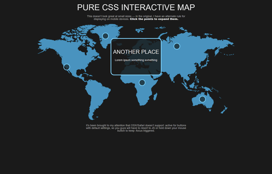
You can check this interactive world map in action on the demo page. There you can see how the location dots convert into a place info box with an expanded animation. So, without going into depth, let’s get started with HTML code to create the world map.
The HTML Structure
In HTML, the "distribution-map" class is the main container of the world map. It contains an image and button elements that are located in different locations on the map. Each button has place information wrapped with a div (with a class name "content") element.
If you don’t want to use the map image, you can check out this tutorial to create a world map using SVG. Therefore, for the image map, create the HTML structure as follows:
<div class="distribution-map">
    <img src="img/map.png" alt="" />

    <button class="map-point" style="top:15%;left:35%">
        <div class="content">
            <div class="centered-y">
                <h2>A Place</h2>
                <p>You can put plenty of details in here. In the original, I listed contact information and linked phone numbers and email addresses.</p>
            </div>
        </div>
    </button>
    <button class="map-point" style="top:35%;left:50%">
        <div class="content">
            <div class="centered-y">
                <h2>Another Place</h2>
                <p>Lorem ipsum something something</p>
            </div>
        </div>
    </button>
    <button class="map-point" style="top:76%;left:82.5%">
        <div class="content">
            <div class="centered-y">
                <h2>Marauder Town</h2>
                <p>I solemnly swear that I am up to no good</p>
            </div>
        </div>
    </button>
    <button class="map-point" style="top:45%;left:16%">
        <div class="content">
            <div class="centered-y">
                <h2>Logan's Mum</h2>
                <p>I’m a marshmallow</p>
            </div>
        </div>
    </button>
    <button class="map-point" style="top:60%;left:53%">
        <div class="content">
            <div class="centered-y">
                <h2>Toto</h2>
                <p>I bless the rains</p>
            </div>
        </div>
    </button>
    <button class="map-point" style="top:25%;left:70%">
        <div class="content">
            <div class="centered-y">
                <h2>With Love</h2>
                <p>— 007</p>
            </div>
        </div>
    </button>
</div>
You can place many locations on the map by simply creating a button element with a class name "map-point" and use the inline style to pin location on the map.
CSS Styles for Interactive World Map
In CSS, select the "distribution-map" class and define its relative position. Likewise, define 100% width and 20px value for the padding property. In order to align the map to the center of the page, use the “0 auto” value for the margin property.
.distribution-map {
  position: relative;
  width: 100%;
  padding: 20px;
  box-sizing: border-box;
  margin: 0 auto;
}
The image element should be responsive in order to cover the full area of its container. So, define the 100% width value and keep its relative position. Use the 0 value for both margin and the padding property to remove any extra space between the container and map image.
.distribution-map > img {
  width: 100%;
  position: relative;
  margin: 0;
  padding: 0;
}
The "map-point" class is a special class for the button element to indicate a marker on the image map. Initially, we’ll style it as a marker dot and expand it on the focus event. So, define the 40px dimension (height & width) and 50% border-radius property to make a circular button/pinpoint.
The CSS styles for the transformation can be generated using the Transform CSS Generator tool. The background and border can be set according to your needs.
.distribution-map .map-point {
  cursor: pointer;
  outline: none;
  z-index: 0;
  position: absolute;
  width: 40px;
  height: 40px;
  border-radius: 50%;
  filter: progid:DXImageTransform.Microsoft.Alpha(Opacity=80);
  opacity: 0.8;
  transform: translate(-50%, -50%);
  -moz-transition: opacity 0.25s ease-in-out 0.25s, width 0.25s ease-in-out 0.25s, height 0.25s ease-in-out 0.25s, z-index 0.25s ease-in-out 0.25s;
  -o-transition: opacity 0.25s ease-in-out 0.25s, width 0.25s ease-in-out 0.25s, height 0.25s ease-in-out 0.25s, z-index 0.25s ease-in-out 0.25s;
  -webkit-transition: opacity 0.25s ease-in-out, width 0.25s ease-in-out, height 0.25s ease-in-out, z-index 0.25s ease-in-out;
  -webkit-transition-delay: 0.25s, 0.25s, 0.25s, 0.25s;
  transition: opacity 0.25s ease-in-out 0.25s, width 0.25s ease-in-out 0.25s, height 0.25s ease-in-out 0.25s, z-index 0.25s ease-in-out 0.25s;
  background: rgba(26, 26, 26, 0.85);
  border: 5px solid #7fcff7;
}
The "content" class contains the location information inside the button element. Define its 0 value for the opacity property to hide in normal view. Similarly, define transition property for smoothness and 100% dimension along with the 50% left value.
.distribution-map .map-point .content {
  filter: progid:DXImageTransform.Microsoft.Alpha(Opacity=0);
  opacity: 0;
  transition: opacity 0.25s ease-in-out;
  width: 100%;
  height: 100%;
  left: 50%;
  transform: translateX(-50%);
  overflow: overlay;
}
In order to expand the circular marker, target the "map-point" with focus pseudo-selector, define the 300px and 220px values for the width and height respectively. Use the CSS filter property as mentioned below to convert the circular dot into the content box.
.distribution-map .map-point:active, .distribution-map .map-point:focus {
  margin: 0;
  padding: 0;
  filter: progid:DXImageTransform.Microsoft.Alpha(enabled=false);
  opacity: 1;
  width: 300px;
  height: 220px;
  color: #e5e5e5;
  z-index: 1;
  transition: opacity 0.25s ease-in-out, width 0.25s ease-in-out, height 0.25s ease-in-out;
}
Use the following CSS transformation effect to convert the dot into the box with real-time expand animation.
.distribution-map .map-point:active .content, .distribution-map .map-point:focus .content {
  filter: progid:DXImageTransform.Microsoft.Alpha(enabled=false);
  opacity: 1;
  -moz-transition: opacity 0.25s ease-in-out 0.25s, height 0.25s ease-in-out, overflow 0.25s ease-in-out;
  -o-transition: opacity 0.25s ease-in-out 0.25s, height 0.25s ease-in-out, overflow 0.25s ease-in-out;
  -webkit-transition: opacity 0.25s ease-in-out, height 0.25s ease-in-out, overflow 0.25s ease-in-out;
  -webkit-transition-delay: 0.25s, 0s, 0s;
  transition: opacity 0.25s ease-in-out 0.25s, height 0.25s ease-in-out, overflow 0.25s ease-in-out;
  overflow: hidden;
}
.distribution-map .map-point:active .content a:hover, .distribution-map .map-point:active .content a:active, .distribution-map .map-point:focus .content a:hover, .distribution-map .map-point:focus .content a:active {
  color: #afe1fa;
}
Map Typography
Finally, define the following CSS styles for the typography that’s used in the map. Generally, these styles are optional but you can set the custom styles for the heading and paragraph according to your website’s template.
.description {
  max-width: 600px;
  margin: 0 auto;
  color: rgba(229, 229, 229, 0.7);
}

div, img, footer {
  position: relative;
  box-sizing: border-box;
}

h1, h2, h3, h4, h5, h6 {
  margin-bottom: 20px;
  text-transform: uppercase;
  font-family: "Roboto Condensed", Helvetica, sans-serif;
  font-weight: 300;
}
That’s all! I hope now you are able to create an interactive world map using CSS. If you have any questions or suggestions, let me know by comment below.
Hi Muhammad,
Super cool MAP… but I’m struggling as SOME of the PopUp Boxes on a MOBILE will go out of the view-able screen Area (example Austarlia)
Hoe can I fix it, so that regardless of were the Click-Circle is located, that the PopUp will be fully on the screen… ?
Hi Kim!
Each map point has an absolute position that is placed on the map with inline top and left values. So, you can set the custom value for adjustment of the popup according to the mobile screen.
Hey Muhammad! by any chance is it available on github? I would like to study and document it better.
Cheers!
Hi Eva!
There is no GitHub repository for this project. Anyhow, it’s available on CodePen:
https://codepen.io/mirichan/pen/jEBmyG
I have a problem, my background image is not previewing but if I hover over the points, I can see the content… How can I fix this?