This tutorial explains how you can place HTML images side by side with captions using CSS. Whether you are working on a gallery project or want to arrange your feed posts in a grid layout, you can integrate this code snippet into your project.
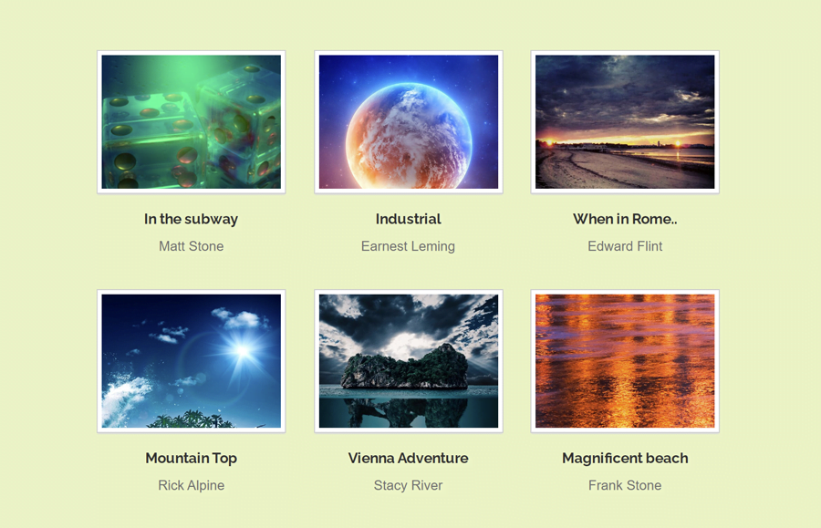
As you’ve seen in the above image, there is a 3 by 3 images grid layout with the two lines of captions. But you are not limited to place only three images side by side, you can increase the container width to place more images. You can also check the demo page to see the layout of these images.
The coding concept to arrange images side by side is really simple and straightforward. You just need to place your images in a container and display them as the inline-block element. Similarly, you need to create a few HTML elements for images captions. So, let’s get started with coding to place images side by side.
How to Place HTML Images Side by Side
First of all, you need to create an unordered list of images in order to arrange them side by side. So, create a ul element with a class name “image-list-small” and place anchor link, div element with a class name “details” (for caption text) inside each li element.
Inside the hyperlink, you can place your image (through img tag or) using style attribute as the background image. Similarly, you can set the destination link of your full-size image.
<ul class="image-list-small">
    <li>
      <a href="#" style="background-image: url('img/image-1.jpg');"></a>
      <div class="details">
        <h3><a href="#">In the subway</a></h3>
        <p class="image-author">Matt Stone</p>
      </div>
    </li>
    <li>
      <a href="#" style="background-image: url('img/image-2.jpg');"></a>
      <div class="details">
        <h3><a href="#">Industrial</a></h3>
        <p class="image-author">Earnest Leming</p>
      </div>
    </li>
    <li>
      <a href="#" style="background-image: url('img/image-3.jpg');"></a>
      <div class="details">
        <h3><a href="#">When in Rome..</a></h3>
        <p class="image-author">Edward Flint</p>
      </div>
    </li>
    <li>
      <a href="#" style="background-image: url('img/image-4.jpg');"></a>
      <div class="details">
        <h3><a href="#">Mountain Top</a></h3>
        <p class="image-author">Rick Alpine</p>
      </div>
    </li>
    <li>
      <a href="#" style="background-image: url('img/image-5.jpg');"></a>
      <div class="details">
        <h3><a href="#">Vienna Adventure</a></h3>
        <p class="image-author">Stacy River</p>
      </div>
    </li>
    <li>
      <a href="#" style="background-image: url('img/image-6.jpg');"></a>
      <div class="details">
        <h3><a href="#">Magnificent beach</a></h3>
        <p class="image-author">Frank Stone</p>
      </div>
    </li>
</ul>
Basically, there are six images in the above HTML structure. But you are not limited to keep only six, you can place images as many as you need.
The CSS Styles
The very first element is an unordered list that we’ll design as a container of all images. So, define the 640px max-width and keep the left and right margin auto to align this container to the center of the page. Specify text-align property and set the “center” value. Likewise, you can define other CSS properties (like font-family, padding, etc.) in order to further customization.
.image-list-small {
  font-family: Arial, Helvetica, sans-serif;
  margin: 0 auto;
  text-align: center;
  max-width: 640px;
  padding: 0;
}
Now, target the li element and display it as an inline-block. Here, you need to specify 181px width for list items to display them side by side. In order to keep some space between items, define the margin property as mentioned below. You can increase/decrease the margin value if you want to set the custom gap between the images.
.image-list-small li {
  display: inline-block;
  width: 181px;
  margin: 0 12px 30px;
}
After that, target the “a” element and display it as a block. Define the CSS background-size property with the “cover” value. Similarly, define the background-repeat property with a “no-repeat” value. Specify its height as 137px and set border, outline, and box-shadow property as described in the following snippet.
.image-list-small li > a {
  display: block;
  text-decoration: none;
  background-size: cover;
  background-repeat: no-repeat;
  height: 137px;
  margin: 0;
  padding: 0;
  border: 4px solid #ffffff;
  outline: 1px solid #d0d0d0;
  box-shadow: 0 2px 1px #DDD;
  transition: .25s;
}
If you want to place your image using the HTML img tag, then target your images in CSS as follows.
.image-list-small li img{
    width: 100%; /* To make the images responsive */
    height: auto;
}
To make a better user experience, also add a hover effect for your images. If you want to add a custom hover effect, browse creative hover effects for images to implement into your project.
.image-list-small li > a:hover{
    transform: scale(1.1);
    transition: .25s;
}
CSS Styles for the HTML Images Captions
After defining the basic styles for images layout, now it’s time to specify CSS styles for the images caption. Therefore, target that "details" class that is the wrapper element of the caption text. You just need to define the margin-top property for this element in order to leave some space from the top.
.image-list-small .details {
  margin-top: 13px;
}
The h3 inside the "details" class is the main title of the image caption. Display it as a block element, define font-size, and margin property. Here, the important thing to keep in mind is how to handle longer text? Well! for this solution we’ll use the overflow hidden property and white-space as nowrap. So, define these properties and set the "ellipsis" value for the tex-overflow to add the dots (…) at the end of a longer text.
Similarly, define the CSS styles for the hyperlinks (by targeting a element) if you want to add a link inside your caption text.
.image-list-small .details h3 {
  display: block;
  font-size: 14px;
  margin: 0 0 3px 0;
  white-space: nowrap;
  overflow: hidden;
  text-overflow: ellipsis;
}
.image-list-small .details h3 a {
  color: #303030;
  text-decoration: none;
}
The "image-author" class is the wrapper element of the second line of the image caption text. Specify font-size, color, and margin property for this class.
.image-list-small .details .image-author {
  display: block;
  color: #717171;
  font-size: 13px;
  font-weight: normal;
  margin: 0;
}
Make the Responsive Images Layout
In order to make the layout of these images responsive on mobile devices, use the CSS media queries, and define the styles as follows:
@media only screen and (max-wdith: 640px){
.image-list-small{
   max-width: 100%;
 }
.image-list-small li > a {
   width: 50%;
 }
}
That’s all! I hope you have successfully arranged side by side images with captions in your HTML project. Don’t hesitate to comment below if you have any questions or suggestions.