Today we have a collection of Creative Image Hover Effects that are built with CSS3 & HTML. There are more than 60 effects and you can pick one or more that you want to use on your website.
This vast collection of creative Image hover effects using CSS3 gives you more choice to choose the best effect for your web template
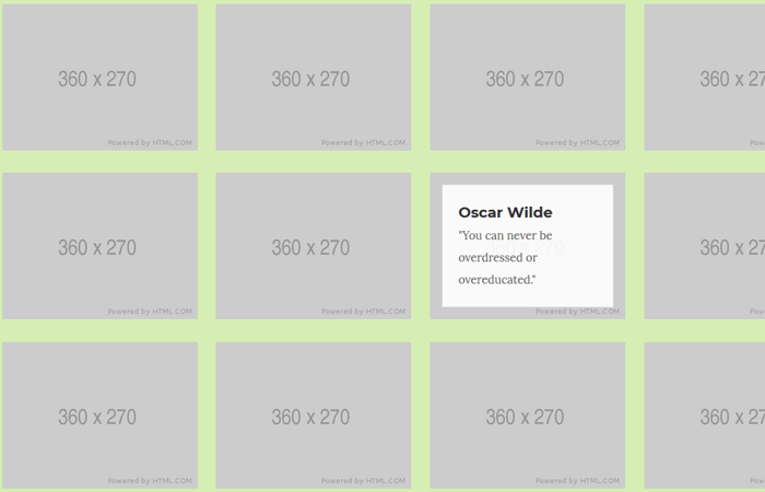
These effects make your website look differently and enhance the user experience. All of them allow you to show some title and description over the image and it will show when the user hovers it.
You can easily customize them by just editing the CSS to make the fit according to your requirements. These image effects are responsive and also work on all major browsers.
How to Create Creative Image Hover Effects
We will start with the markup which is simple and easy to understand. All of the effects HTML code define inside two of divs. The first one is our main div and the second one is child div with the class name effects.
Each image effect place inside a div class name demo and then defines an HTML5 figure element that holds the image.
It also used the figcaption HTML5 element that holds the text, heading, and a link. Here we have the first two effects HTML code example.
<div class="main">
<div class="effects" id="effects">
<div class="demo">
<figure class="imghvr-fade"><img src="https://placehold.it/360x270" alt="01">
<figcaption>
<h3>Oscar Wilde</h3>
<p>"You can never be overdressed or overeducated."</p>
</figcaption><a href="javascript:;"></a>
</figure>
</div>
<div class="demo">
<figure class="imghvr-push-up"><img src="https://placehold.it/360x270" alt="02">
<figcaption>
<h3>Oscar Wilde</h3>
<p>"You can never be overdressed or overeducated."</p>
</figcaption><a href="javascript:;"></a>
</figure>
</div>
</div>
</div>
The Styling
The CSS is a bit long because there are 60+ effects, so we are going to explain a few important styles here, but you can find all of the styles in the download source files.
The following CSS is use must need to add for all the effects whether you want to use one or more effects. Its the common style where we will set the font-family, margin, max-with, and background-color, etc.
[class*=' imghvr-'],
[class^=imghvr-] {
  font-family: Montserrat, sans-serif;
  position: relative;
  display: inline-block;
  margin: 0;
  max-width: 100%;
  background-color: rgba(230, 230, 230, .7);
  color: #666;
  overflow: hidden;
  -moz-osx-font-smoothing: grayscale;
  -webkit-backface-visibility: hidden;
  backface-visibility: hidden;
  -webkit-transform: translateZ(0);
  transform: translateZ(0)
}

[class*=' imghvr-'] img,
[class^=imghvr-] img {
  vertical-align: top;
  max-width: 100%
}
Similar we have common style for the figcaption the element where we will do the same.
[class*=' imghvr-'] figcaption,
[class^=imghvr-] figcaption {
  background-color: rgba(255, 255, 255, .9);
  padding: 20px;
  position: absolute;
  top: 15px;
  bottom: 15px;
  left: 15px;
  right: 15px;
  border: 1px solid rgba(0, 0, 0, .1)
}
For each effect, we have different styles. For example, Let’s say we want to use the Fade effect than our code looks like:
.imghvr-fade figcaption,
.imghvr-fade:hover img {
  opacity: 0
}

.imghvr-fade:hover figcaption {
  opacity: 1
}
That’s It. Share with your friend and leave your feedback.