Are you look for a solution to add a responsive but fullscreen HTML5 video as background? And want to make it work with most of the major browsers including mobiles?
In this tutorial, You will learn how you can do that without using any plugin. This can be done simply by using CSS3 and HTML5.
You don’t need to rely on JavaScript.
By using images as the background is always a great thing that provides an amazing visual impact. But what you think about adding video as a background in exactly the same manner.
Adding a background video effect is very easy and pretty much simple. In fact, this can be done by only using CSS or CS3.
video tag (except IE8).We know that the background or background-image property only accepts color gradients, SVG as a value. so you may be thinking what about the video?
Well, I’ll simply take the help of the HTML5 video element which helps us add video has a background. The HTML5 video already has some awesome features.
It includes autoplay, loop and mute. Not only this but we can also add the poster.
The poster element allows us to add an image that replaces the first frame of the video. Therefore, it’s a great thing to add a poster to the first frame of the video. It will make look the video good for users.
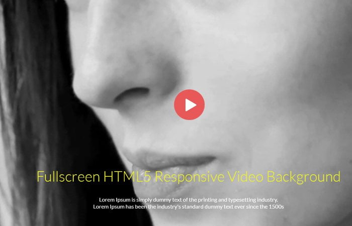
How to Make Responsive Fullscreen HTML5 Video as Background
Let’s start with how the HTML can be written. We will define <video> tag with the source. I added autoplay, loop, poster and define an ID video.
Now, We include two different sources because we want to make sure that the video should work on all browsers. Some browser plays MP4 whereas some play WebM format.
The poster picture will be replaced by the first frame of the video when it loads, so it makes feel to derive that photograph from the same first frame.
<video autoplay  poster="images/poster.jpg" id="video by" loop>
    <source src="images/video.webm" type="video/webm">
    <source src="images/video.mp4" type="video/mp4">
    Your browser does not support the video tag. I suggest you upgrade your browser.
</video>
CSS Styles for Video Background
To achieve a video that fills the screen for both width and height, we need to set the position fixed with top and left should be 50%.
In addition, you could also add a min-height:100% to ensure that you don’t get any vertical scroll bars. With this method, the min-width or height will always be used without any scrolling.
video#videobg {
	position: fixed;
	top: 50%;
	left: 50%;
	min-width: 100%;
	min-height: 100%;
	width: auto;
	height: auto;
	z-index: -100;
	transform: translateX(-50%) translateY(-50%);
	background: url('images/poster.jpg') no-repeat;
	background-size: cover;
	transition: 1s opacity;
}
For the older browsers, we create a background image for the element, using the same placeholder picture. At this degree, the most effective Safari (mobile and desktop) requires the -webkit vendor prefix for transforms, so it has been included in the code.
if you’re also targeting Firefox 15 or earlier, you’ll need to include a -moz prefixed version of the transform.
You need to have now a video that fills all the available space on the display screen. As evidence of how this works; we’re telling the video to use the most available width or height, but as it will hold its aspect ratio. This may suggest, it will overflow over the full-screen size (unless you happen to be browsing in the perfect screen size).
Hi I have tried different codes
& so far haven’t been able to
Scale the video dimensions to fit the whole screen on mobile can you email me the code to make it happen
doesn’t work, all i get is a poster image at the top of the page, no video at all