Did you try an image parallax scrolling? What do you think about adding fullscreen video parallax background by using CSS3 and HTML5 only?
You might be thinking is it possible? Yep, that’s entirely possible and in this tutorial, you will learn how you can achieve this with simple tips.
Not only this, but I am also going to implement scrolling layers for content and images so you can see how you can mix up different effects.
We are going to implement different layers for each section. Each section consists of content video, images, and content.
For the video section, the video will autoplay in the background and for image section, the images will show in the background at fullwidth by using the background-image property.
As for content concern, we are going to implement a solid background and you can easily add the content using HTML tags.
The parallax scrolling is a new way in computer graphics, where background images or video move by the camera slower than foreground images.
It is the technique of depth in a 2D scene. There are many references to creating parallax transition for photos as a background, but here I will share you how to display parallax video by using CSS3 purely.
This technique based on our previous article fullscreen video background which modifies to make it possible for parallax image and video background.
Without wasting your time lets get started with markup and let’s see how it will work.
Video Parallax Background Using CSS3
As I explain to you above that there are different sections for images and content. I am going to explain to you each of them step by step. Of course, I will also show how you can implement a video section which is an important part of this tutorial.
So, Let’s have a look at our first section which is about adding parallax image as a background.
What we did here to simply place a div class name ParallaxImage and you also notice another class bg1 which will be a unique class for each image section and we will define a background image in CSS file.
1. The HTML
A child div container is used to align the content to a center of the page and make the section responsive. Then finally we have h1 heading.
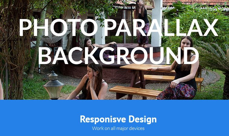
<div class="ParallaxImage bg1">
  <div class="container">
  <h1>Parallax Effect Video Background</h1>
  </div>
</div>
Now let’s have a look in the second section which is for the content area. We place a div class name ParallaxContent to define it. Then next, we have a container which allows us to align the content center of the body.
For demo purpose, We have added a div headlines and added the couple of H3 and P tags.
<div class="ParallaxContent">
  <div class="container">
  <div class="headlines">
  <h3>Parallax Effect Video Design</h3>
  <p>Work on all major devices</p>
  </div>
  <h3>Lorem Ipsum Dolor</h3>
  <p> Lorem ipsum dolor sit amet, consectetur adipiscing elit.</p>
  </div>
</div>
Now the last section which is about making the video as parallax. Ok for video parallax section we have defined a div class name ParallaxVideo and place the HTML5 video tag inside.
You can also add heading on that video, all you need to do to place the heading just right below the video tag.
<div class="ParallaxVideo">
  <video autoplay muted loop>
  <source src="https://www.w3schools.com/html/mov_bbb.mp4" type="video/mp4">
  <source src="https://www.w3schools.com/html/mov_bbb.ogg" type="video/ogg">
  </video>
  <h1>Video Background</h1>
</div>
2. The Styling
Without CSS, the HTML is nothing so we are going to style our sections to not only make them look good but also function as you can see in the demo.
1. Background Image Section
First of all, we will take a look at parallax image and we simply use background-attachment: fixed; element. You need to define background-position: 50% 50%; which will adjust the size of the background.
The property background-repeat: no-repeat; will not repeat the background. We are going to use background-size: cover; which make background responsive to all kind of device.
The heading h1 have few styles like font-weight, font-size, color, text-transform and text-align.
We have three different classes, each has a different background image. These classes are bg1, bg2, and bg3. Now let’s have a look at how the CSS style will look like:
.ParallaxImage {
  background-attachment: fixed;
  background-position: 50% 50%;
  background-repeat: no-repeat;
  background-size: cover;
  padding-bottom: 50px;
  padding-top: 50px;
}
.ParallaxImage h1 {
  font-weight: 700;
  font-size: 76px;
  text-align: center;
  text-transform: uppercase;
  color:#FFF;
}
.bg1 {
  background-image: url("../images/paxallax1.jpg");
}
.bg2 {
  background-image: url("../images/paxallax2.jpg");
}
.bg3 {
  background-image: url("../images/paxallax3.jpg");
}
2. Content Section
To style the content section, We don’t need to use a fixed thing. All we need to add background color and we used nice blue color for the background. Then we have added top and bottom padding 42px. We’re going to color the text to white.
.ParallaxContent {
  background: none repeat scroll 0 0 #2581e8;
  padding: 42px 0;
  color:#FFF;
}
.ParallaxContent h2{
	color:#FFF;
}
3. Video Section
Now the important video section. First, we need to apply some height and padding as per our need into class ParallaxVideo.
Then video element inside ParallaxVideo div will be position: fixed; and top:0; Remember that top:0; will show the video from the top of the page.
We also need to use min-width: 100%; CSS element to make the full video width. The z-index property allows us to define the stack order.
Let’s have a look piece of CSS code:
.ParallaxVideo{
height: 300px;
padding-bottom: 50px;
padding-top: 50px;
}
.ParallaxVideo video{
min-width: 100%;
position: fixed;
top:0;
z-index: -999;
}
.ParallaxVideo h1 {
  color: #fff;
  font-size: 76px;
  font-weight: 700;
  text-align: center;
  text-transform: uppercase;
}
That’s it all you have to do while adding scrolling controls for HTML5 video but there are few general styles included in the demo and download source. We have defined them separately in the cssparallax.css file.
This solution is fully responsive and works well on all kind of devices, but If you have an any better idea please share it in below comment section.
very helpful. Thank you