Today we have excellent examples of CSS animated dropdown menu which build without using Javascript. The menu provides beautiful animation on hover the menu on the main navbar.
To apply the animation on the dropdown, We will use the @keyframes property from the CSS3. It’s easy to use and all you need to copy and paste the source code.
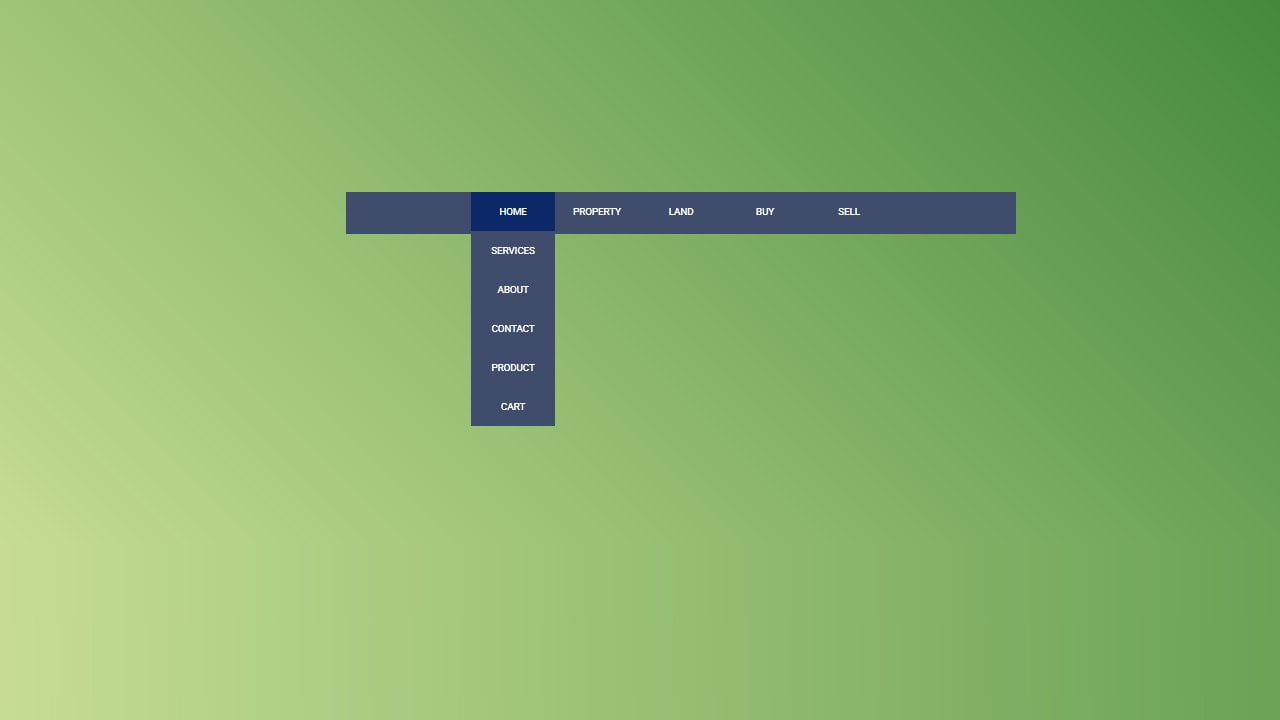
We will first create the primary navbar with some items and then apply dropdown to each one. When user mouse hovers to any item on the primary menu, The dropdown menu list with animation will show up.
Build such animation isn’t easy and you need to rely on javascript or jquery. But here we can easily do it with the help of CSS3. Just an issue with CSS3 is browser support for the older version.
But at the same time, we know there are very fewer users of the older version of the browser. If you still need the support for the previous version, you can add the fallback.
How to Create CSS Animated Dropdown Menu
Let’s have a look at the HTML code and the code is simple. All we need to list the menus using standard HTML element UL and LI.
We will place the whole menu list under the div class name AniNav. Next, we will Ul. The UL element will also hold all the menu list.
Each Li element itself a menu link and if we need to add the drop-down menu under any li, we simply need to place ul and li. Let’s see it as the simplest way as possible.
<div class="AniNav">
  <ul class="AniNavList">
    <li class="AniNavMenu">Home</li>
    <li class="AniNavMenu">Property </li>
  </ul>
</div>
You see above code is only have two menus and don’t have any drop-down menu, Now let’s say we need to add drop-down menu under the Home than our code will look this:
<div class="AniNav">
  <ul class="AniNavList">
    <li class="AniNavMenu">Home
      <ul class="nav__menu-lists nav__menu--1-lists">
       <li class="nav__menu-items">Services</li>
        <li class="nav__menu-items">About</li>
        <li class="nav__menu-items">Contact</li>
        <li class="nav__menu-items">Product</li>
        <li class="nav__menu-items">Cart</li>
      </ul>
    </li>
    <li class="AniNavMenu">Property </li>
  </ul>
</div>
What we did here is to define the list of the menu using UL and li. Similar if you need to add the dropdown menu under the property or any other menu, you simply need to do the same thing.
The Styles
Let’s have a look at the implementation of CSS. First of all, we need to do some basic stuff. We need to add a background color, some margin, and text alignment.
We also do implement the height and width of AniNavMenu class and add background color on hover. Our basic CSS here.
.AniNav {
    background: #3f4c6b none repeat scroll 0 0;
    margin-top: 30px;
    text-align: center;
    width: 100%;
}
.AniNavList {
  display: inline-block;
}
.AniNavMenu {
  float: left;
  width: 140px;
  height: 65px;
  line-height: 65px;
  text-transform: uppercase;
  background-color: #3f4c6b;
  cursor: pointer;
}
.AniNavMenu:hover {
  background-color: #0C2868;
}
.AniNavMenu:hover > .nav__menu-lists li {
  display: block;
}
The next thing needs to do with CSS is to create animation. We will use the nth-child element to handle each menu item that has a dropdown.
The nth-child will utilize with li, and we will add ease-in-out animation. To create the animation effect on hover, we will use keyframes for each menu. We do rotate the menu at x-as by giving the value of -180deg.
.AniNavMenu:hover > .nav__menu--1-lists li:nth-child(1) {
  opacity: 0;
  -webkit-animation: menu1 ease-in-out forwards;
          animation: menu1 ease-in-out forwards;
  -webkit-animation-duration: 300ms;
          animation-duration: 300ms;
  -webkit-animation-delay: 0ms;
          animation-delay: 0ms;
}
@-webkit-keyframes menu1 {
  from {
    opacity: 0;
    -webkit-transform: rotateX(-180deg);
            transform: rotateX(-180deg);
  }
  to {
    opacity: 1;
    -webkit-transform: rotateX(0deg);
            transform: rotateX(0deg);
  }
}
@keyframes menu1 {
  from {
    opacity: 0;
    -webkit-transform: rotateX(-180deg);
            transform: rotateX(-180deg);
  }
  to {
    opacity: 1;
    -webkit-transform: rotateX(0deg);
            transform: rotateX(0deg);
  }
}
We will keep using the same technique with all the drop-down menu, but the animation-delay will change accordingly.
The animation-duration almost remain the same for all the menus, but the animation-delay will modify like for second menu item, the delay will be 150ms whereas the delay is zero for the first menu item.
That is the small css3 tutorial about creating animations for the dropdown. Hope you find it suitable to use for your upcoming project.
I tried to do your animated navigation menu but when I tried to validate the HTML code the validator showed an error on the 1st line which is <div class="AniNav" I am a beginner
and I would appreciate your help to correct this.
thank you
Edmond January
Hi Edmond!
Please make sure you have placed the closing tag for the div element.