A sticky navbar helps you keep your website clean and easy to read. Using this technique, the navigation bar remains at the top of the screen and never scrolls away.
Meanwhile, the main content area remains below the navigation bar, allowing you to keep your visitors’ focus on the content you’re providing.
In this tutorial, you’ll learn how to create a CSS sticky navbar. We’ll cover how to use the CSS property position: sticky to make it happen.
What Is a Sticky Navbar?
Before creating the sticky navbar, it is important to understand what is a “sticky” in CSS? Well, To make your navbar stick to its parent element, you have to use the position: fixed and position: sticky.
So there are two parts of the CSS properties for making Sticky Div Element and each one has different properties. You can read about them here.
Position: fixed;is used to keep the element in the same place when you scroll down the page. It will float with the content.Position: sticky;also, stay in the same position on the viewport but only within its parent element.
Let’s take a look at the simple example of making a sticky bar with the help of position: sticky; CSS property. You should include -webkit- prefix for WebKit browsers support.
.sticky {
	position: -webkit-sticky;
	position: sticky;
	top: 0;
}
We have a simple HTML with Nav element with class name sticky. Then we define the unorder list elements.
<nav class="sticky">
	<ul>
		<li><a href="#a">Section A</a></li>
		<li><a href="#b">Section B</a></li>
		<li><a href="#c">Section C</a></li>
		<li><a href="#d">Section D</a></li>
	</ul>
</nav>
If you need a quick solution then you can use the above source code but in case you are looking for a complete solution then we have to build a Sticky Header with Logo so that when someone clicks on the link, it will move to a specific section of the content.
Let’s learn how you can do that.
Build the Navbar
We will start with a div element that has the class “nav”. The logo div is placed within the div with the class “nav”. We have added the class “logo” to the div so we can style it.
For navigation, we use the unordered list element to arrange the nav links.
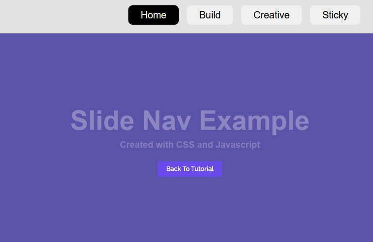
<div class="nav">
	<div class="logo">Logo</div>
	<ul>
		<li><a href="#section1" class="active">Home</a></li>
		<li><a href="#section2">Build</a></li>
		<li><a href="#section3">Creative</a></li>
		<li><a href="#section4">Sticky</a></li>
	</ul>
</div>
Now we will design the navigation using the following CSS.
.nav {
	background: #e3e3e3;
	padding: 15px;
	position: fixed; /*left: 50%;*/
	width: 100%;
	top: 20px;
	z-index: 9;
}
.nav .logo {
  display: inline-block;
  font-size: 25px;
  color: #2f2d2d;
  font-weight: bold;
  text-transform: capitalize;
}
.nav ul {
  margin: 0;
  padding: 0;
  float: right;
}
.nav li{
	list-style: none;
	display: inline-block;
}
.nav a {
	padding: 7px 20px;
	border-radius: 7px;
	margin-right: 10px;
	background: rgba(255, 255, 255, 0.5);
	-webkit-transition: all 0.2s ease-out;
	-moz-transition: all 0.2s ease-out;
	-ms-transition: all 0.2s ease-out;
	-o-transition: all 0.2s ease-out;
	transition: all 0.2s ease-out;
	text-decoration: none;
	color: black;
	font-family: sans-serif, arial;
	font-weight: 100;
}
.nav a.active {
	background: #000;
	color: white;
}
.nav a:hover {
	background: #000;
	color: #fff;
}
Make a Simple Website for the Sticky Navbar
Now we will build the one-page sections for each link so that when a link clicks, it leads to the specific section where we will display the content.
Each link pointed to a different section of the site. For this purpose, we will use the <section> elements with heading and paragraph tags. Here is what our structure will look like.
<div id="section1" class="section">
	<div class="text-wr">
		<h1 class="title">Section 2</h1>
		<p>Lorem ipsum dolor sit amet, consectetur adipisicing elit, sed do eiusmod tempor.</p>
	</div>
</div>
To design these sections we have the following CSS styles.
.section {
	min-height: 800px;
	position: relative;
	text-align: center;
	font-family: sans-serif, arial;
	margin: 0;
}
.text-wr {
	position: absolute;
	top: 50%;
	left: 50%;
	-webkit-transform: translate(-50%, -50%);
	-moz-transform: translate(-50%, -50%);
	-o-transform: translate(-50%, -50%);
	-ms-transform: translate(-50%, -50%);
	transform: translate(-50%, -50%);
}
h1 {
	font-size: 50px;
	margin-bottom: 25px;
}
.title-top {
	font-size: 60px;
	padding-bottom: 30px;
}
.title-bottom {
	font-size: 30px;
}
.title-tx {
	font-size: 20px;
	opacity: 0.8;
}
After that, we will design each section’s individual section through ID. So the first section will look like this:
#section1 {
    background: #5c53aa;
    color: #8d86c3;
}
Adding Javascript for Navbar Sticky
We need some help from Javascript so we will include the slideNav.js and then require Initialization
<script src="js/slideNav.js"></script>
<script type="text/javascript">
var nav = new SlideNav({
	activeClass: "active",
	toggleButtonSelector: '.hamburger',
	toggleBoxSelector: '.nav',
	hideAfterSelect: false,
	speed: 100  //default 250
});
</script>
Conclusion
In conclusion, we have created a sticky navbar that will remain in place while scrolling. We used an unordered list to display the navigation items and a position:fixed; to make it sticky. We also created a simple hover effect to add some extra pizzazz to the navigation.