Today, we are going to create HTML div element sticky on window scroll event. Want to know how? well, when scroll reaches a certain point of the webpage, we’ll stick div by using the CSS position property. So, move on.
One way to create an on-scroll animated sticky header by using jQuery but here we will experiment with CSS only by using it’s positioning properties.
You may have experience with creating a sticky header or footer with the help of position: sticky; which always stay at the top of the page but how about making an element sticky beneath a block of content?
With the help of both position property relative and fixed, we can easily create an sticky element depending upon the scroll position. The element position stay relative until it reach to the given offset position – then it “sticks” in place (like position:fixed).
There are two types of position properties position: sticky; and position: fixed; which allow us to make an element stick. Both work in a similar way to fixed the HTML element and maintain their position on the browser screen, even the user scrolls down or up to the page.
But the sticky element bounded to its parent container whereas the fixed element isn’t confined to its parent.
top, right, bottom or left to make work the sticky element.So what I am going to do in this tutorial to create a div element that situated beneath the block of content. When user scrolled enough to contact its top boundary area, its becomes fixed in the place and start scrolling with the page.
I will discuss two different methods.
- A typical
stickymethod which confined to the parent. - A
fixedelement that is not confined to the parent it is in.
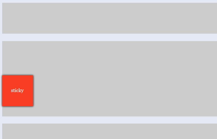
Sticky Element (div) Container
Let’s start with sticky method. We have a div wrapper and then additional div element with an ID “sticky”. In addition, we did place two extra divs for demo purpose.
You can think this will be your above and bottom content area and we are applying the sticky position on the child div of our main wrapper.
Here’s the simple markup:
<div class="extra"></div>
<br />
<div id="wrapper">
  <div id="sticky">
    sticky
  </div>
</div>
<br />
<div class="extra"></div>
And now our styles, We use position: stick with it’s top point. The height and width just according to our need. Note the display: flex; is use to make work the sticky well. So, the CSS for “sticky div on scroll” is as follow:
#sticky {
  position: sticky;
  position: -webkit-sticky;
  background: #f83d23;
  width: 100px;
  height: 100px;
  top: 70px;
  display: flex;
  justify-content: center;
  align-items: center;
  box-shadow: 0 0 6px #000;
  color: #fff;
}
.extra,
#wrapper {
  width: 75%;
  margin: auto;
  background-color: #ccc;
}
#wrapper {
  height: 800px;
}
.extra {
  height: 100px;
}
Fixed Position Element
Now in our second example, we will use the fixed position element and when user scroll it will not confined to parent div.
Similar to our first method, We have placed two extra divs for demo then we have a man container. The child div fixed inside the wrapper will stay fixed when scrolling the page.
When you see the demo of this example you will see the sticky div will not care about its container (wrapper) and goes till the end of the content.
<div class="extra"></div>
<br />
<div class="wrapper">
  <div class="fixed">
    fixed
  </div>
</div>
<br />
<div class="extra"></div>
As for styling, We will use the position: fixed; along with flex display to make sure it should work great. Further, we simply apply a few basic styles that are background, color, and box-shadow, etc..fixed { position: fixed; background: #f83d23; width: 100px; height: 100px; display: flex; justify-content: center; align-items: center; box-shadow: 0 0 6px #000; color: #fff; } .extra, .wrapper { width: 75%; margin: auto; background-color: #ccc; } .wrapper { height: 800px; } .extra { height: 100px; }
Just few of additional things to note:
- In our first example, we use the
-webkit-stickyvendor prefix for WebKit browsers such as Safari & Chrome. - It is also important to set the point for the element to become sticky using either of
- the
top,bottom,leftorrightproperties. It’s depend upon which direction the user will scroll the page.