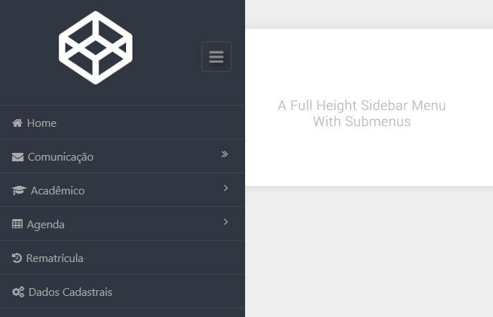
Today, we will show you the best example of a sidebar menu with submenu using CSS and a bit of JavaScript.This menu builds in full height which will always be fixed at the left side of the content area.
When the user clicks on the hamburger button, The menu will accessible to click. By default, the navigation menu text will be hidden and a small strip will show with icons.
The menu also has the functionality of hiding or how with one click hamburger button. Design navigation is awesome and eye-catching. It is intended as the vertical menu which is perfect for the sidebar to use. It does have not only a submenu but also the Multi-Level Dropdown Menu.
HTML Structure for Sidebar Menu with Submenu
Let’s have a look at the HTML/CSS, but before we go ahead, you make sure to add the main query file to make it work. Also the Font Awesome need to be added for icons.
<link href="//maxcdn.bootstrapcdn.com/font-awesome/4.2.0/css/font-awesome.min.css" rel="stylesheet">
<script src="//code.jquery.com/jquery-2.1.1.min.js"></script>
Ok, Here is the rest of the complete HTML.
<div class="page-container">
  <div class="content">
    <h2>Page content</h2>
  </div>
  <div class="sidebar-menu">

    <header class="logo">
      <a href="#" class="sidebar-icon">
        <span class="fa fa-bars"></span>
      </a>
      <a href="#">
        <span id="logo" class="fa fa-codepen fa-5x"></span>
        <!--<img id="logo" src="" alt="Logo"/>-->
      </a>
    </header>

    <div style="border-top:1px solid rgba(69, 74, 84, 0.7)"></div>

    <div class="menu">
      <ul id="menu" >
        <li id="menu-home" ><a href="#"><i class="fa fa-home"></i><span>Home</span></a></li>
        <li id="menu-comunicacao" ><a href="#"><i class="fa fa-envelope"></i><span>Comunicação</span><span class="fa fa-angle-double-right" style="float: right"></span></a>
            <ul id="menu-comunicacao-sub" >
                <li id="menu-mensagens" style="width: 120px" ><a href="#">Mensagens<i class="fa fa-angle-right" style="float: right; margin-right: -8px; margin-top: 2px;"></i></a>
                    <ul id="menu-mensagens-sub" >
                        <li id="menu-mensagens-enviadas" ><a href="#">Enviados</a></li>
                        <li id="menu-mensagens-recebidas" ><a href="#">Recebidos</a></li>
                        <li id="menu-mensagens-nova" ><a href="#">Nova Mensagem</a></li>
                    </ul>
                </li>
                <li id="menu-arquivos" ><a href="#">Arquivos</a></li>
            </ul>
        </li>
        <li id="menu-academico" ><a href="#"><i class="fa fa-graduation-cap"></i><span>Acadêmico</span><span class="fa fa-angle-right" style="float: right"></span></a>
            <ul id="menu-academico-sub" >
                <li id="menu-academico-avaliacoes" ><a href="#">Avaliações</a></li>
                <li id="menu-academico-boletim" ><a href="#">Boletim</a></li>
            </ul>
        </li>
        <li><a href="#"><i class="fa fa-table"></i><span>Agenda</span><span class="fa fa-angle-right" style="float: right"></span></a>
            <ul>
                <li><a href="#">Avaliações Agendadas</a></li>
                <li><a href="#">Faltas</a></li>
                <li><a href="#">Calendário</a></li>
            </ul>
        </li>
        <li><a href="#"><i class="fa fa-history"></i><span>Rematrícula</span></a></li>
        <li><a href="#"><i class="fa fa-gears"></i><span>Dados Cadastrais</span></a></li>
        <li><a href="#"><i class="fa fa-institution"></i><span>Instituição</span><span class="fa fa-angle-right" style="float: right"></span></a>
            <ul>
                <li><a href="#">Relação de Alunos</a></li>
                <li><a href="#">Relação de Professores</a></li>
                <li><a href="#">Plano de Ensino</a></li>
                <li><a href="#">Pagamentos Pendentes</a></li>
                <li><a href="#">Mapa</a></li>
            </ul>
        </li>
    </ul>
    </div>
  </div>
</div>
CSS Style for Menu
The CSS is a bit longer similar to HTML, but I have mention complete CSS here.
@import url(https://fonts.googleapis.com/css?family=Roboto);

html, body
{
    height: 100%;
    font-family: "Roboto";
    background: #eeeeee;
}

a, a:hover, a:active
{
    text-decoration: none;
}

a
{
    color: #008DE7;
    font-style: italic;
    font-weight: 700;
}

a:hover
{
    transition: all 200ms ease-in-out;
}

.page-container
{
    min-width: 1260px;
    position: relative;
    top: 0;
    left: 0;
    right: 0;
    bottom: 0;
    width: 100%;
    height: 100%;
    margin: 0px auto;
}

.content
{
    max-width: 800px;
    min-width: 600px;
    display: block;
    padding: 50px;
    margin: 50px auto;
    box-shadow: 0px 0px 10px 0px rgba(0, 0, 0, 0.1);
    background-color: #ffffff;
    overflow: hidden;
}

.page-container.sidebar-collapsed
{
    padding-left: 65px;
    transition: all 100ms linear;
    transition-delay: 300ms;
}

.page-container.sidebar-collapsed-back
{
    padding-left: 280px;
    transition: all 100ms linear;
}

.page-container.sidebar-collapsed .sidebar-menu
{
    width: 65px;
    transition: all 100ms ease-in-out;
    transition-delay: 300ms;
}

.page-container.sidebar-collapsed-back .sidebar-menu
{
    width: 280px;
    transition: all 100ms ease-in-out;
}

.page-container.sidebar-collapsed .sidebar-icon
{
    transform: rotate(90deg);
    transition: all 300ms ease-in-out;
}

.page-container.sidebar-collapsed-back .sidebar-icon
{
    transform: rotate(0deg);
    transition: all 300ms ease-in-out;
}

.page-container.sidebar-collapsed .logo
{
    padding: 21px;
    height: 136px;
    box-sizing: border-box;
    transition: all 100ms ease-in-out;
    transition-delay: 300ms;
}

.page-container.sidebar-collapsed-back .logo
{
    width: 100%;
    padding: 21px;
    height: 136px;
    box-sizing: border-box;
    transition: all 100ms ease-in-out;
}

.page-container.sidebar-collapsed #logo
{
    opacity: 0;
    transition: all 200ms ease-in-out;
}

.page-container.sidebar-collapsed-back #logo
{
    opacity: 1;
    transition: all 200ms ease-in-out;
    transition-delay: 300ms;
}

.page-container.sidebar-collapsed #menu span
{
    opacity: 0;
    transition: all 50ms linear;
}

.page-container.sidebar-collapsed-back #menu span
{
    opacity: 1;
    transition: all 200ms linear;
    transition-delay: 300ms;
}

.sidebar-menu
{
    position: fixed;
    float: left;
    width: 280px;
    top: 0;
    left: 0;
    bottom: 0;
    background-color: #303641;
    color: #aaabae;
    font-family: "Segoe UI";
    box-shadow: 0px 0px 10px 0px rgba(0, 0, 0, 0.5);
    z-index: 1;
}

#menu
{
    list-style: none;
    margin: 0;
    padding: 0;
    margin-bottom: 20px;
}

#menu li
{
    position: relative;
    margin: 0;
    font-size: 12px;
    border-bottom: 1px solid rgba(69, 74, 84, 0.7);
    padding: 0;
}

#menu ul
{
    opacity: 0;
    height: 0px;
}

#menu li a
{
    font-style: normal;
    font-weight: 400;
    position: relative;
    display: block;
    padding: 10px 20px;
    color: #aaabae;
    white-space: nowrap;
    z-index: 2;
}

#menu li a:hover
{
    color: #ffffff;
    background-color: #333944;
    transition: color 250ms ease-in-out, background-color 250ms ease-in-out;
}

#menu li.active > a
{
    background-color: #2b303a;
    color: #ffffff;
}

#menu ul li
{
    background-color: #2b303a;
}

#menu ul
{
    list-style-type: none;
    margin: 0;
    padding: 0;
}

#menu li ul
{
    position: absolute;
    visibility: hidden;
    left: 100%;
    top: -1px;
    background-color: #2b303a;
    box-shadow: 0px 0px 10px 0px rgba(0, 0, 0, 0.5);
    opacity: 0;
    transition: opacity 0.1s linear;
    border-top: 1px solid rgba(69, 74, 84, 0.7);
}

#menu li:hover > ul
{
    visibility: visible;
    opacity: 1;
}

#menu li li ul
{
    left: 100%;
    visibility: hidden;
    top: -1px;
    opacity: 0;
    transition: opacity 0.1s linear;
}

#menu li li:hover ul
{
    visibility: visible;
    opacity: 1;
}

#menu .fa
{
    margin-right: 5px;
}

.logo
{
    width: 100%;
    padding: 21px;
    box-sizing: border-box;
}

.sidebar-icon
{
    position: relative;
    float: right;
    margin-top: 32px;
    border: 1px solid #454a54;
    text-align: center;
    line-height: 1;
    font-size: 18px;
    padding: 6px 8px;
    border-radius: 3px;
    color: #888;
    background-clip: padding-box;
    text-shadow: 4px 4px 6px rgba(0,0,0,0.4);
}

/*#logo
{
    width: 150px;
    height: 64px;
    vertical-align: middle;
    -webkit-filter: drop-shadow(0px 0px 10px rgba(0,0,0,0.5));
}*/

.fa-codepen
{
  color: #fff;
  margin-left: 50px;
}
After that, you need to add Javascript which is here.
var toggle = true;

$(".sidebar-icon").click(function() {
  if (toggle)
  {
    $(".page-container").addClass("sidebar-collapsed").removeClass("sidebar-collapsed-back");
    $("#menu span").css({"position":"absolute"});
  }
  else
  {
    $(".page-container").removeClass("sidebar-collapsed").addClass("sidebar-collapsed-back");
    setTimeout(function() {
      $("#menu span").css({"position":"relative"});
    }, 400);
}

    toggle = !toggle;
});
That’s all! have a look at the demo page of this CSS sidebar menu with submenu.
See the Pen GvpJg by Rodrigo Manske (@rodrigomanske) on CodePen.
Enjoy that beautiful navigation and keep sharing with friends on Facebook or Twitter.
when screen height is small, sumenus are not shown correctly.
Hi John!
Thanks for your feedback, please let me know which element not display properly?