In the latest web trends, we can discover a lot of fullscreen navigation menus. Most of such menu doesn’t come with hamburger icon. So, here I’ll build fullscreen overlay menu with hamburger toggle button using CSS and a little bit JavaScript.
It is responsive and works well with small to large devices. Such type of overlay navbar handle through toggle button and when to click, it will open and cover all the page with the transparent color full background.
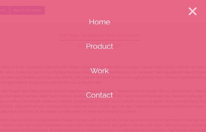
The different links will be over that background and properly center to the page.
They indeed became very popular as a result of their simpleness. In this blog post, we’ll describe for you how to produce one with a smooth transition effect between displaying and hiding it.
That full-screen navigation builds on HTML, CSS3, and jQuery. You can use it as a starter template for your next project.
HTML for Fullscreen Hamburger Menu
Ok, Let’s first we need to create toggle button that will be used to generate event open/close. We do the same thing with a switch button as we have done previously with Side Navigation Menu.
We have a div with the class name fullnavBtn and also defined an ID toggle which will be handled through JavaScript later on in the JS section.
The span tags are placed to create a nice looking hamburger menu through CSS.
<div class="fullnavBtn" id="toggle">
  <span class="top"></span>
  <span class="middle"></span>
  <span class="bottom"></span>
</div>
Now we need to create a list of menu links, and we are going to keep them inside the main div called .fullnav
We created an unorder list li and ul and then place a hyperlink inside each li.
<div class="fullnav" id="fullnav">
  <nav class="fullnavMenu">
    <ul>
      <li ><a href="#">Home</a></li>
      <li><a href="#">Product</a></li>
      <li><a href="#">Work</a></li>
      <li><a href="#">Contact</a></li>
    </ul>
  </nav>
</div>
Style Overlay Menu with CSS
After creating HTML structure, now its time to build CSS styles for fullscreen overlay hamburger menu. To make the navbar fullscreen and to cover the full page, we will use the fixed position and by setting up top and let zero, we will able to make it the center of the screen.
The CSS transition property allows me to set the sliding from top animation. Let’s have a look CSS.
.fullnav {
  font-family: 'Lato',sans-serif;
  position: fixed;
  background: #E6567A;
  top: 0;
  left: 0;
  width: 100%;
  height: 0%;
  opacity: 0;
  visibility: hidden;
  -webkit-transition: opacity .35s, visibility .35s, height .35s;
  transition: opacity .35s, visibility .35s, height .35s;
  overflow: hidden;
}
When the user clicks on a button to open a navigation overlay div, we need to set its background opacity so the back content area also visible.
.fullnav.open {
  opacity: .9;
  visibility: visible;
  height: 100%;
}
Great animations are always vital and attract users. It also adds value to the existing design and allows you to improve design performs.
Then, why not add some nice looking fade in right animation as an overlay load?
.fullnav.open li {
  -webkit-animation: fadeInRight .5s ease forwards;
          animation: fadeInRight .5s ease forwards;
  -webkit-animation-delay: .35s;
          animation-delay: .35s;
}
.fullnav.open li:nth-of-type(2) {
  -webkit-animation-delay: .4s;
          animation-delay: .4s;
}
.fullnav.open li:nth-of-type(3) {
  -webkit-animation-delay: .45s;
          animation-delay: .45s;
}
.fullnav.open li:nth-of-type(4) {
  -webkit-animation-delay: .50s;
          animation-delay: .50s;
}
Let’s give the navigation proper shape and style them in a better way so it will be center of the page.
.fullnav nav {
  position: relative;
  height: 70%;
  top: 50%;
  -webkit-transform: translateY(-50%);
          transform: translateY(-50%);
  font-size: 35px;
  font-family: 'Lato',sans-serif;
  font-weight: 400;
  text-align: center;
}
.fullnav ul {
  list-style: none;
  padding: 0;
  margin: 0 auto;
  display: inline-block;
  position: relative;
  height: 100%;
}
.fullnav ul li {
  display: block;
  height: 25%;
  height: calc(100% / 4);
  min-height: 50px;
  position: relative;
  opacity: 0;
}
.fullnav ul li a {
  display: block;
  position: relative;
  color: #FFF;
  text-decoration: none;
  overflow: hidden;
}
Why not add some nice animated bottom border on hover the links to make it look more user-friendly?
.fullnav ul li a:hover:after, .fullnav ul li a:focus:after, .fullnav ul li a:active:after {
  width: 100%;
}
.fullnav ul li a:after {
  content: '';
  position: absolute;
  bottom: 0;
  left: 50%;
  width: 0%;
  -webkit-transform: translateX(-50%);
          transform: translateX(-50%);
  height: 3px;
  background: #FFF;
  -webkit-transition: .35s;
  transition: .35s;
}

@-webkit-keyframes fadeInRight {
  0% {
    opacity: 0;
    left: 20%;
  }
  100% {
    opacity: 1;
    left: 0;
  }
}

@keyframes fadeInRight {
  0% {
    opacity: 0;
    left: 20%;
  }
  100% {
    opacity: 1;
    left: 0;
  }
}
JavaScript for Toggle Animation
Finally, we add a bit of JavaScript that handles the click function. That’s is just a piece of cake. Isn’t it? We only added a click function which will add/remove the open class which helps us to design overly part differently.
$(document).ready(function () {
$('#toggle').click(function() {
   $(this).toggleClass('active');
   $('#fullnav').toggleClass('open');
  });
});
That’s it. We done! Hope this is something to help you with your new or upcoming projects.
simply awesome. thank you so much for a very easy to understand and easy to implement overlay hamburger menu with so complete editing access. Thanks a lot admin / team codeconvey!!
Thank you Tushar for liking our Work. Your feedback is valuable for us.
Hey,
First of all thanks for this example!
I don’t know why, but when I click on the hamburger (after I copied your code), nothing happened. Could it be a problem with JS? I’ve also had the same problem with another example. I click but nothing happened. Do I need to make some setting in Visual Studio Code to make the JS-code active?
Hi Michel!
Please make sure you have loaded jQuery (JavaScript library) into your project. You can load jQuery file by adding the following CDN link in the head tag of your HTML document.
Hopefully, hamburger toggle function will work now. If you have any other issue, let me know, I’ll answer you as soon as possible.
Hey, thanks for the cool menu!
I just have one problem, when the menu opens some of my content stays on top of the menu: https://snipboard.io/o5QZLI.jpg . I tried changing the z-index, but it seems it doesn’t fix the problem. Do you have any idea what could be wrong?
Best regards, Jurrian
Hello Jurrian!
Here is solution, keep the opacity 1 and define z-index greater than your other contents:
.fullnav.open { opacity: 1; visibility: visible; height: 100%; z-index: 999: }Hey Muhammad!
Thanks for your reply, I appreciate it a lot. 🙂
Unfortunately, the problem still occurs by raising the z-index to 999. Also, when I raise the z-index the close button of the menu disappears.
This is the code of my background and text. When I change the z-index of the text to -1 for example and the backgrounds to -2 and -3 the whole text goes behind the background. Do you know a solution?
Thanks!
Best regards, Jurrian
#home {
    height: 70vh;
    text-align: center;
    background-image: url("/images/bg_socialicons.png"), url("/images/bg_cloud.png");
    background-repeat: no-repeat;
    background-position: top, center;
    background-size: 55em, 45em;
}

.main_text {
    vertical-align: middle;
    position: relative;
    top: 50%;
    left: 50%;
    transform: translate(-50%, -50%);
}